


Welcome at Babù Antwerp
Babù Antwerp is an online interior design store offering timeless decorations with character.
We believe in craftsmanship and sustainable objects that create atmosphere and can transcend generations.
You can visit our showroom during our open days. Would you like to join us? Sign up for our newsletter or follow us on social media.
Are you looking for advice for your interior design project? Is your home finished, but do you feel that it still lacks atmosphere? Feel free to make an appointment to discuss this together in the showroom or at your home.
Love,
Bénédicte
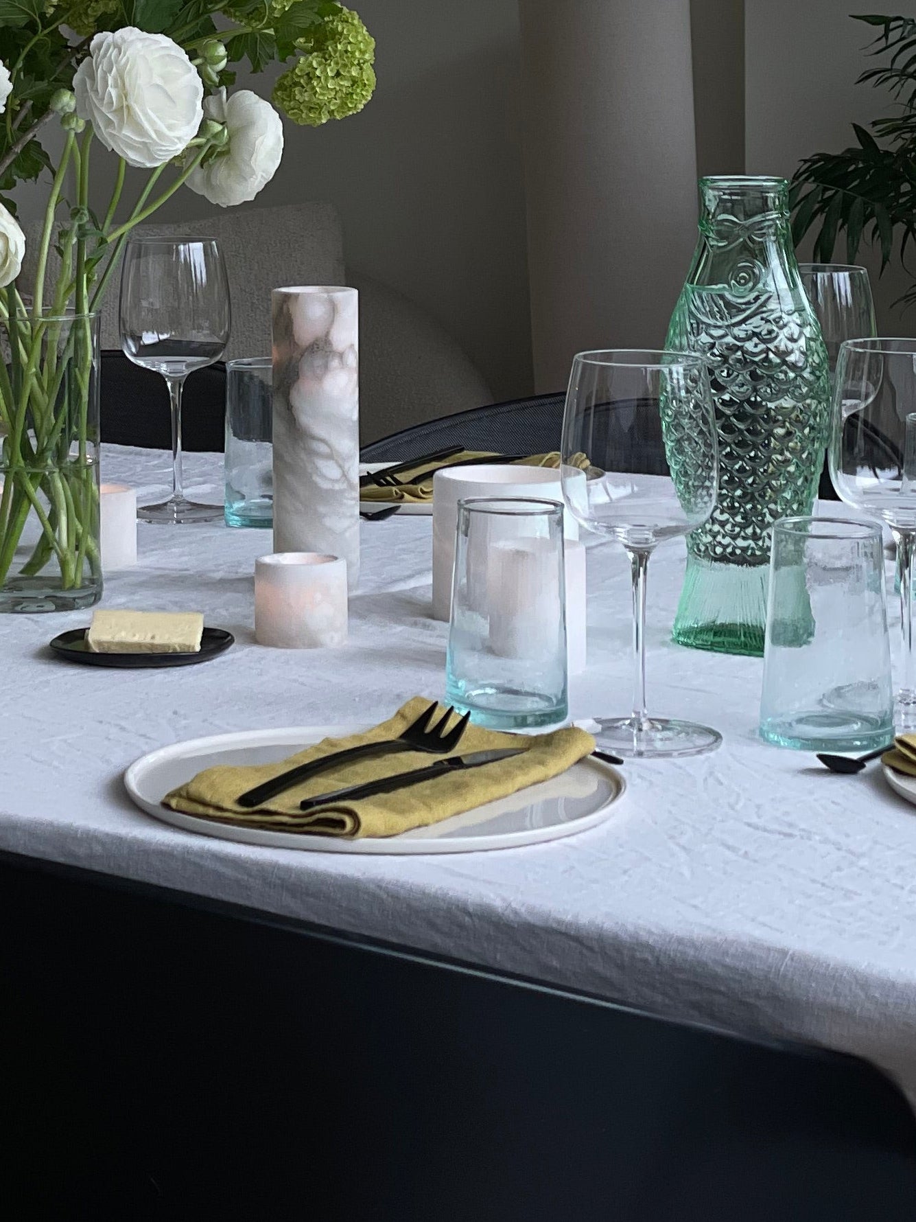
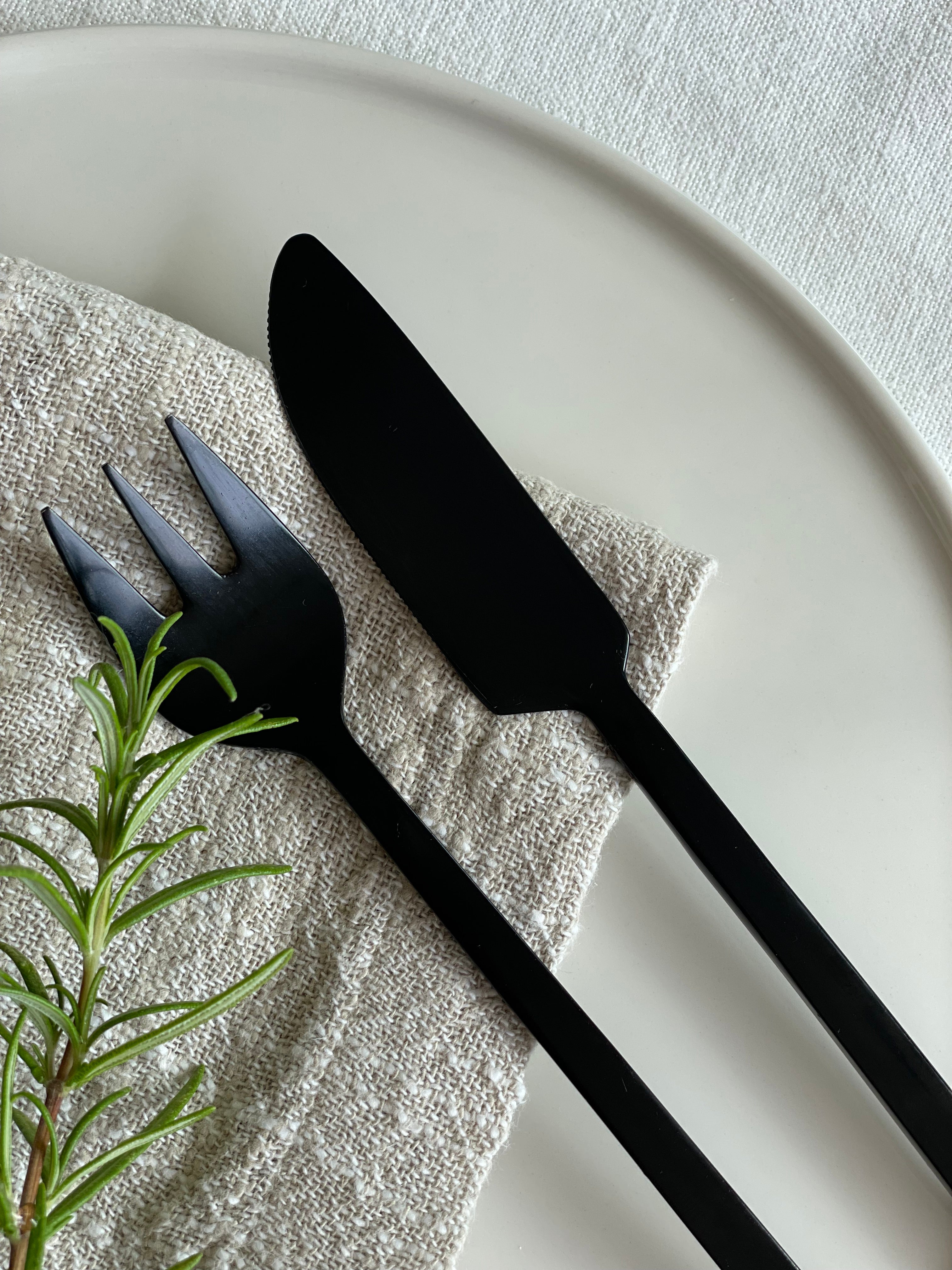
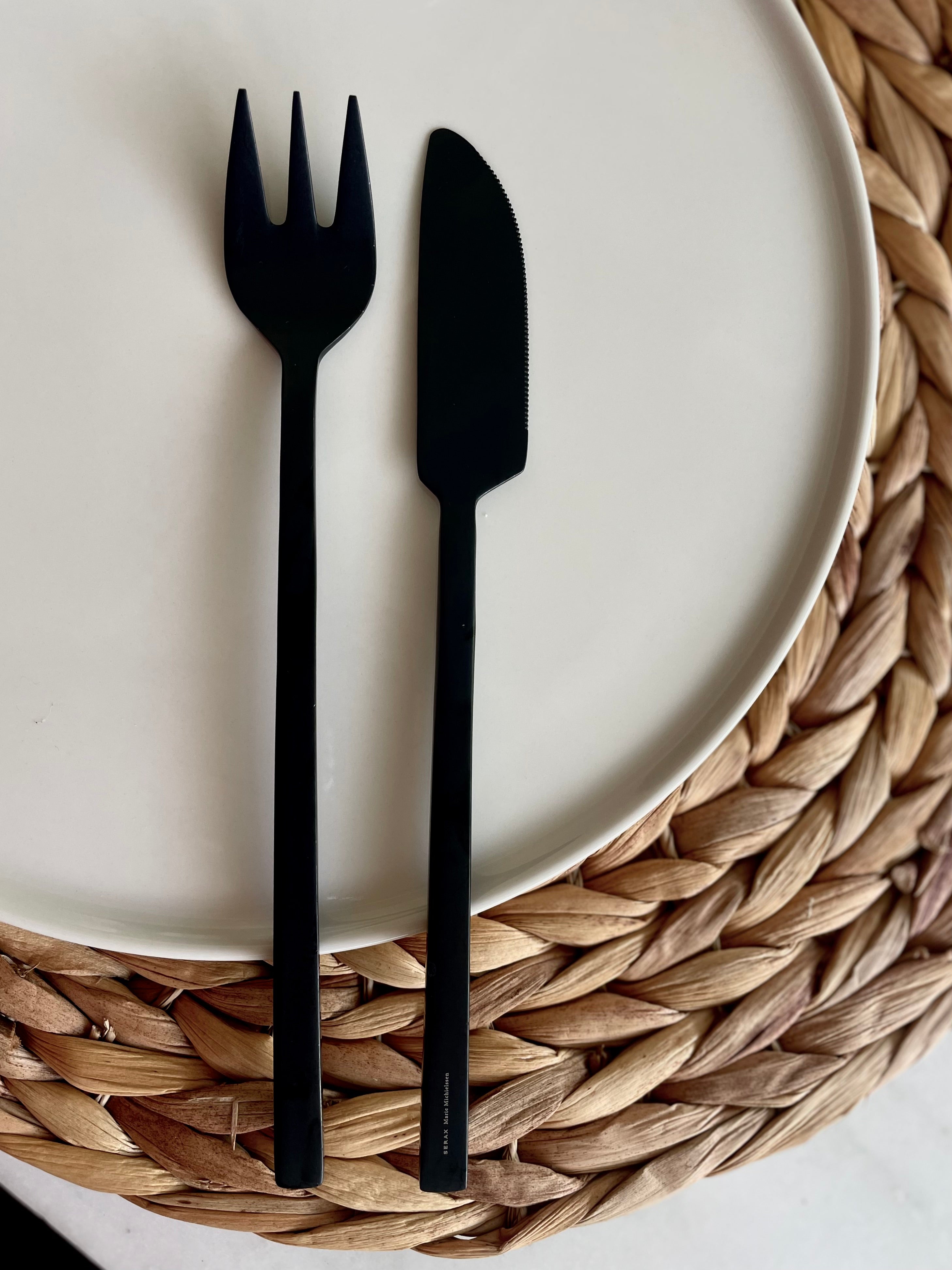
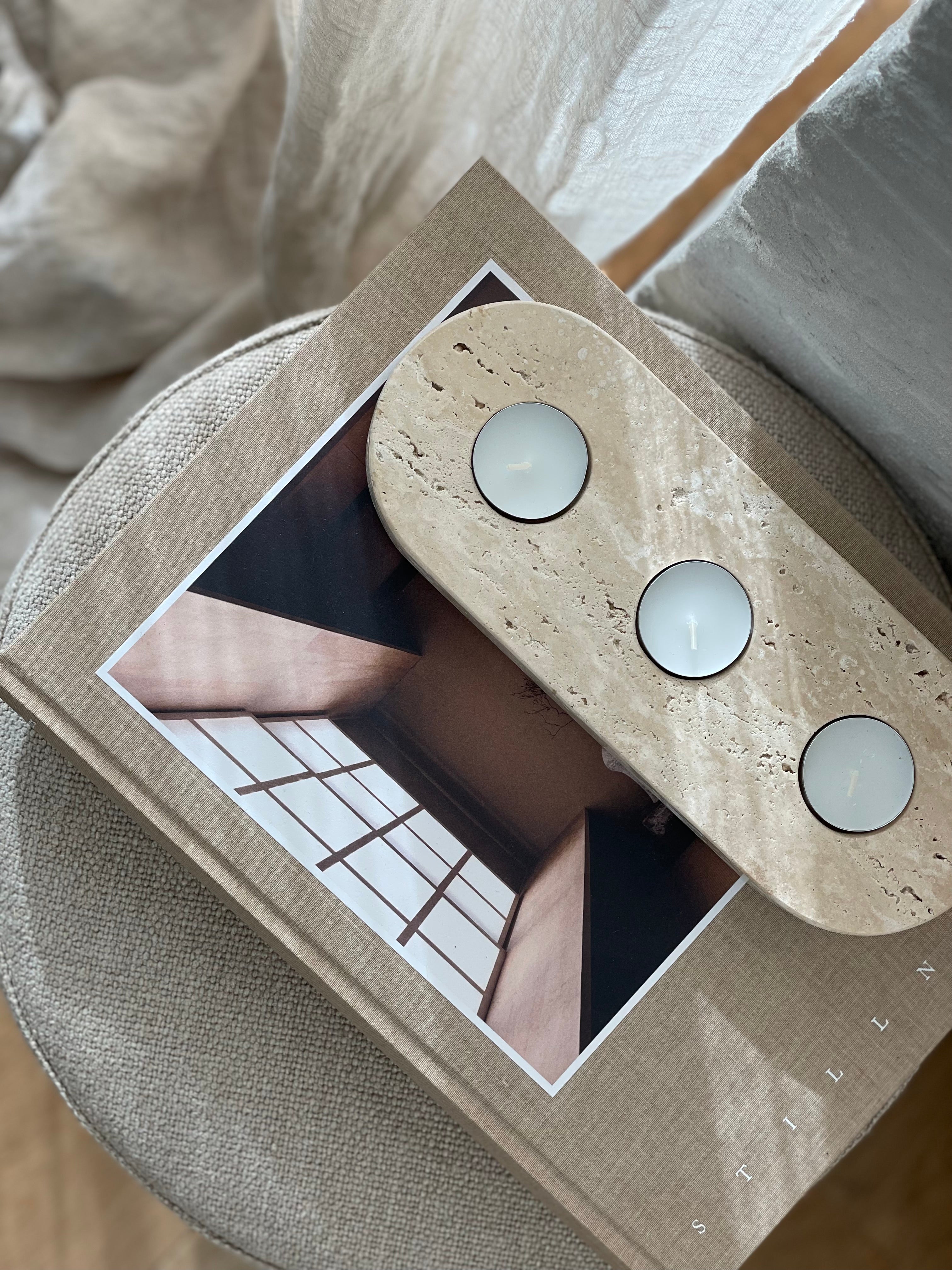
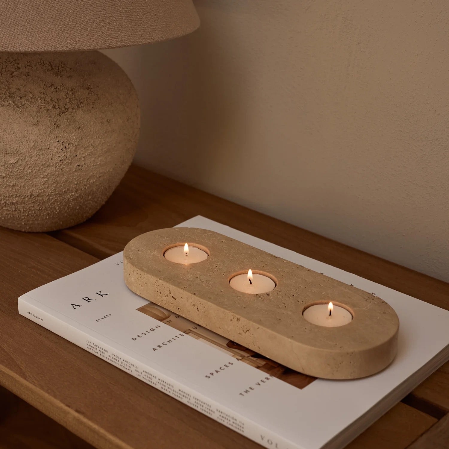
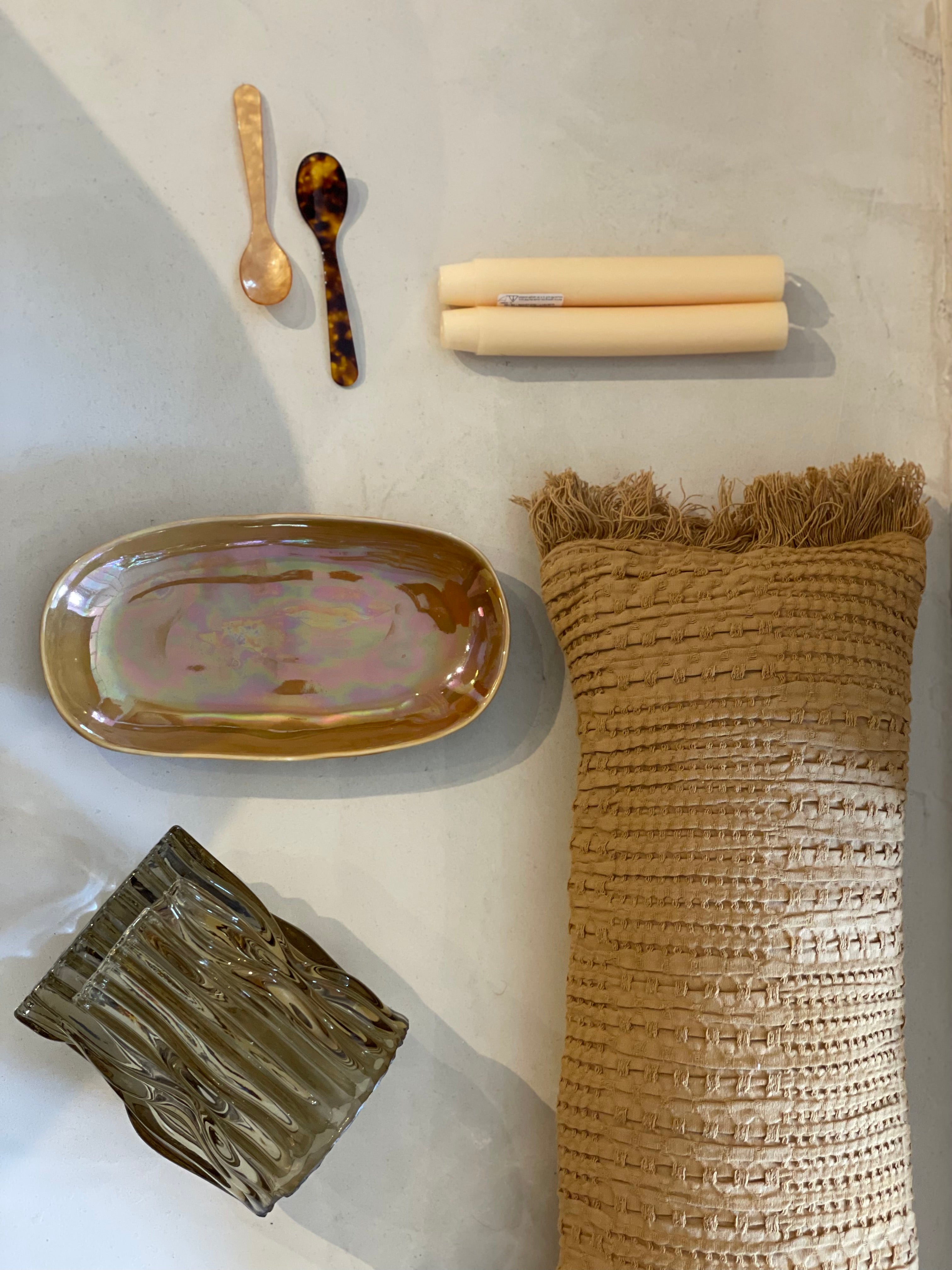
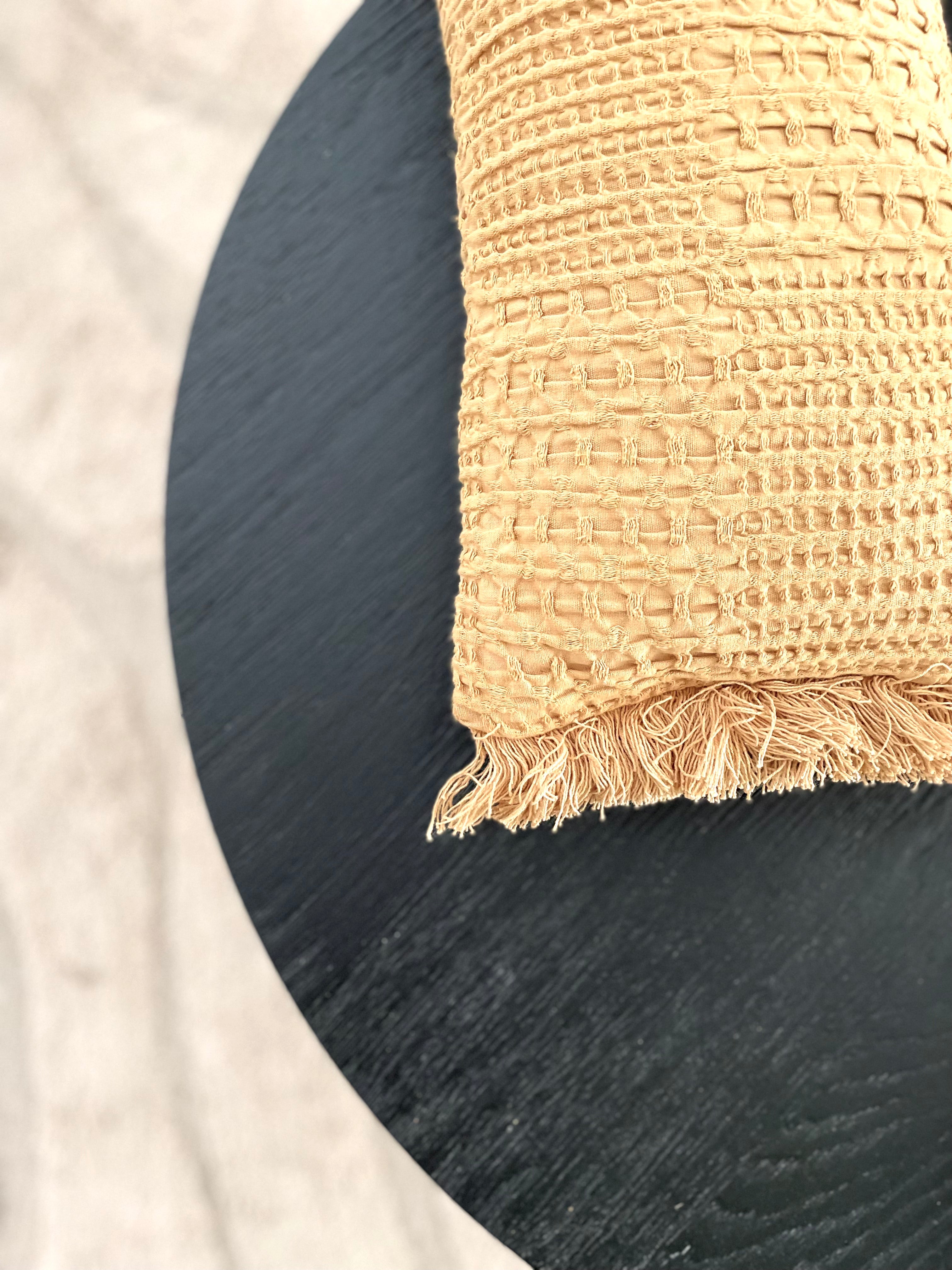
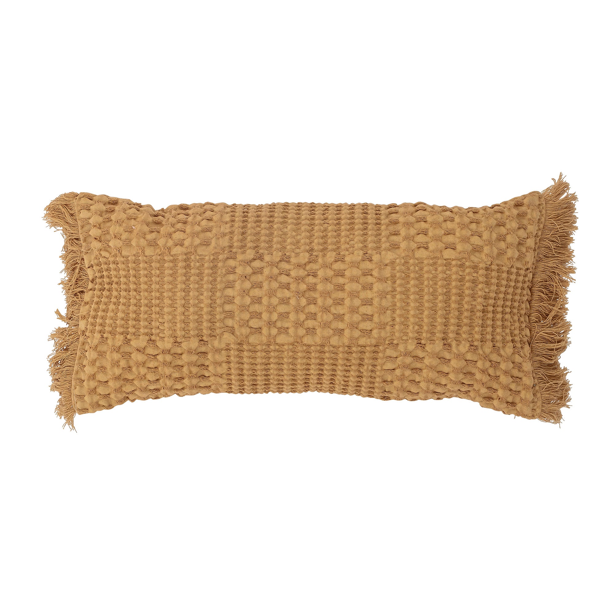
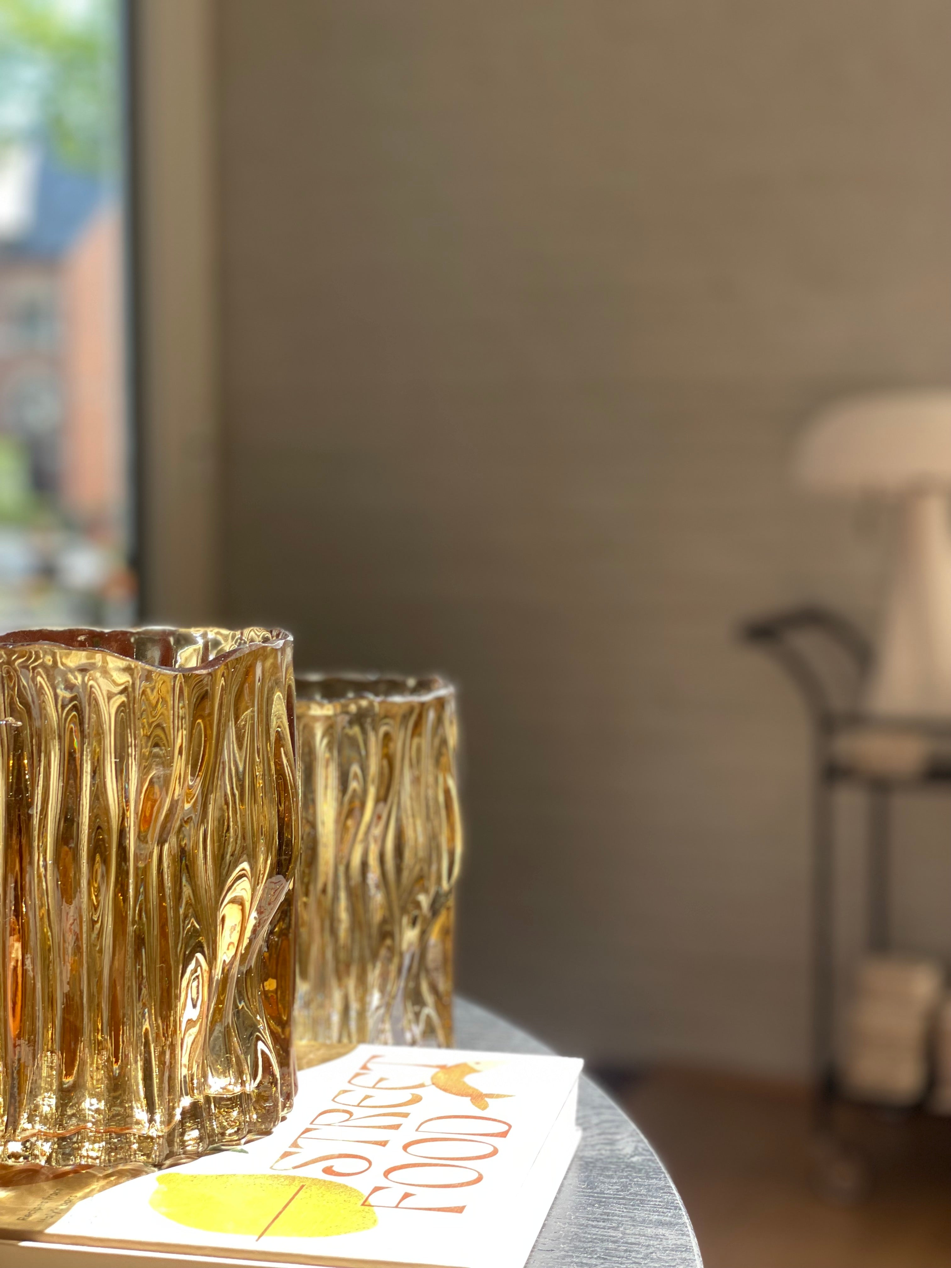
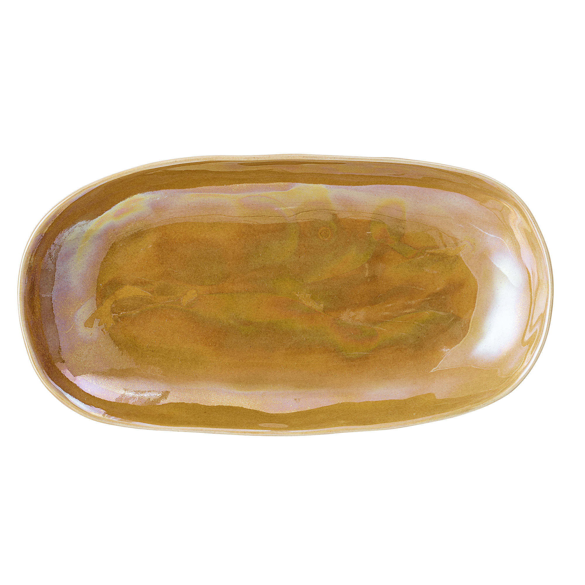
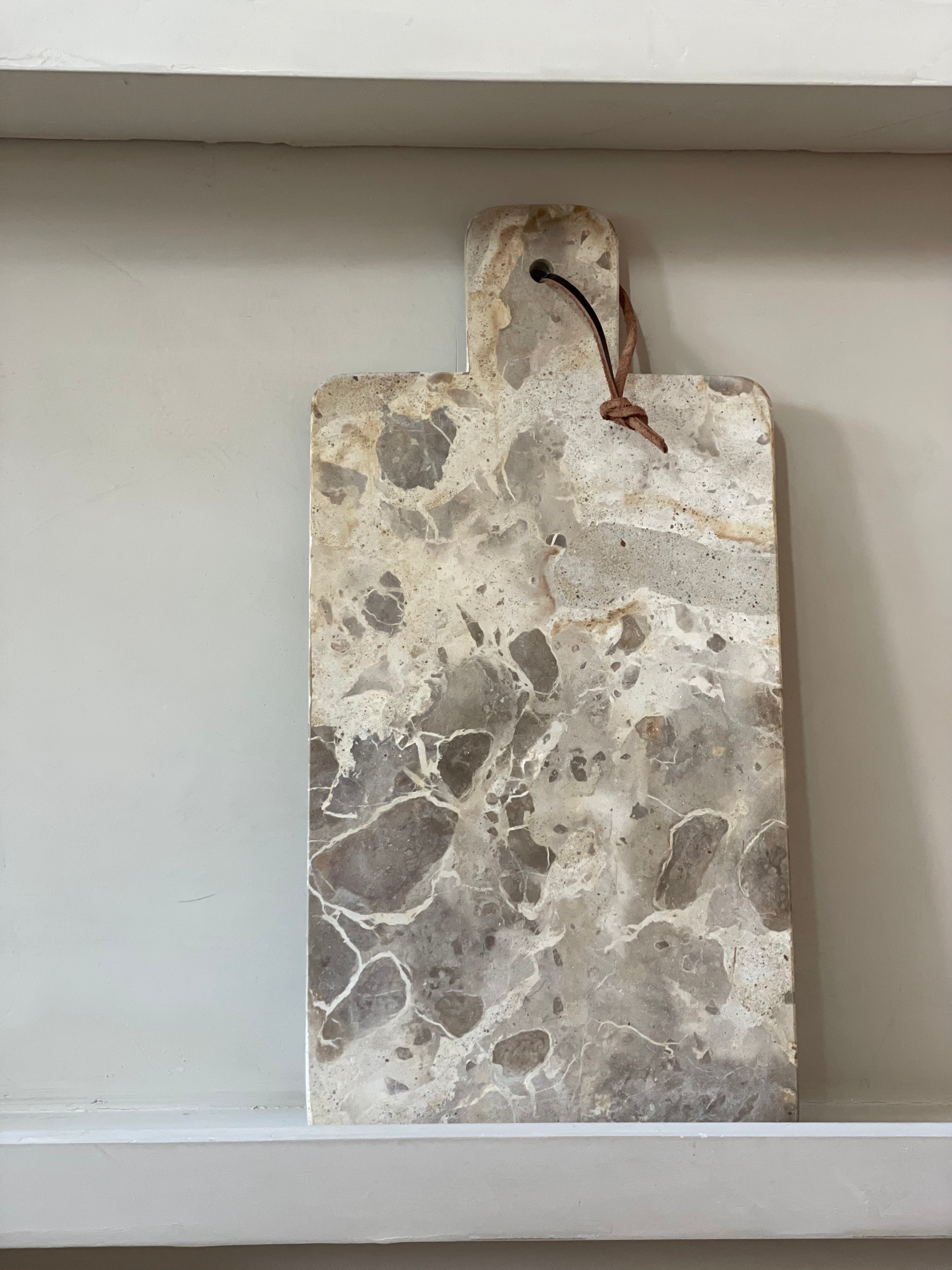
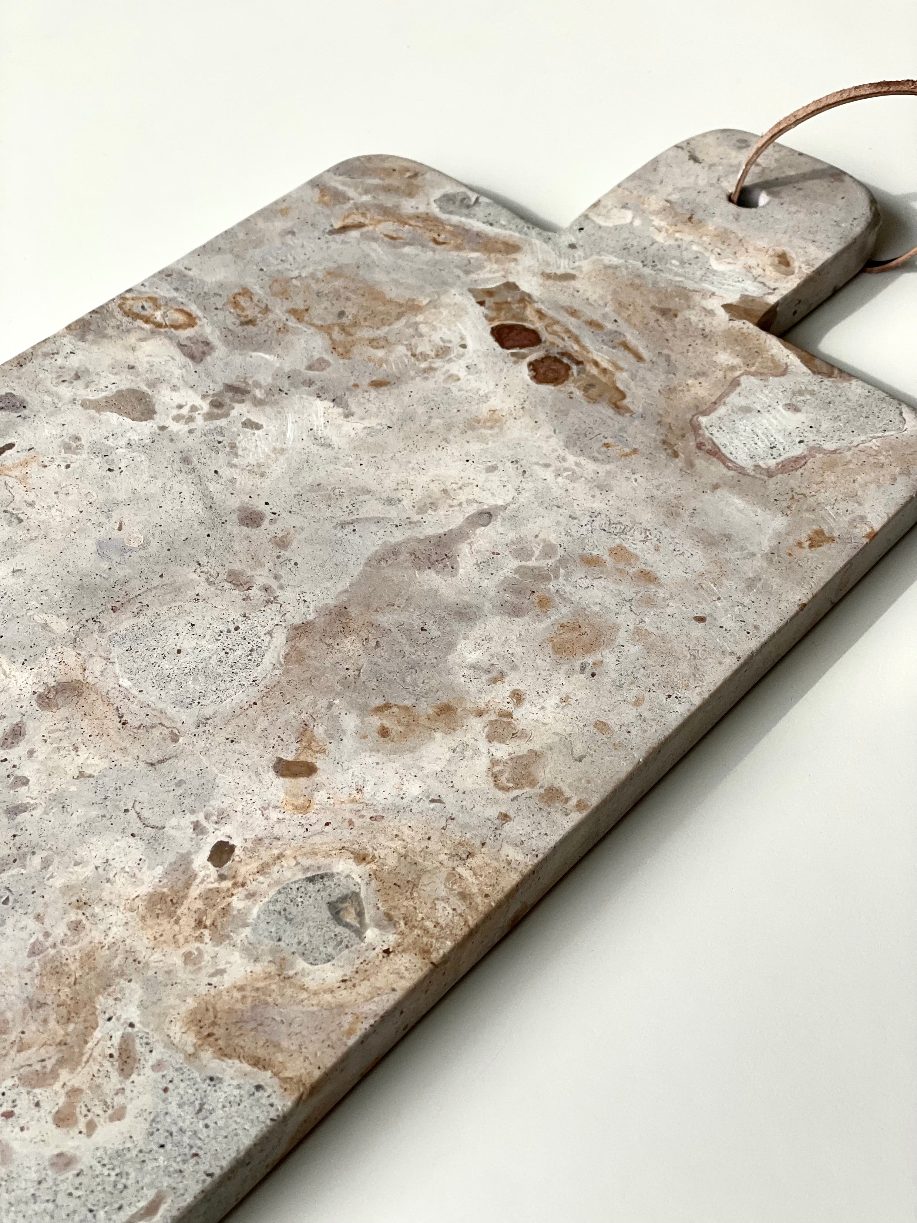
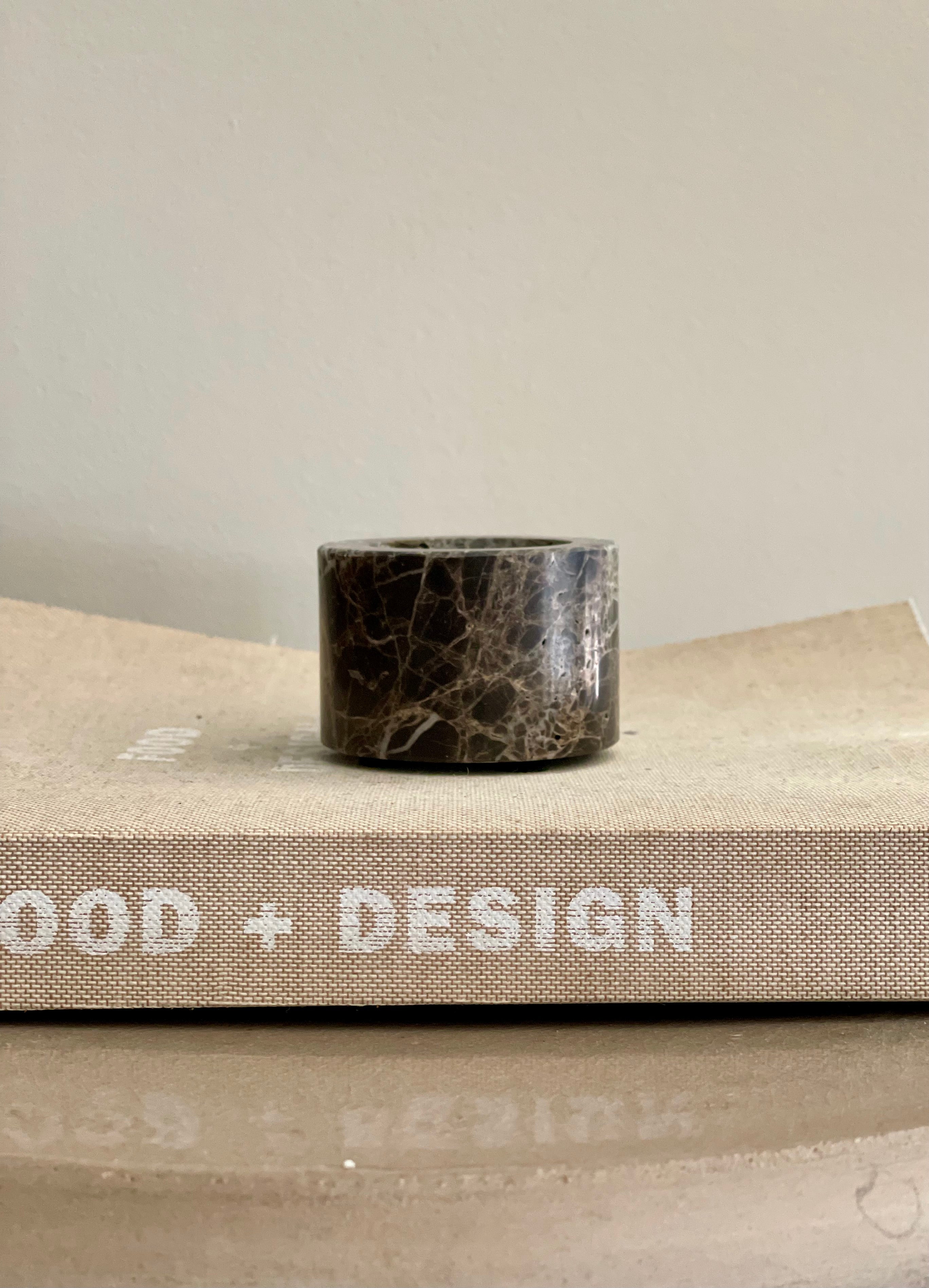
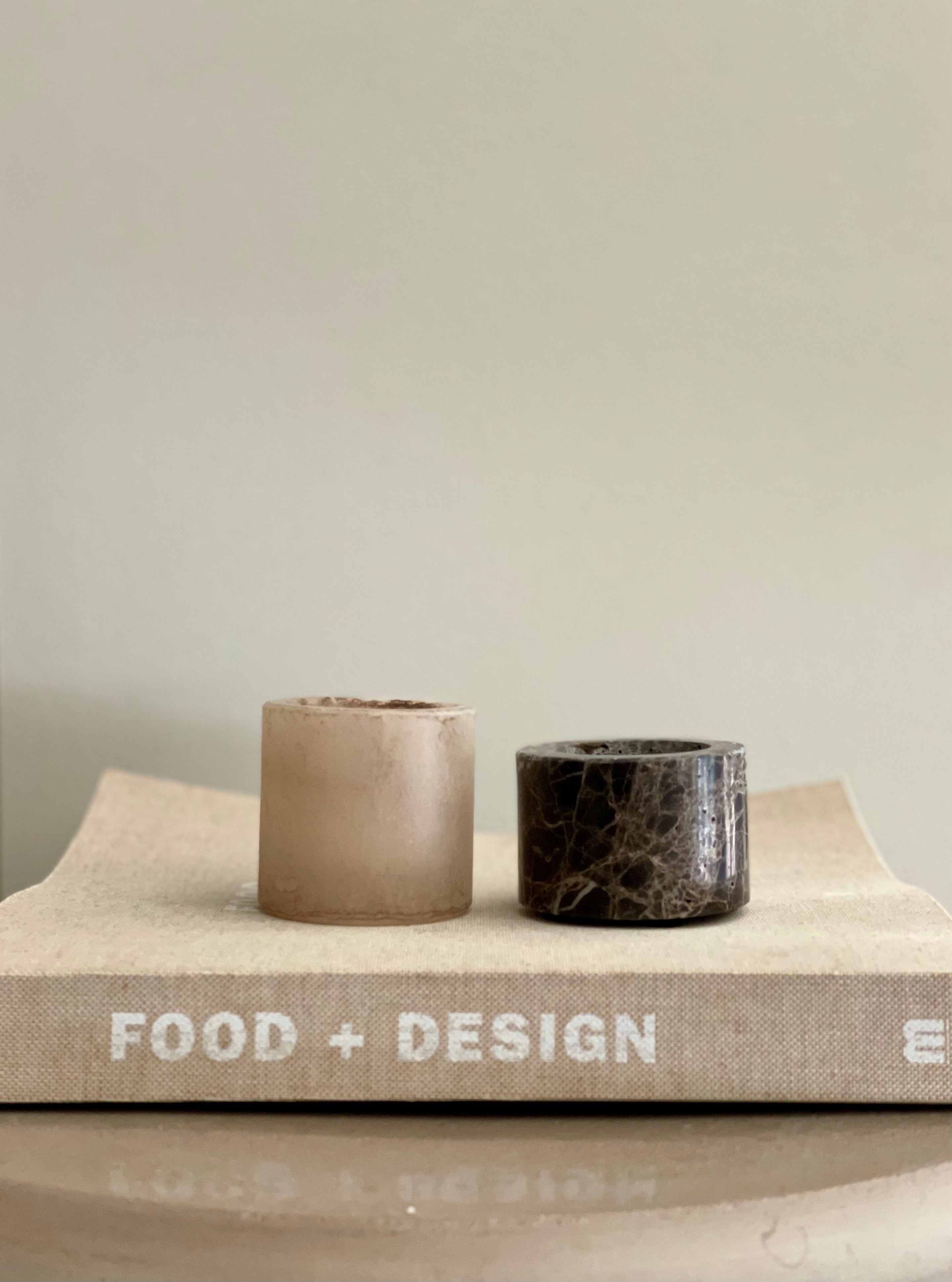
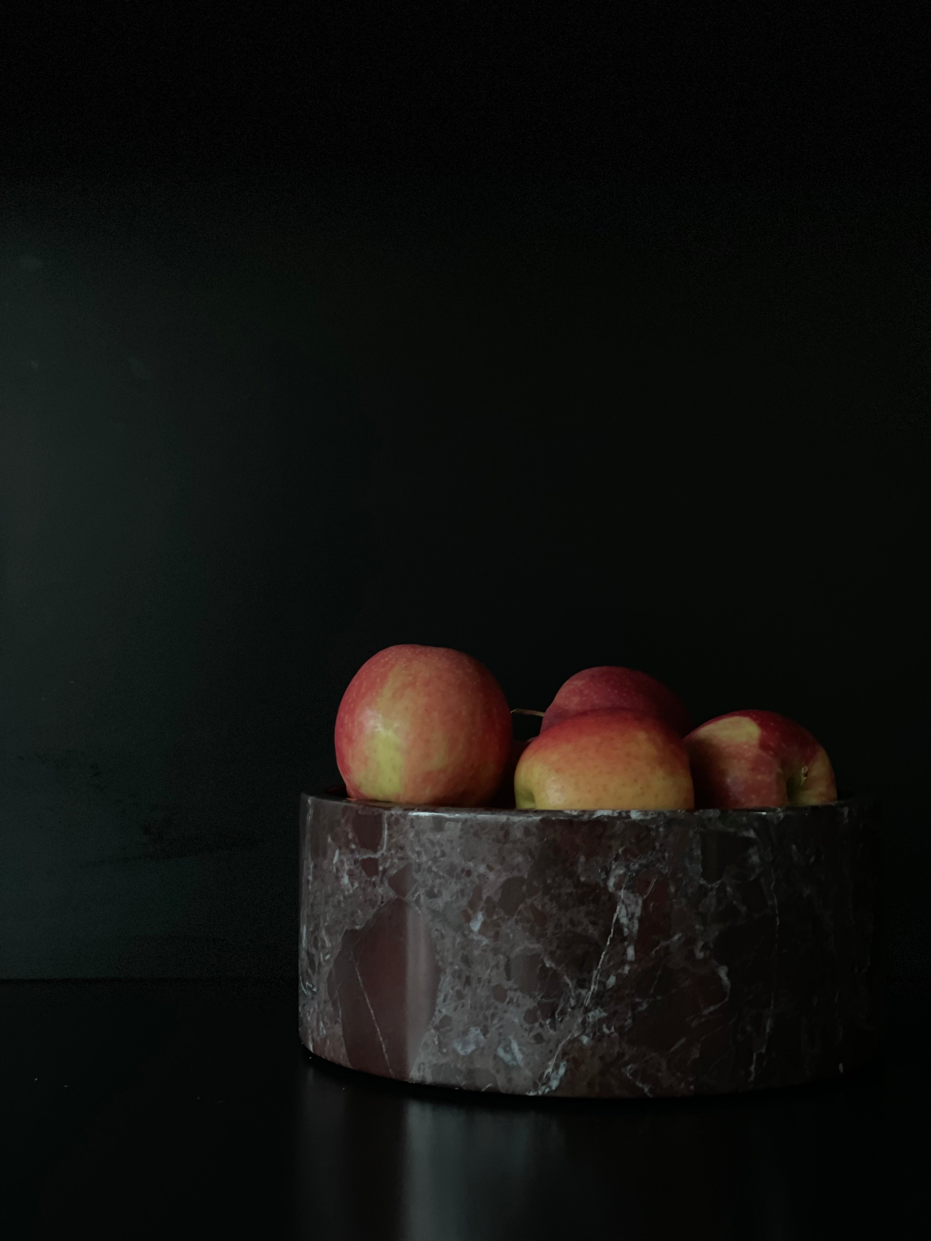
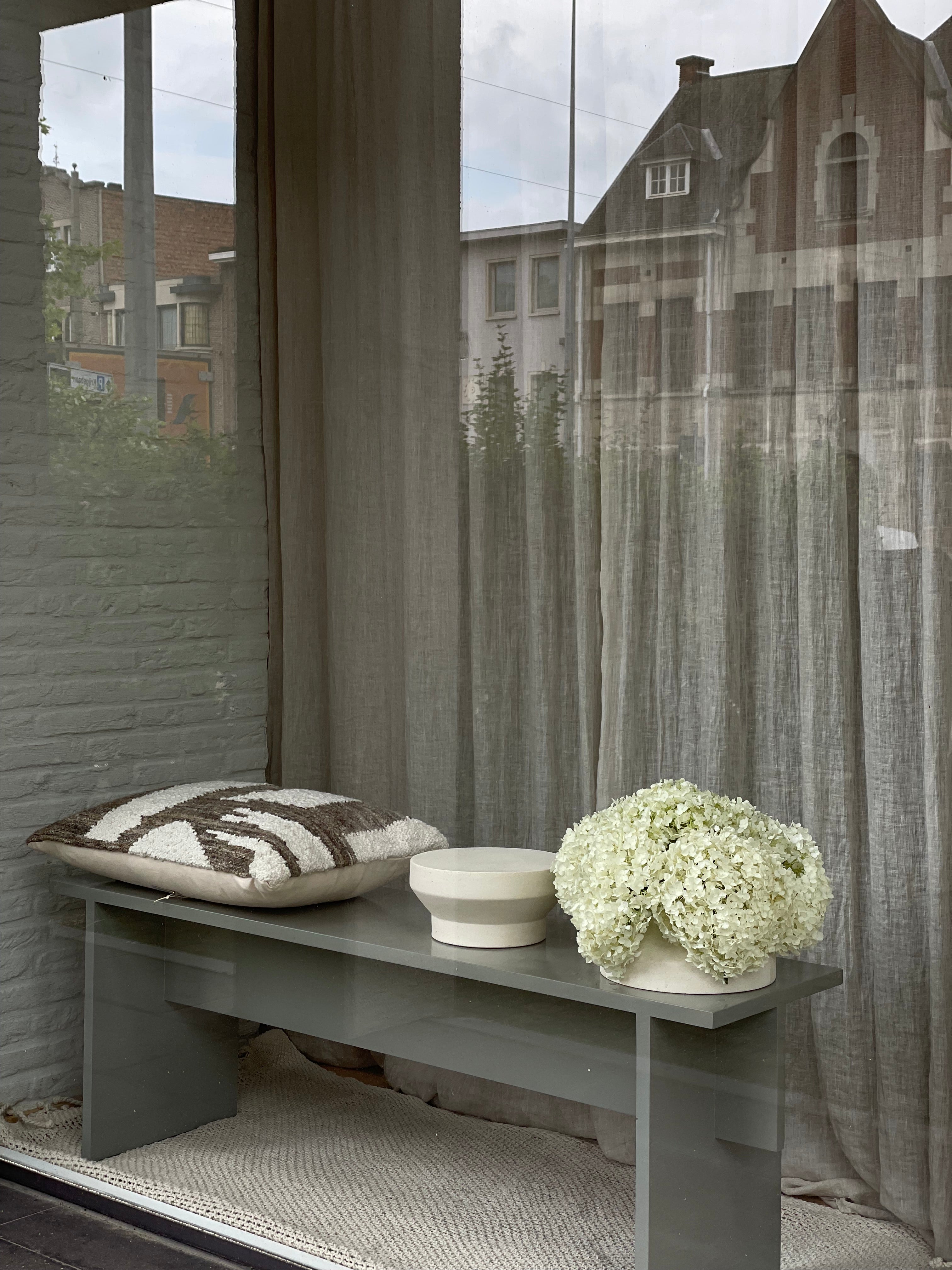
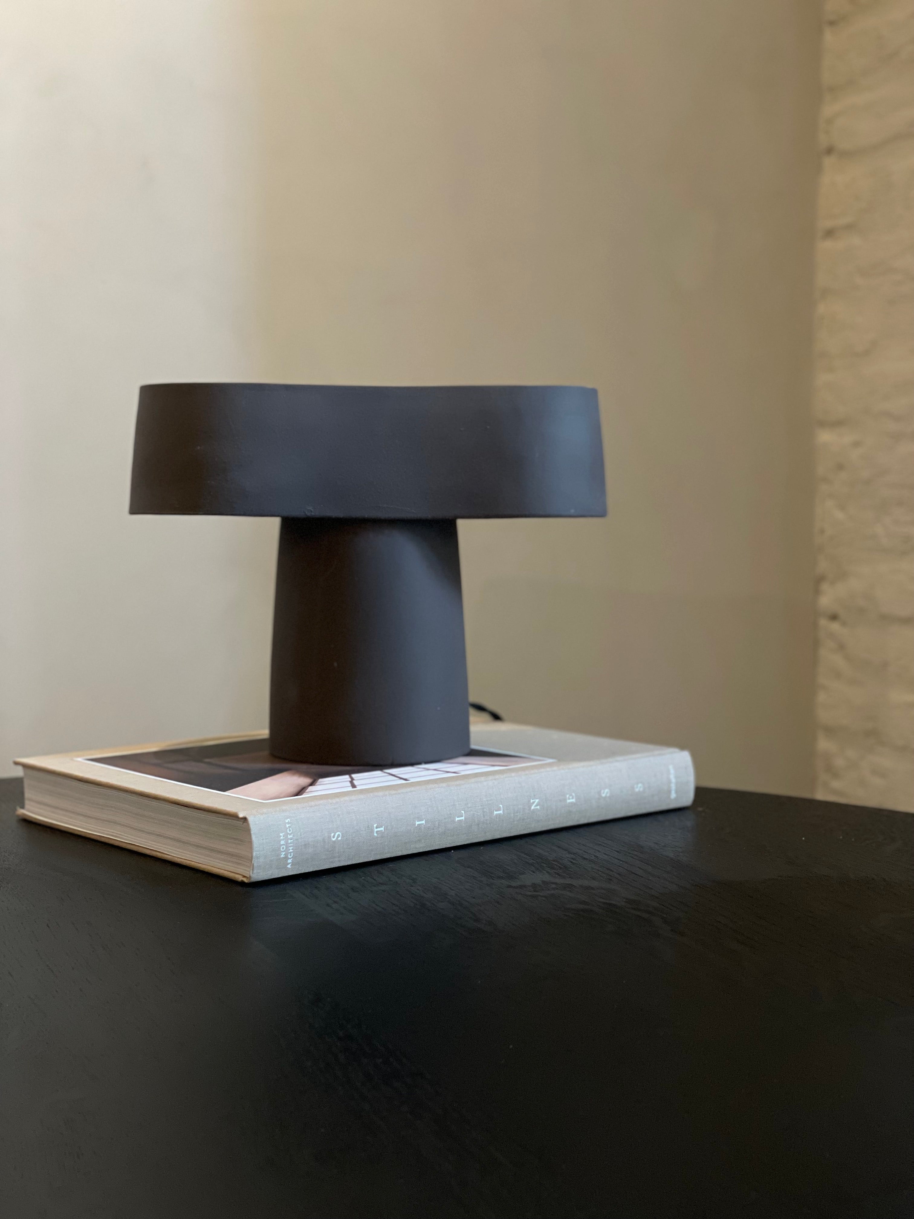
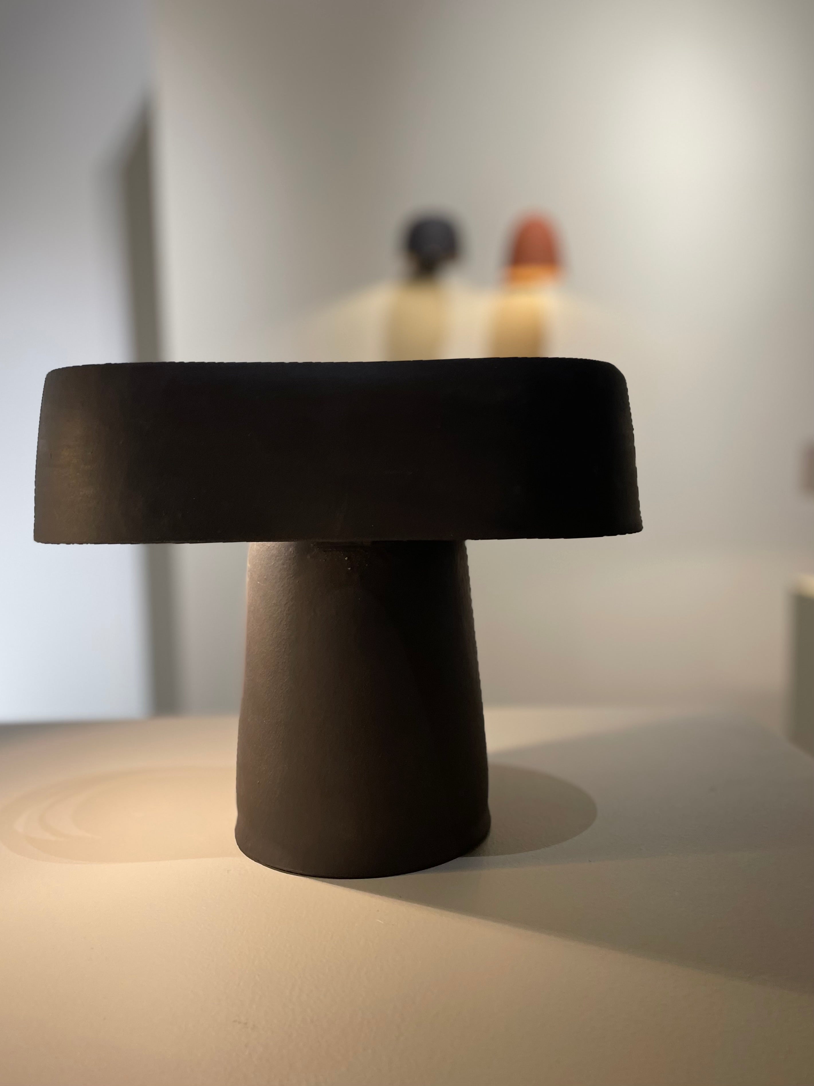
Inspiration
Inspiration
Inspiration
Inspiration
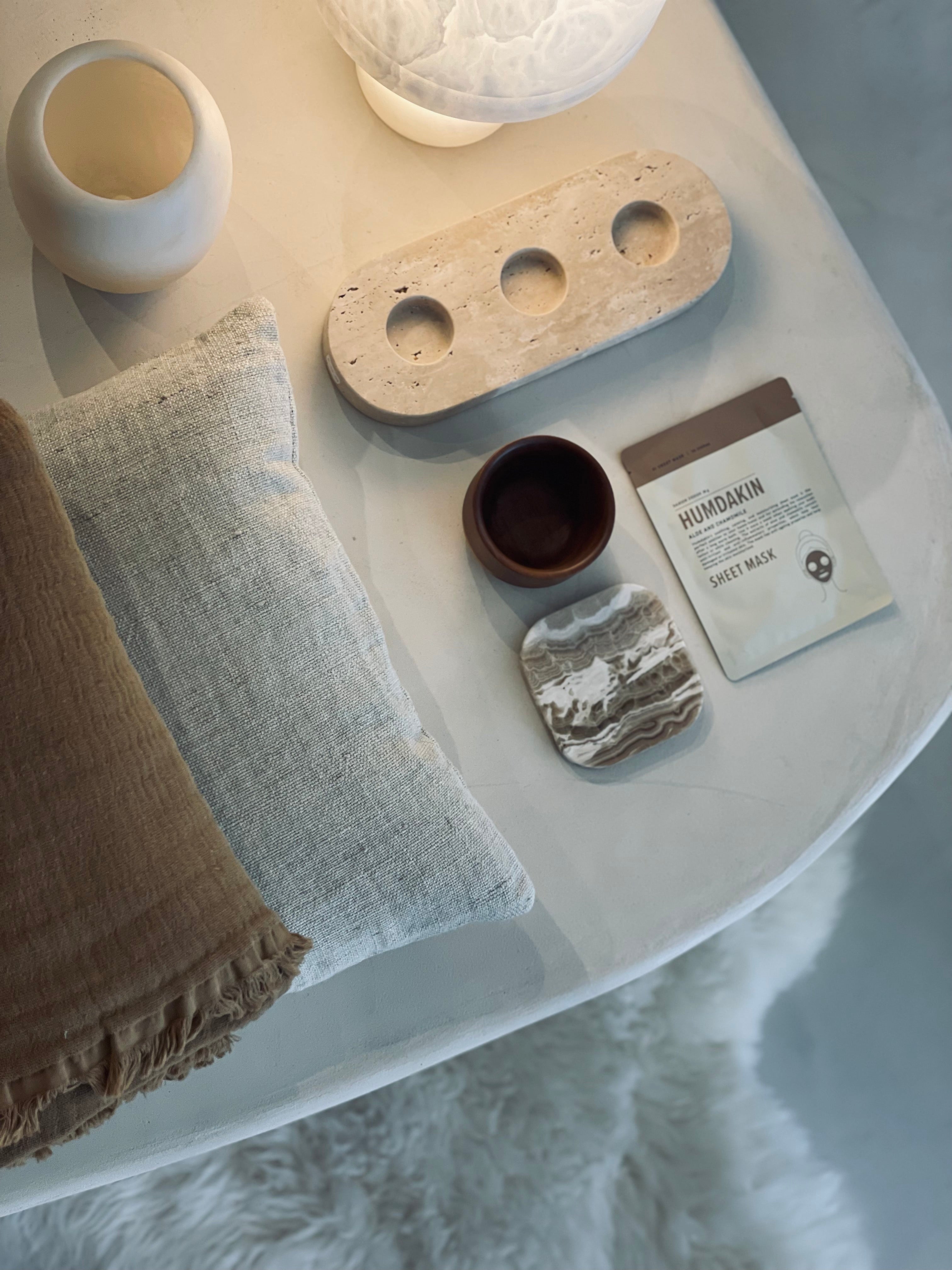
Inspiration
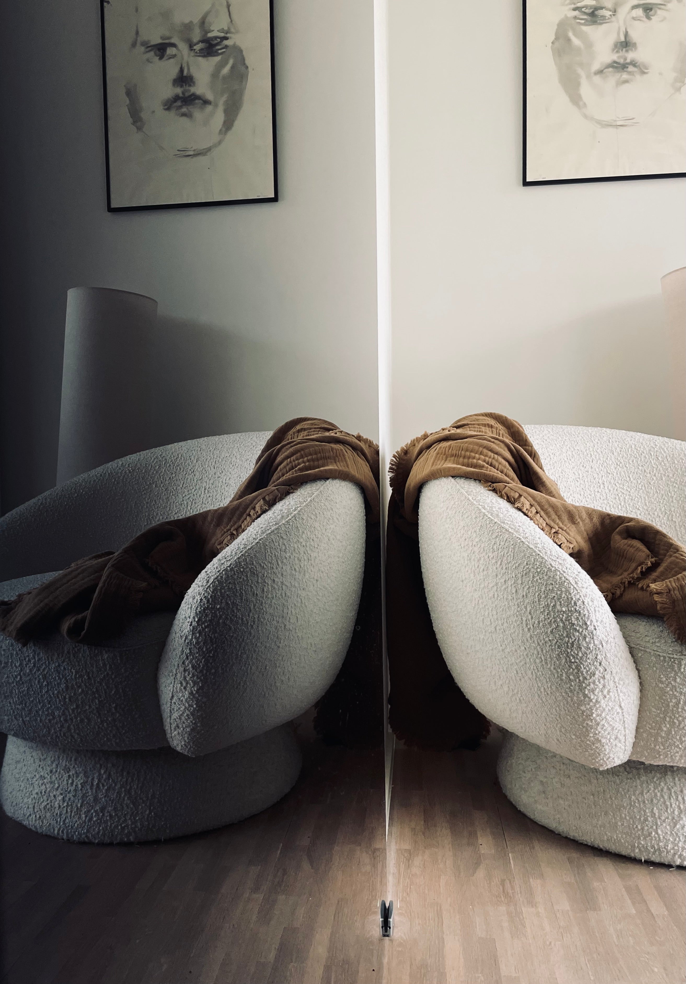
Inspiration
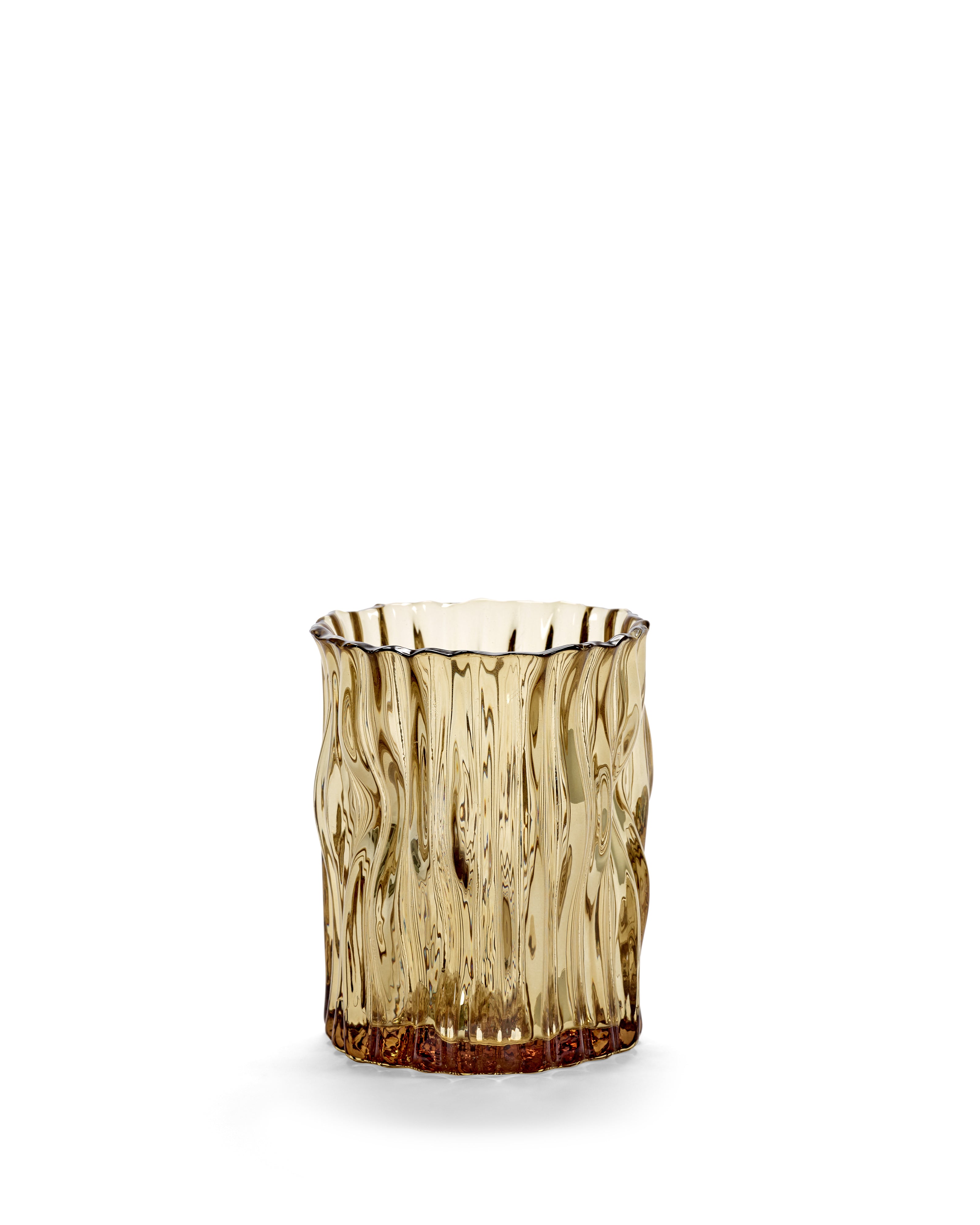
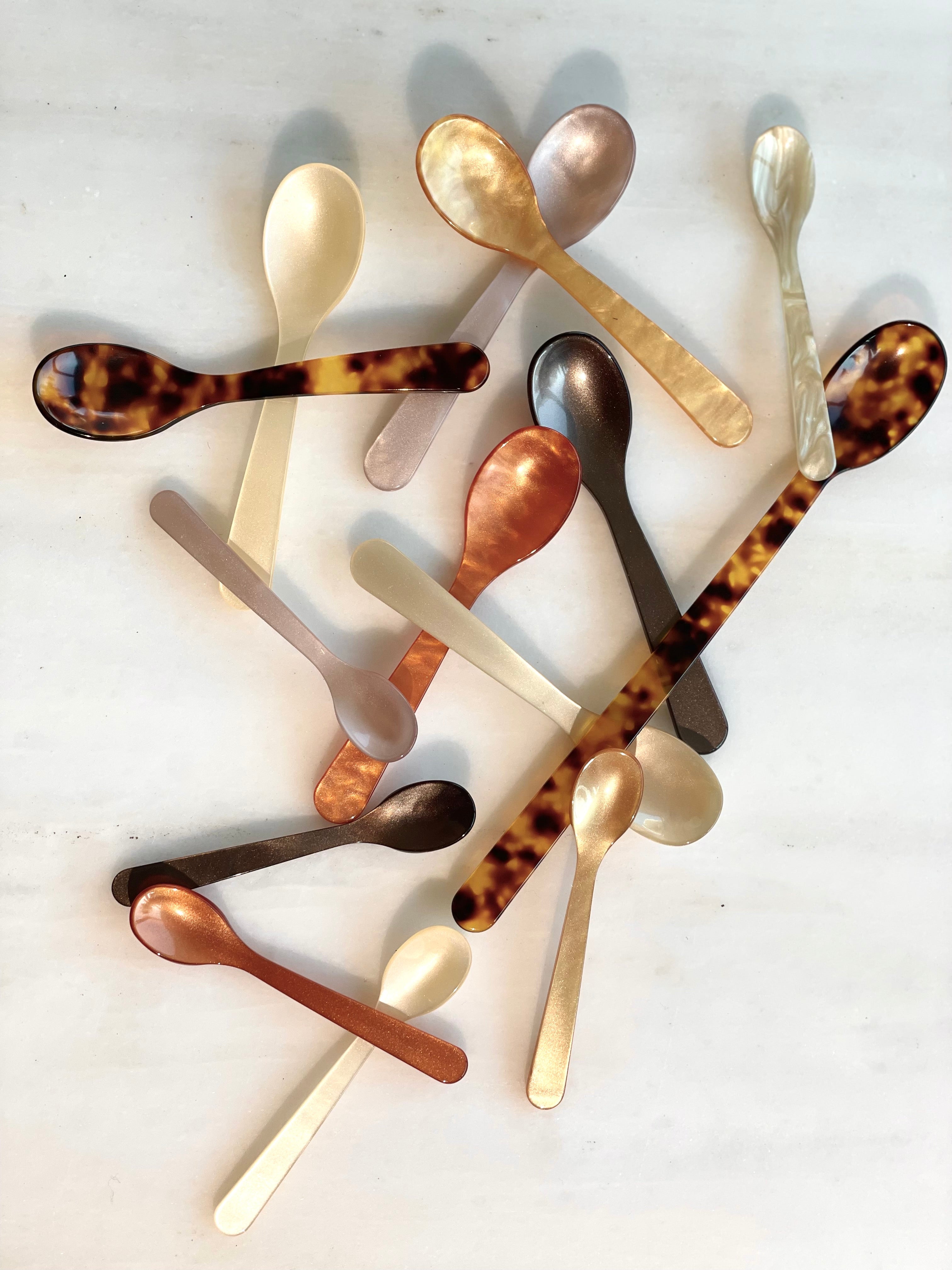
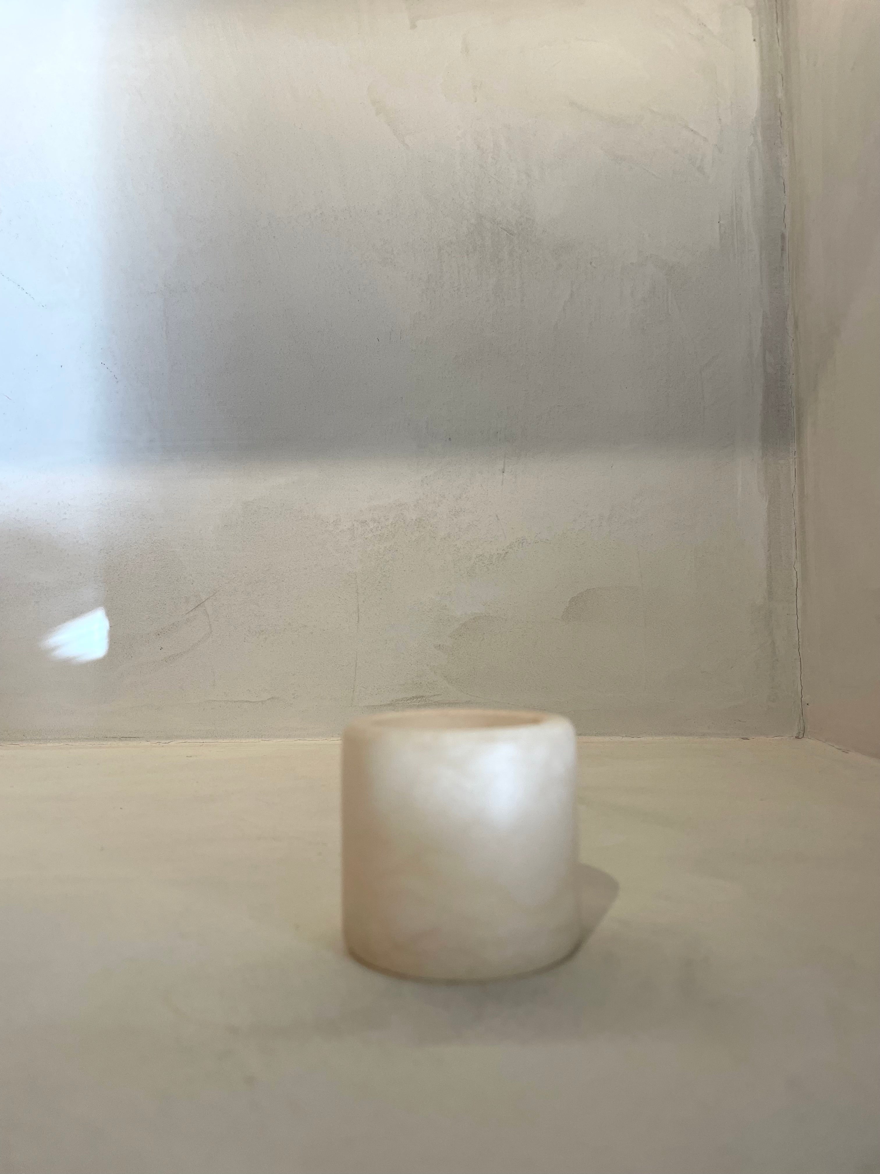
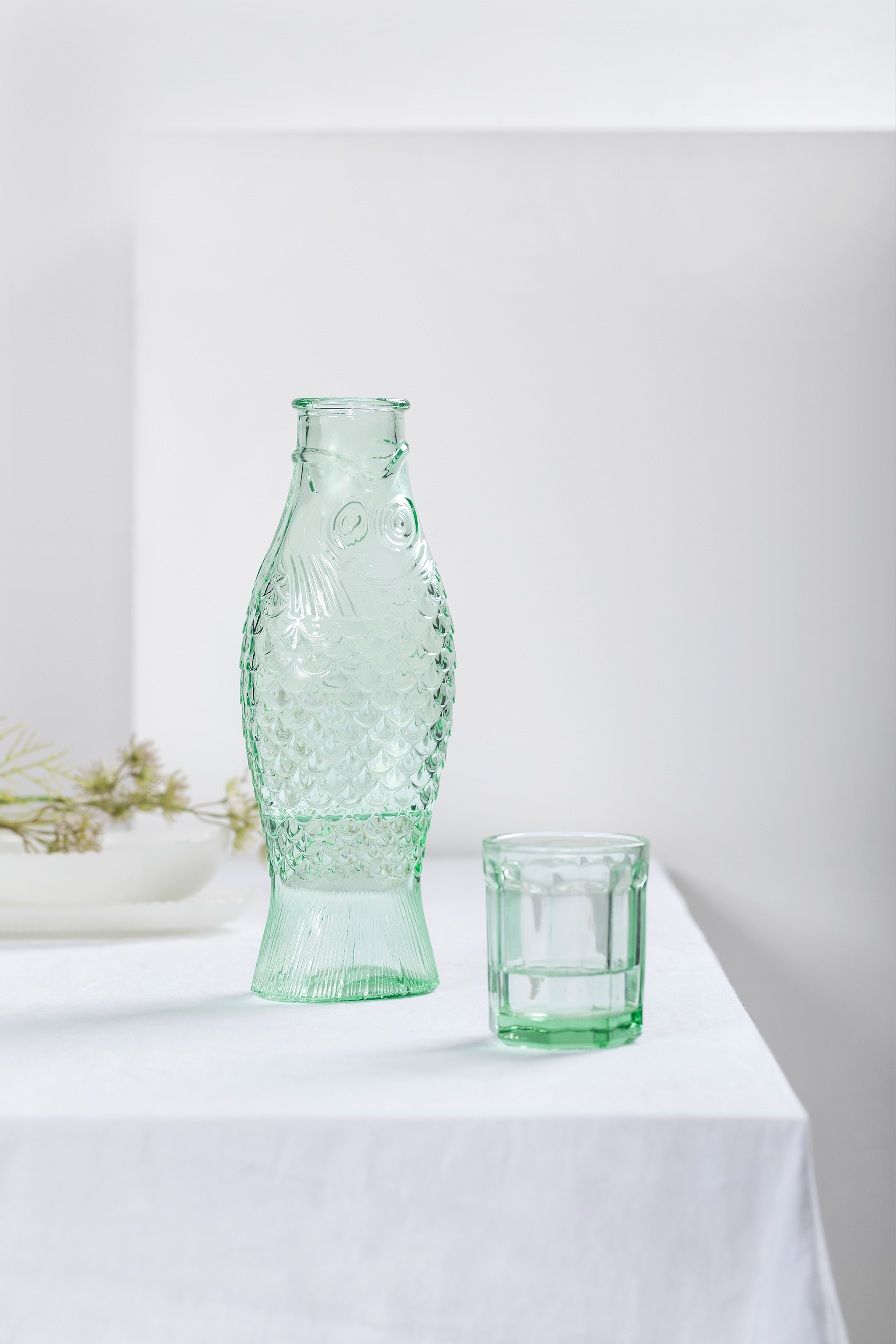
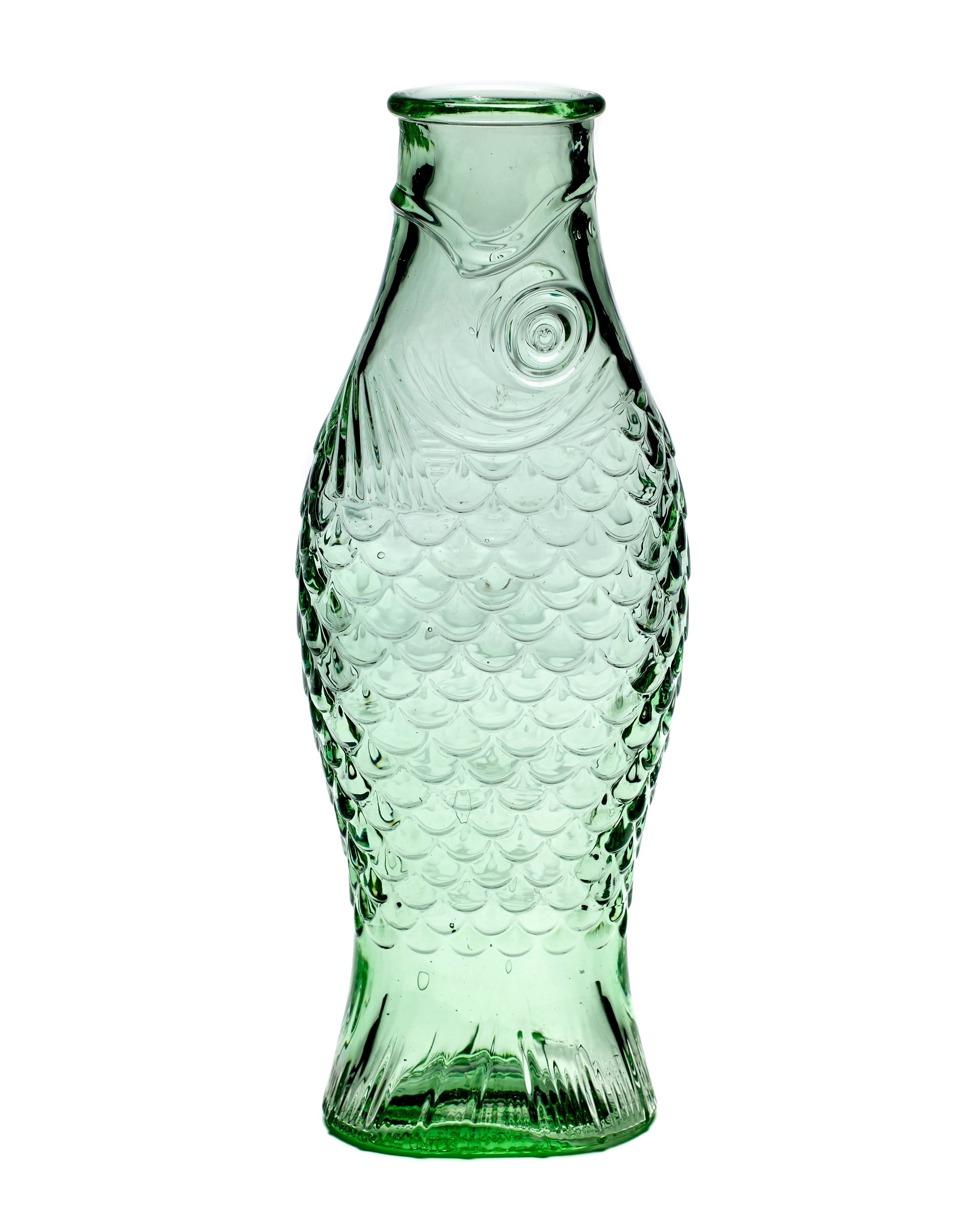
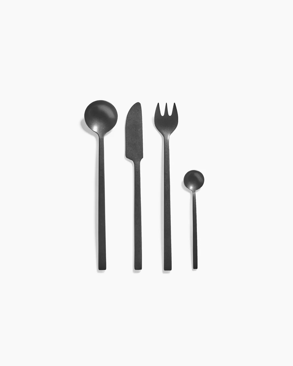
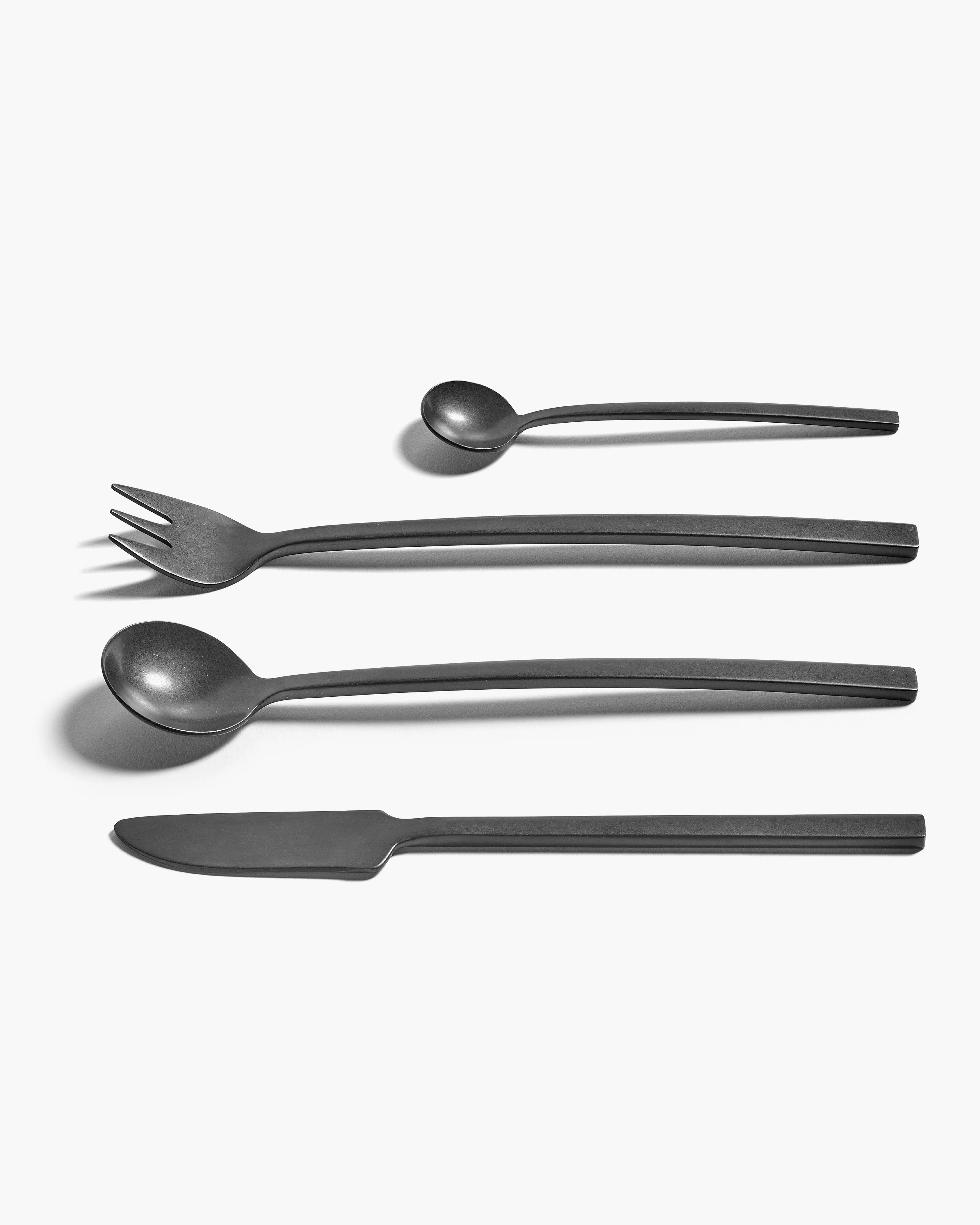
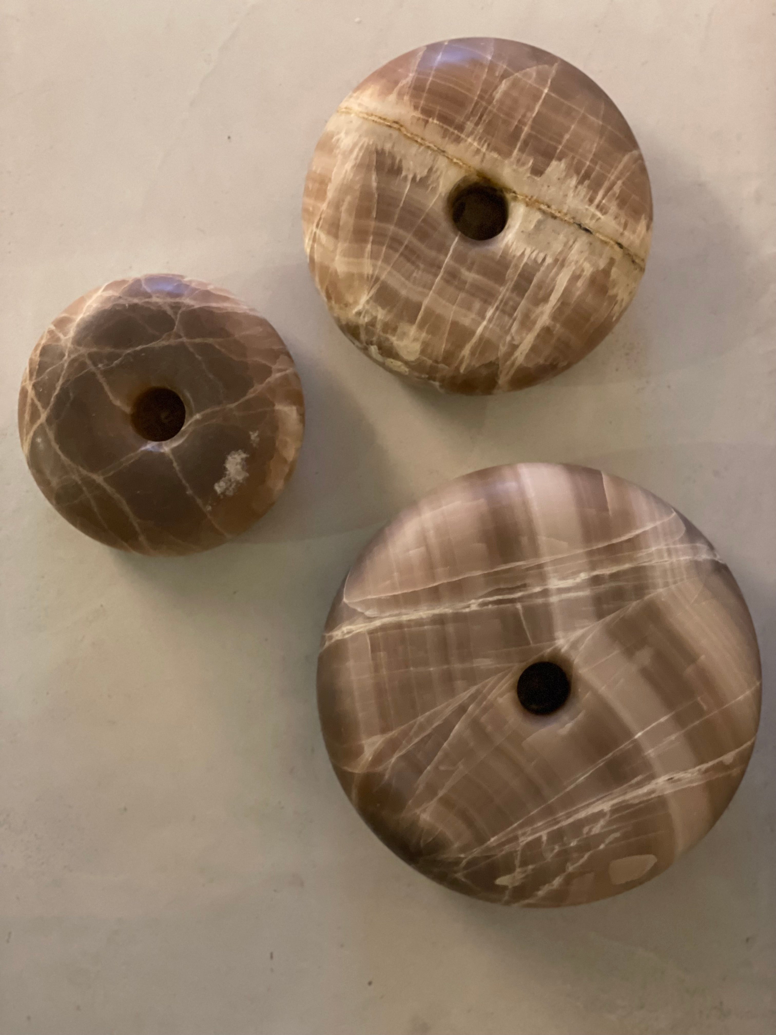
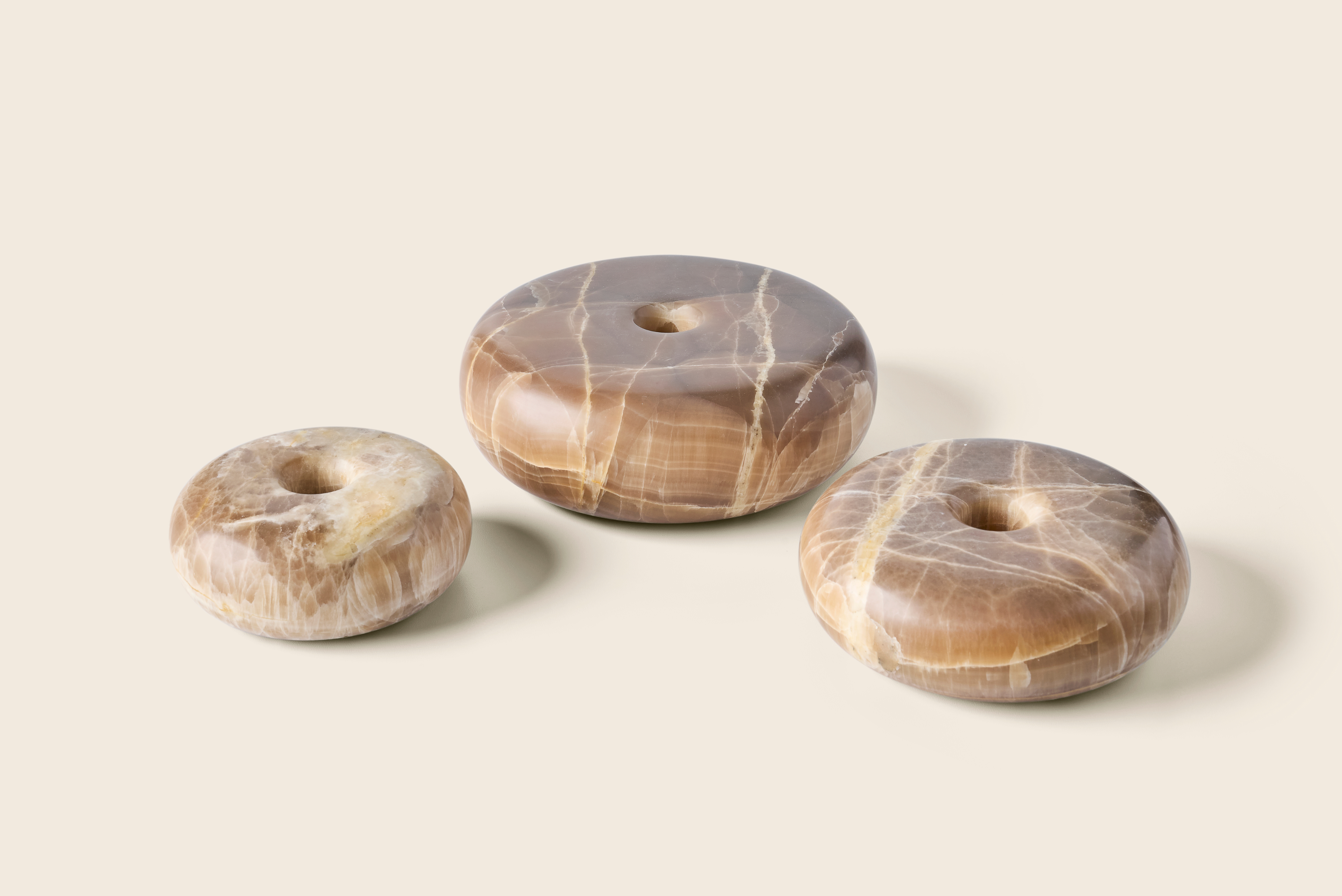
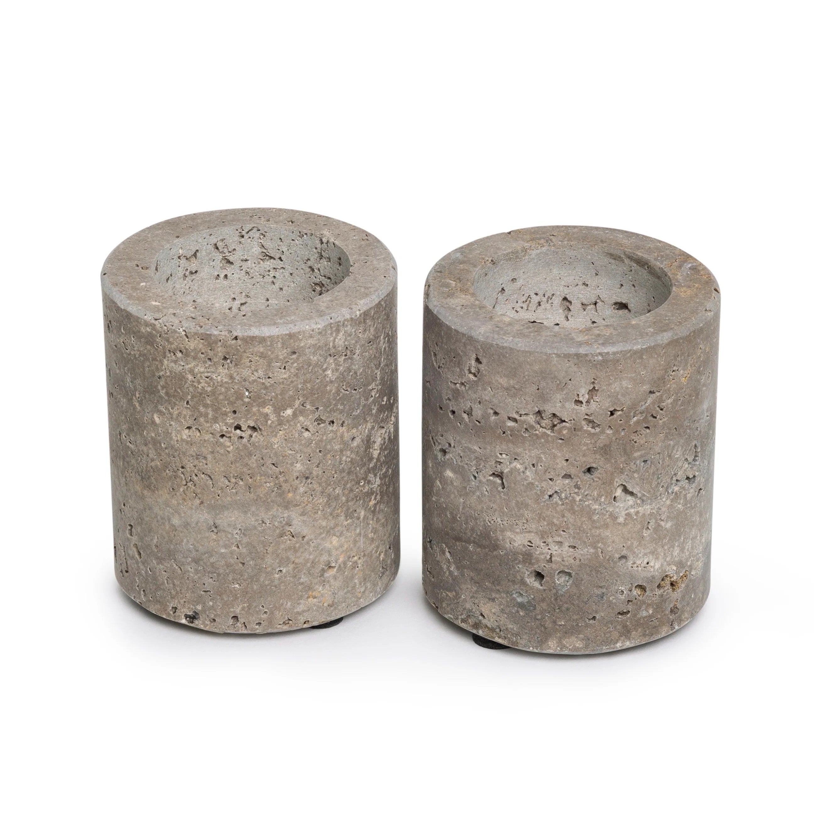
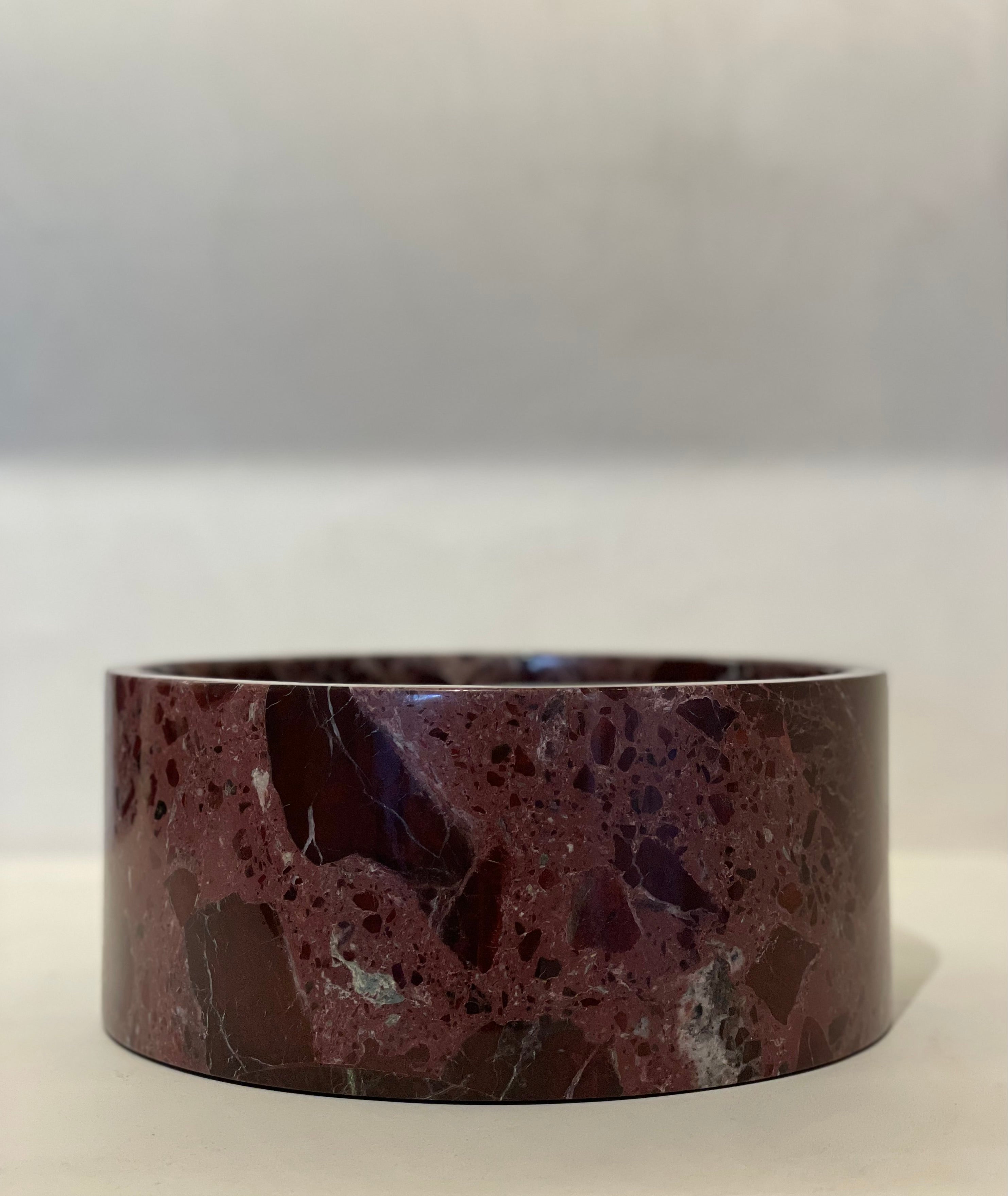
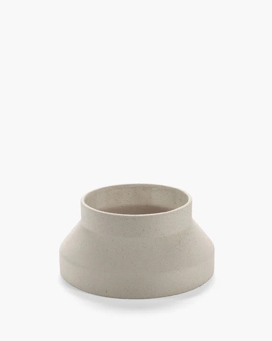
27 colors available
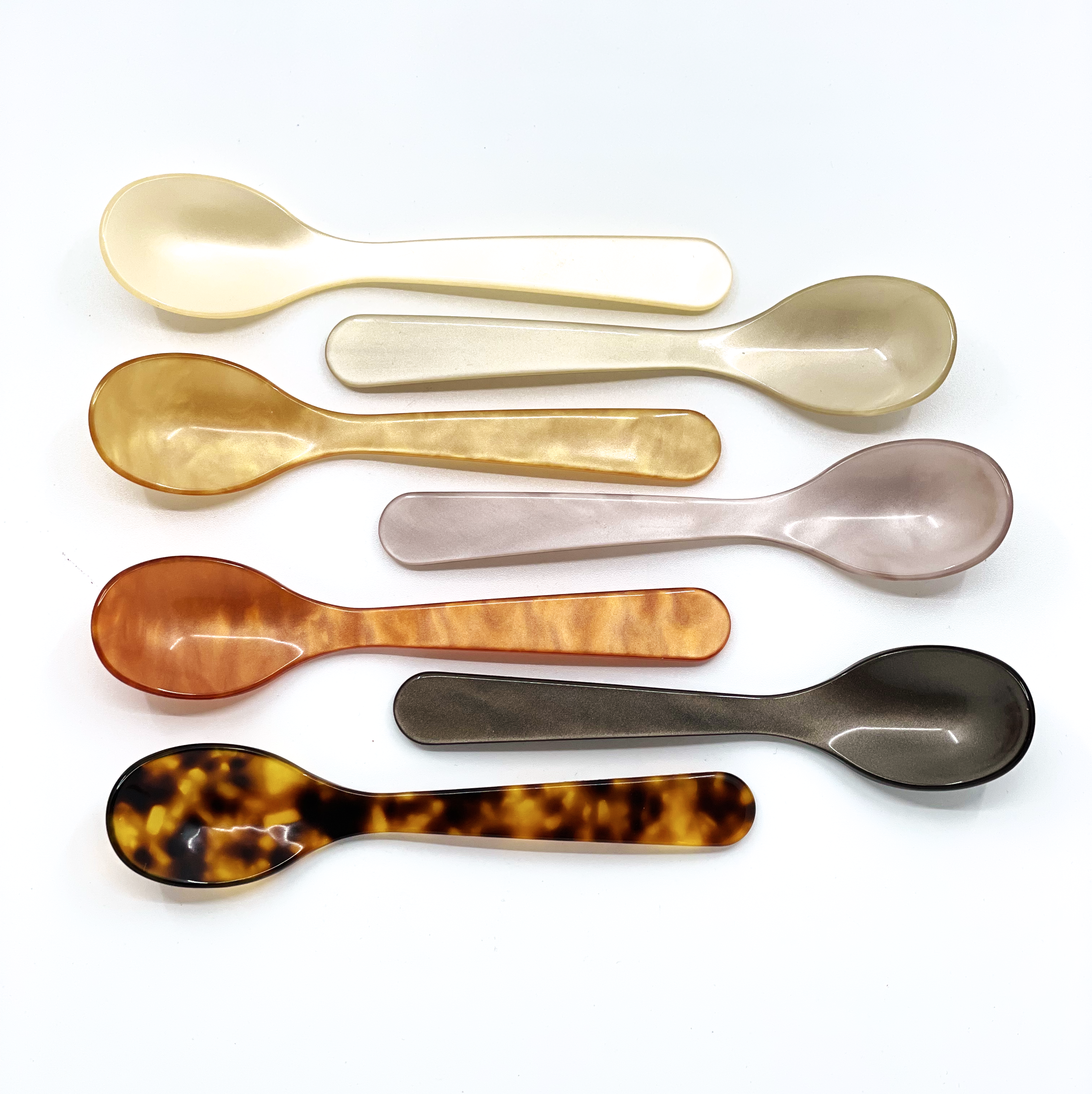
27 colors available
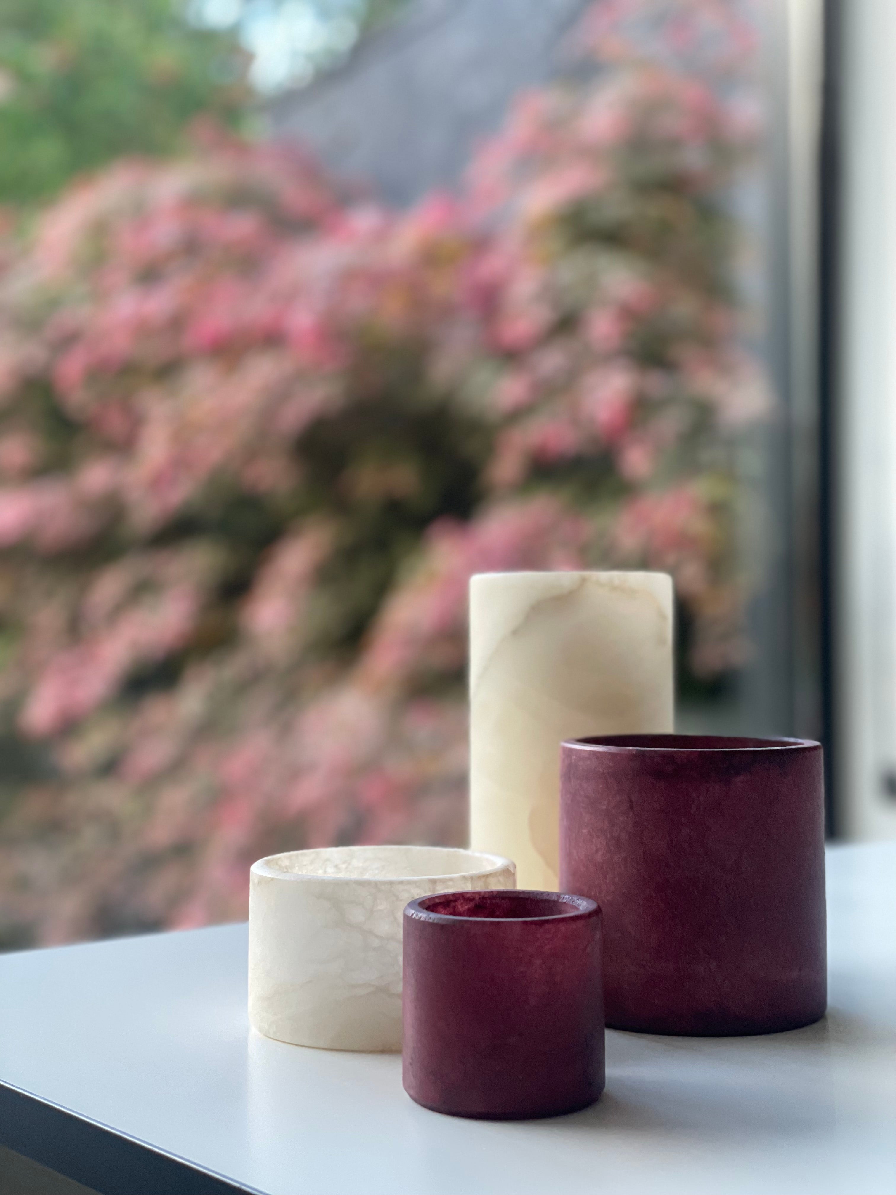
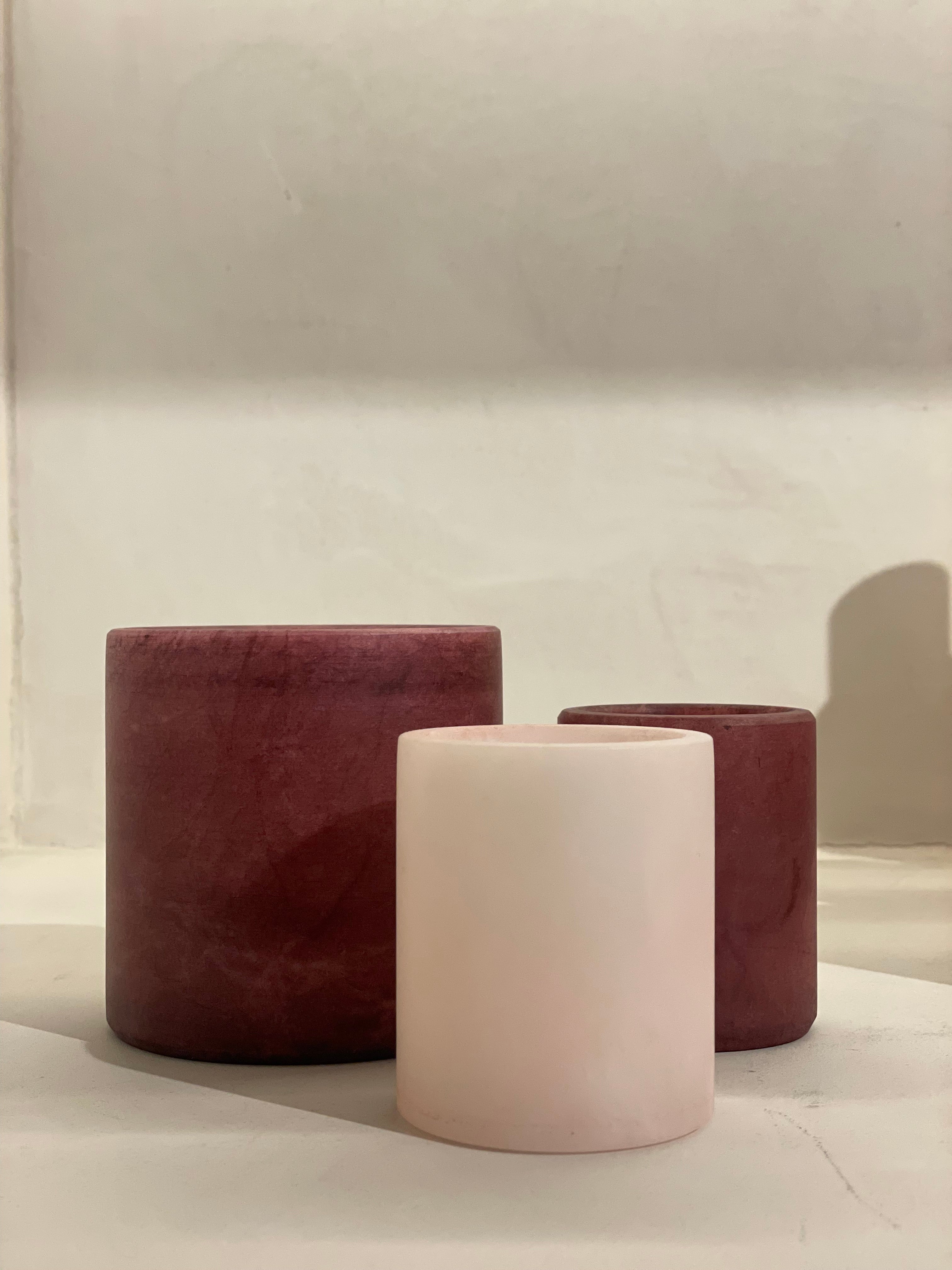
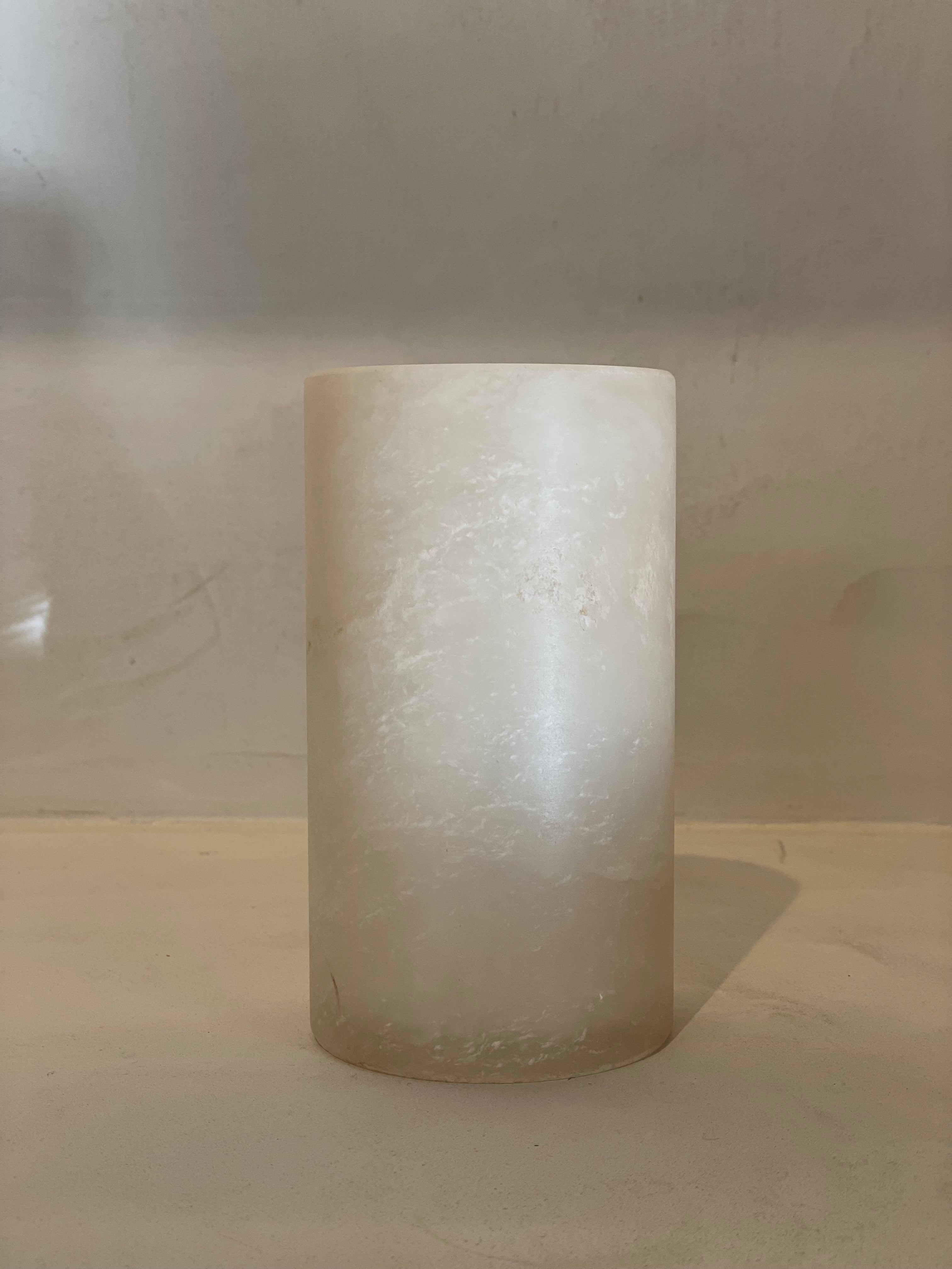
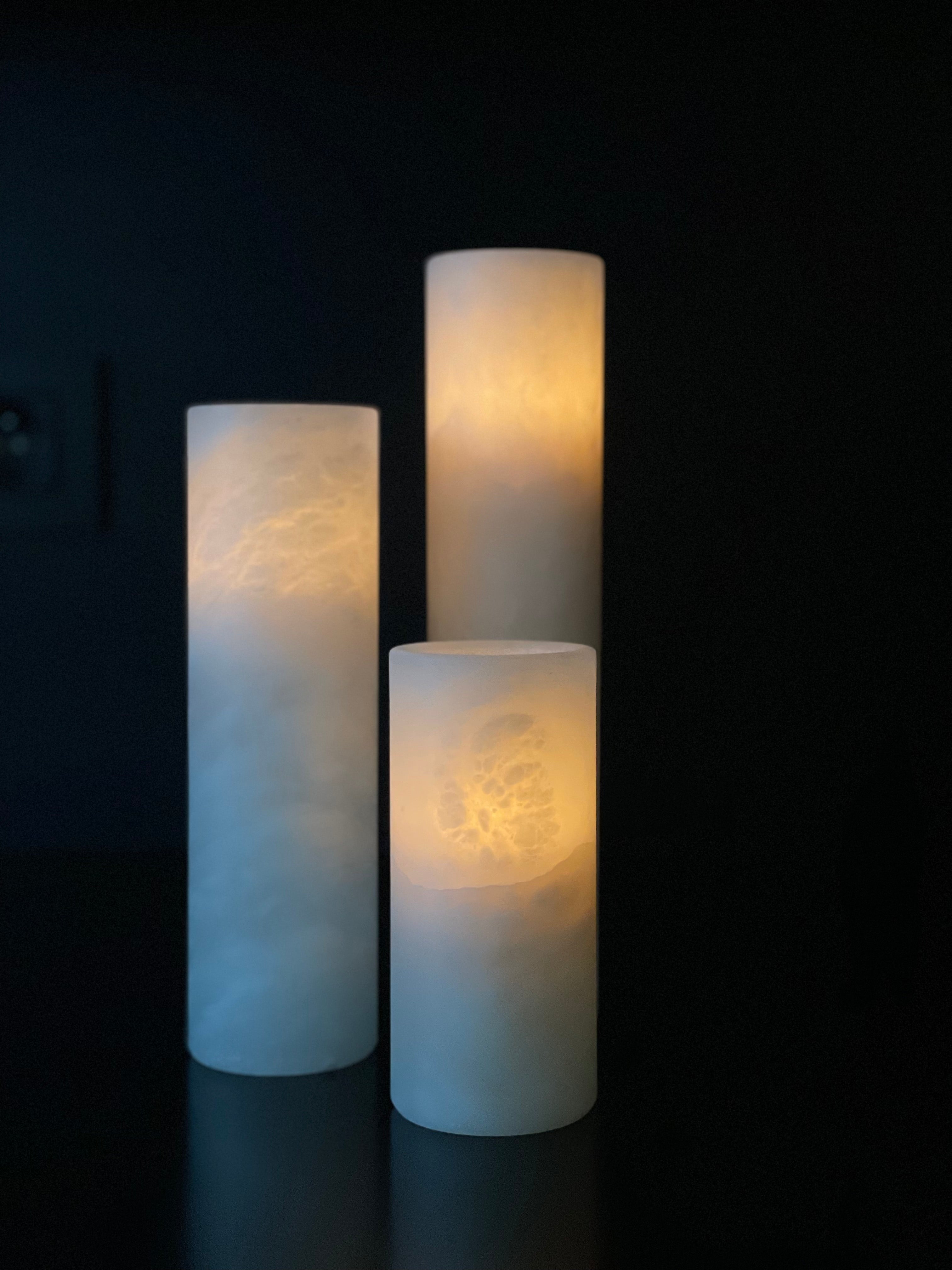
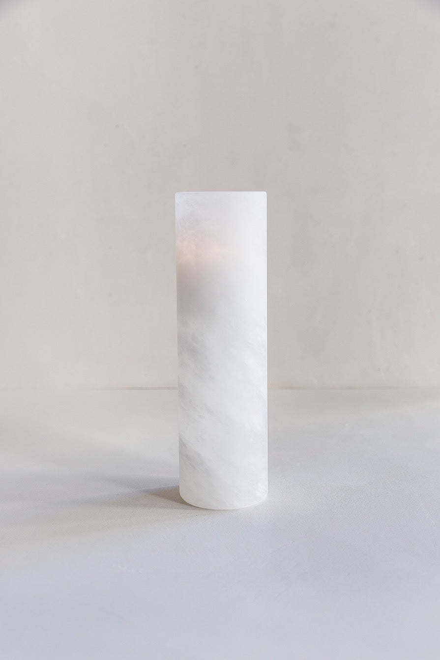
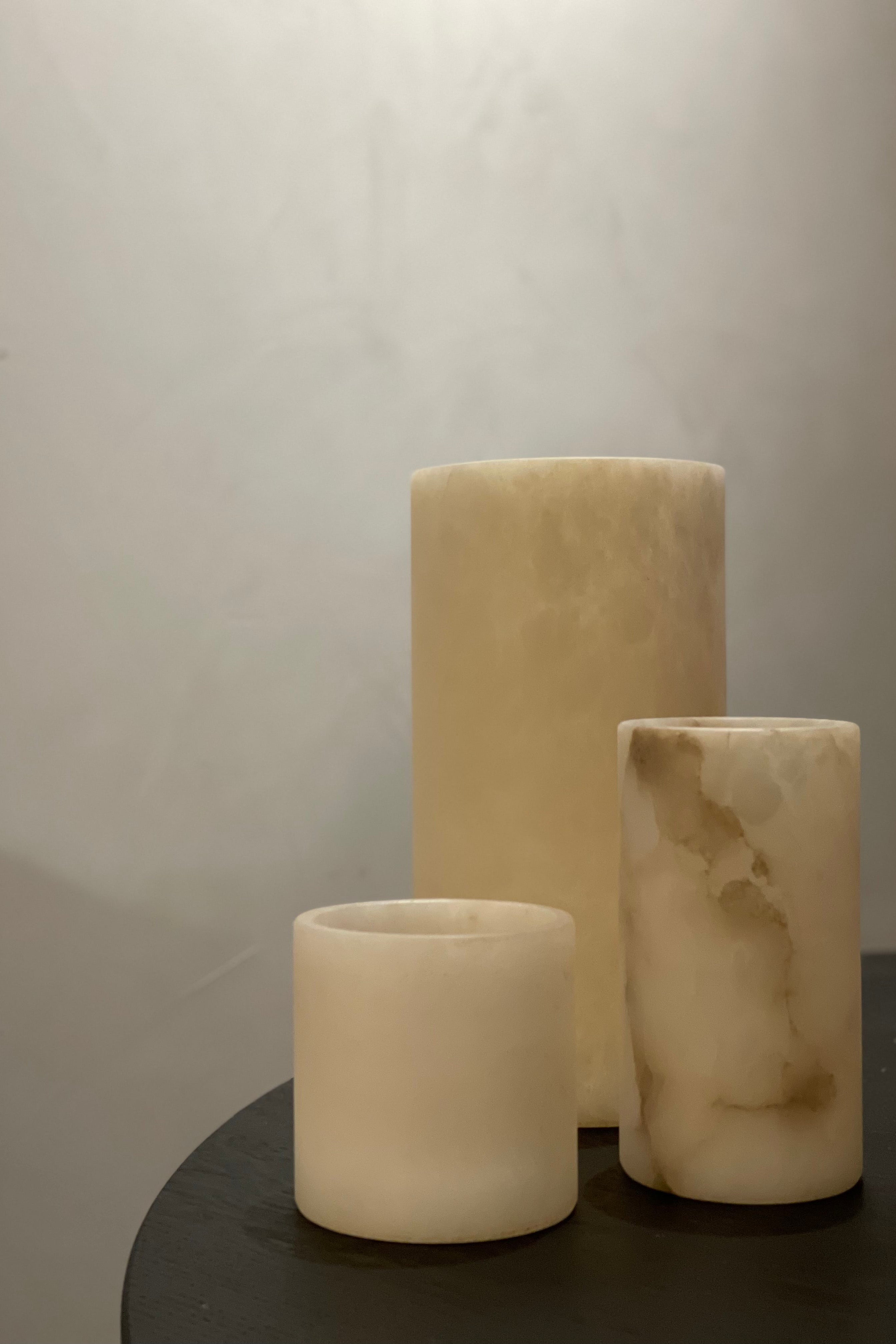
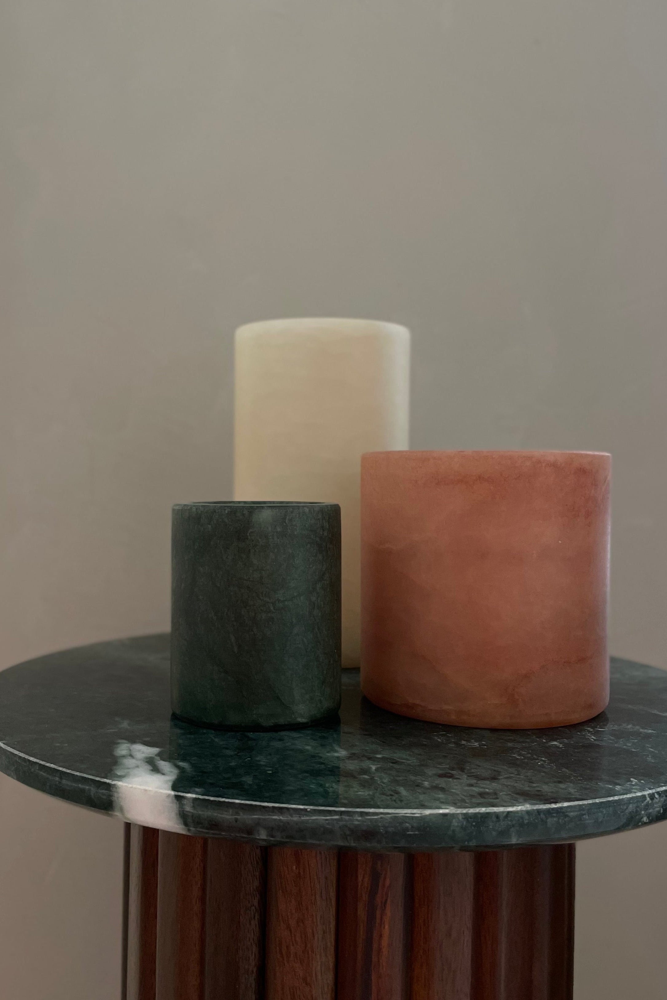
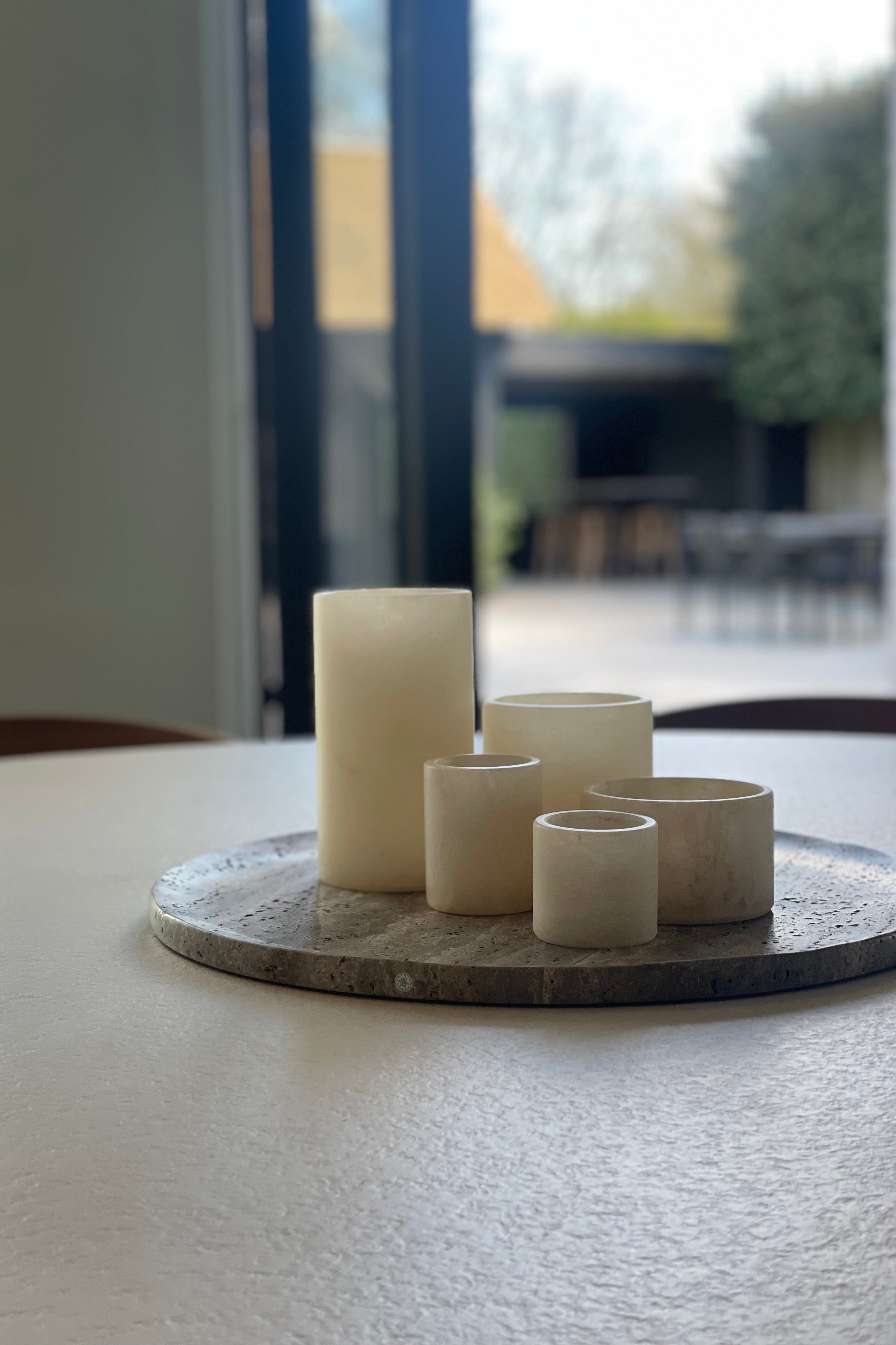
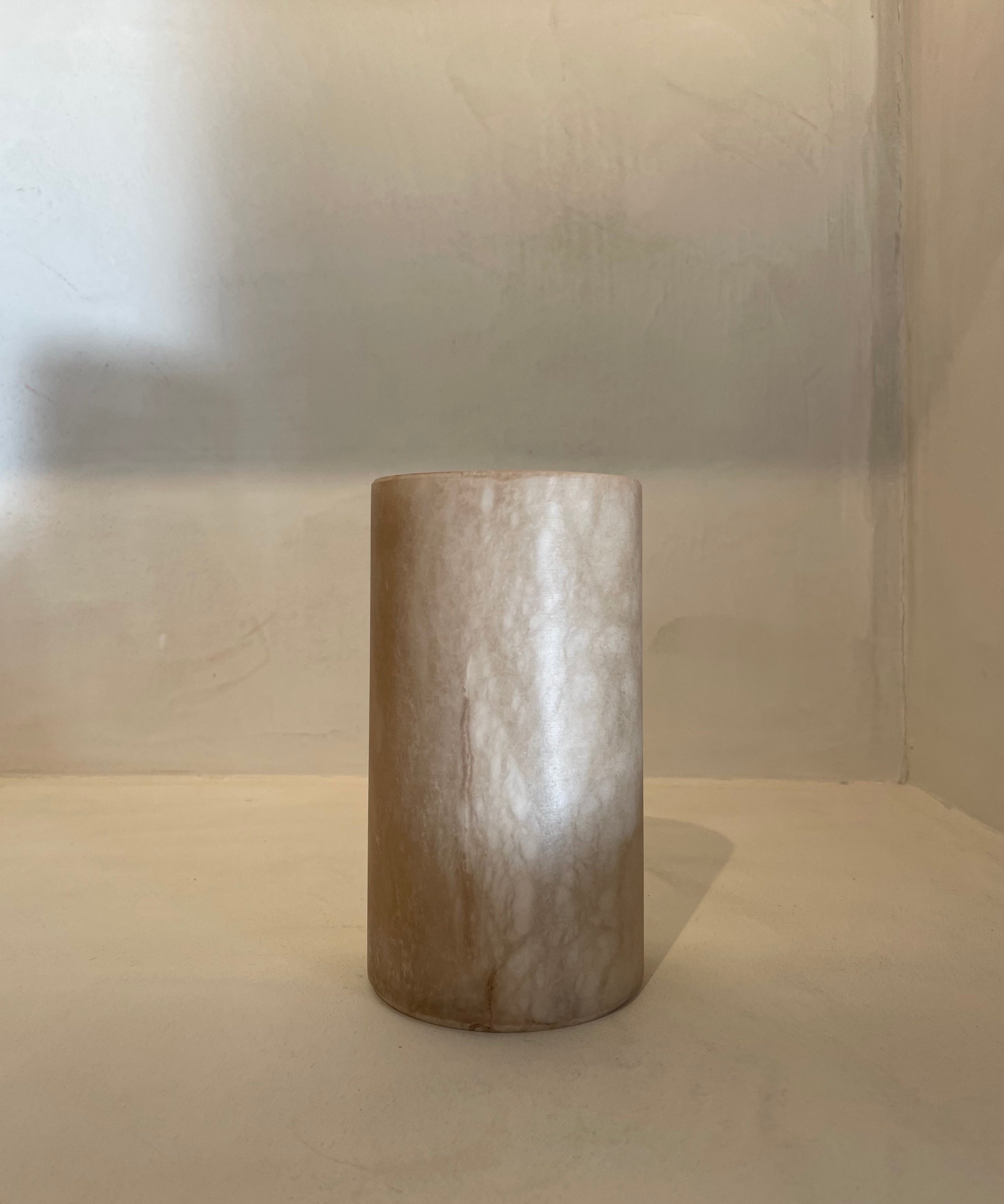
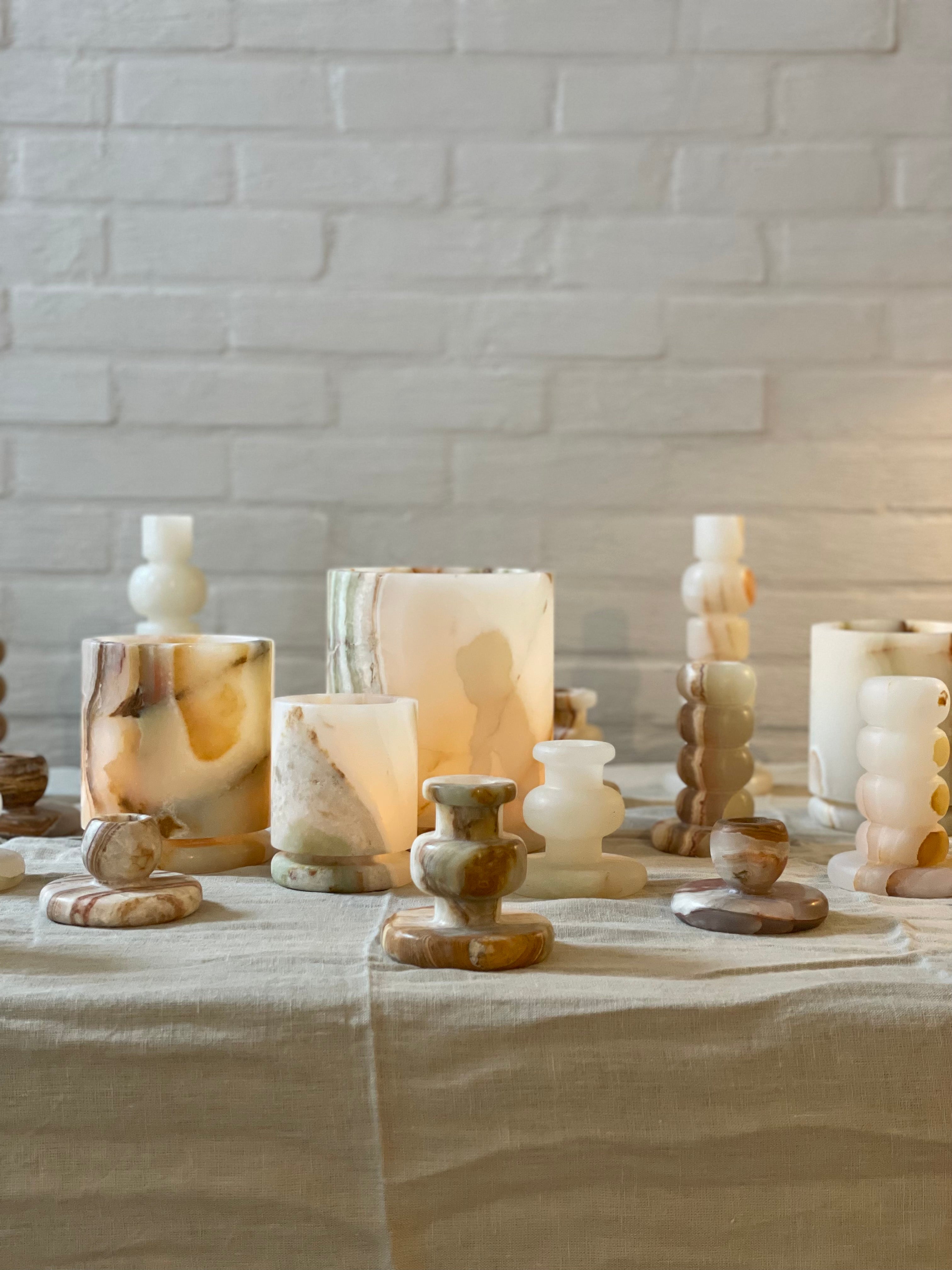
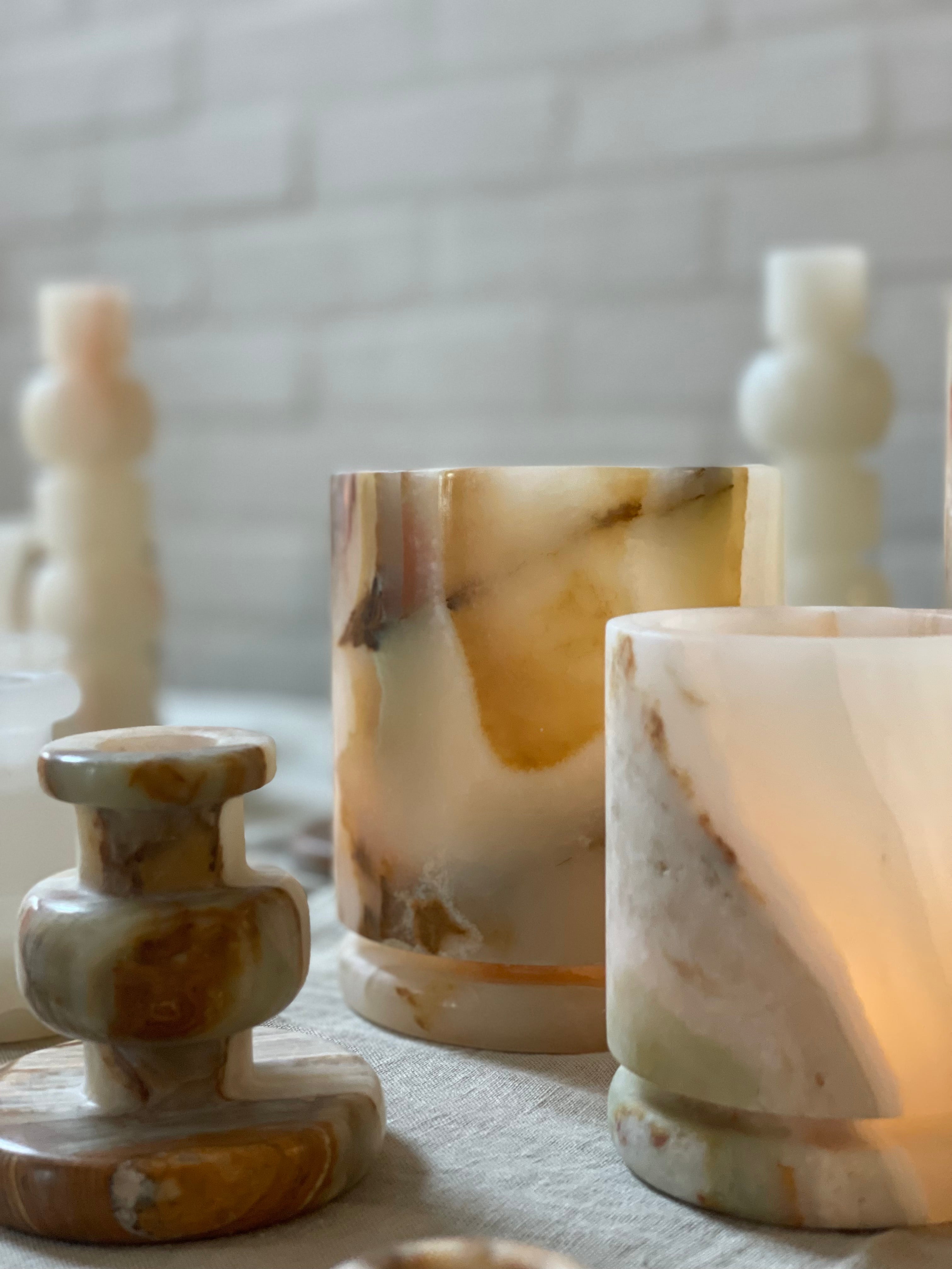
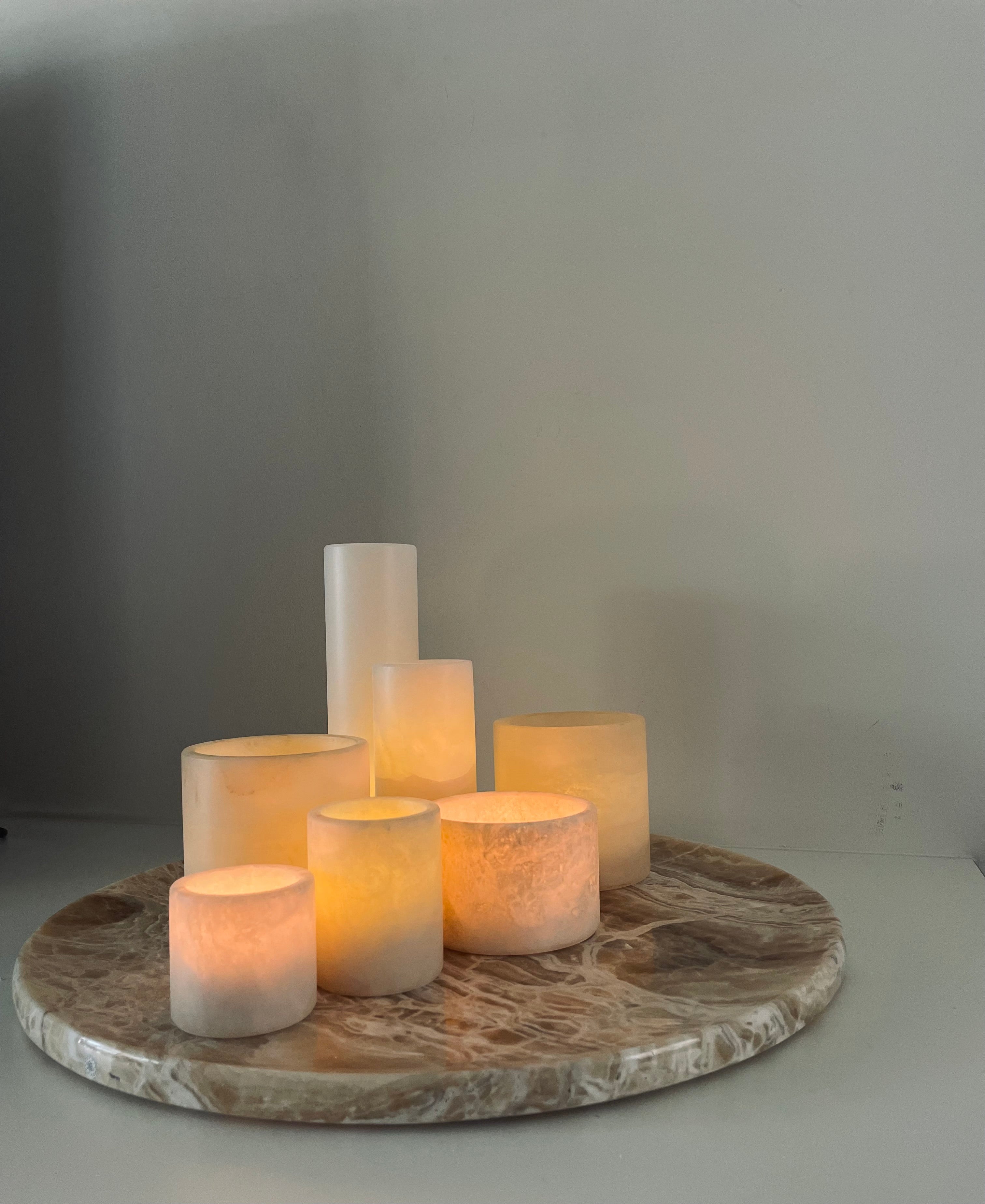
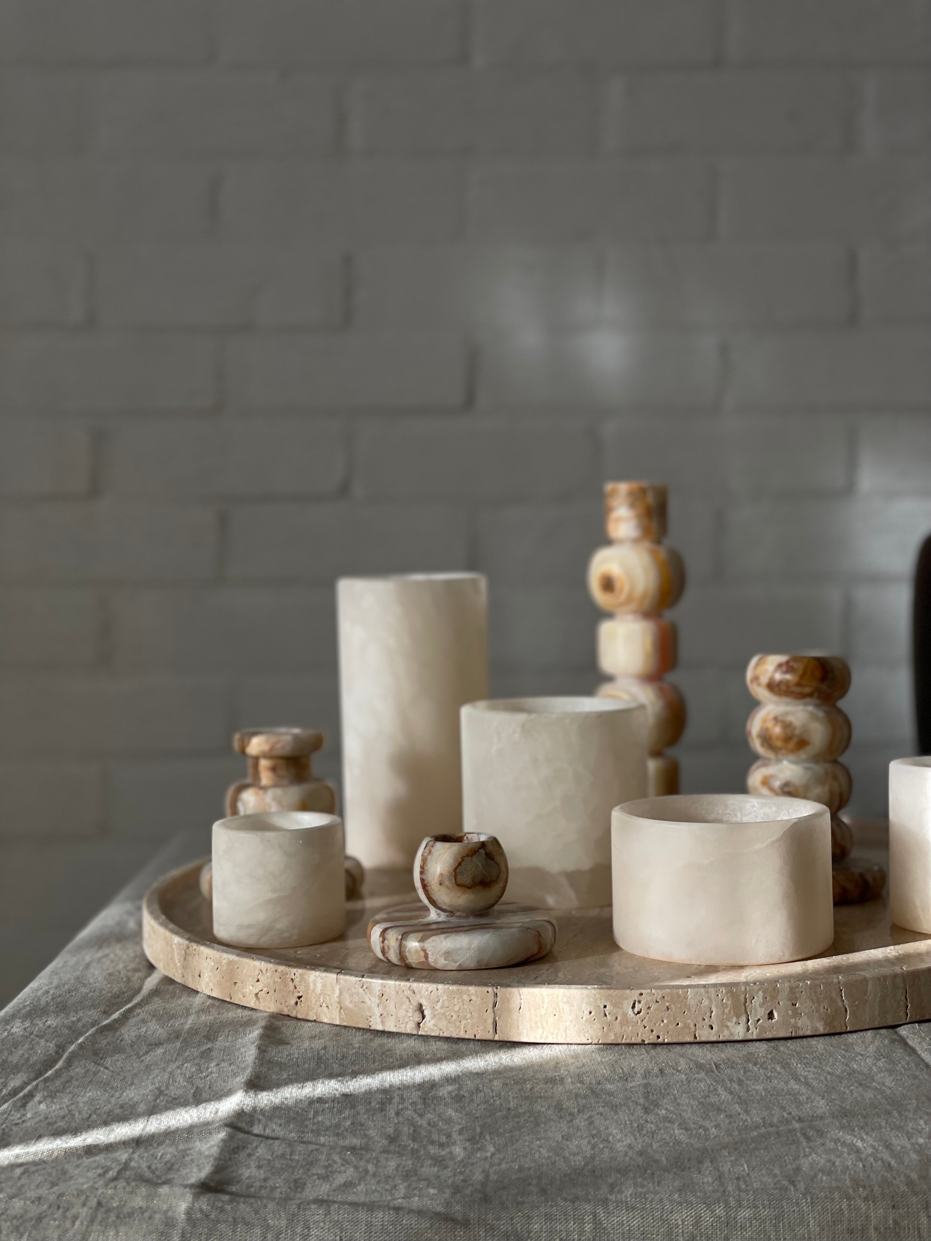
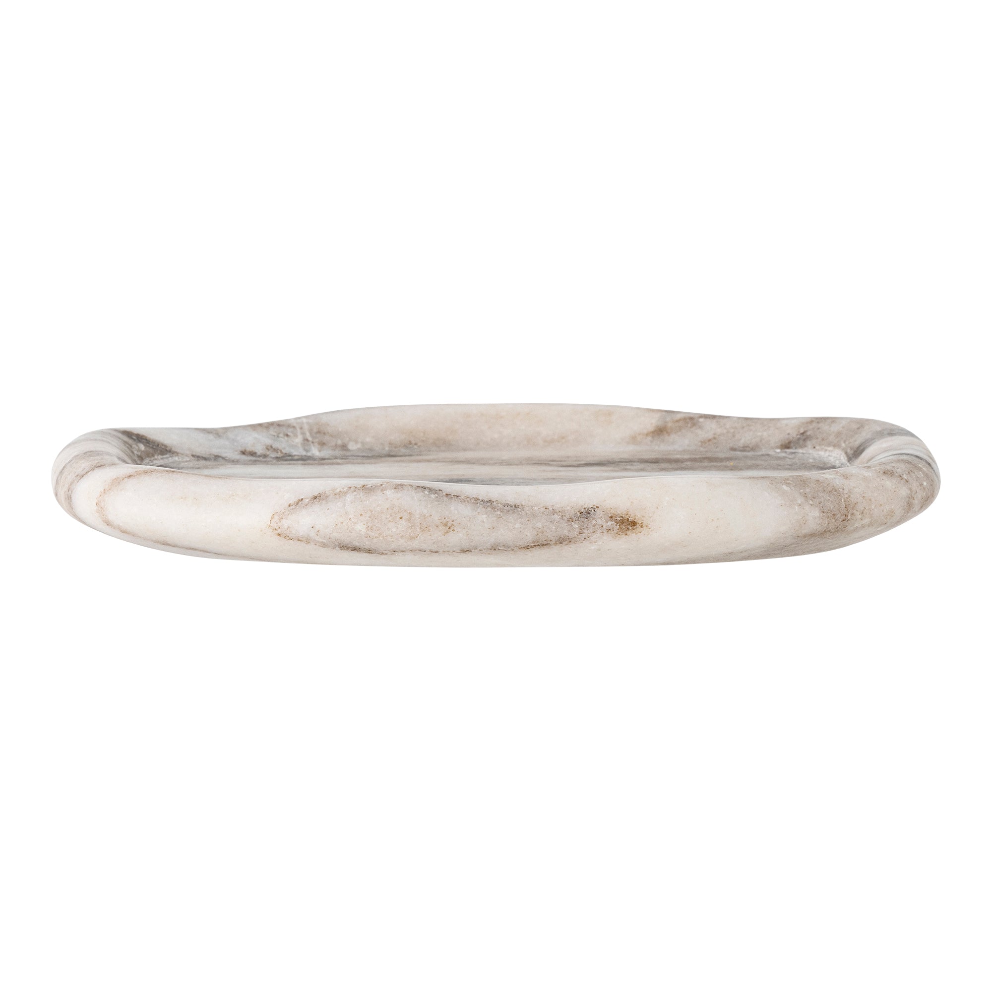
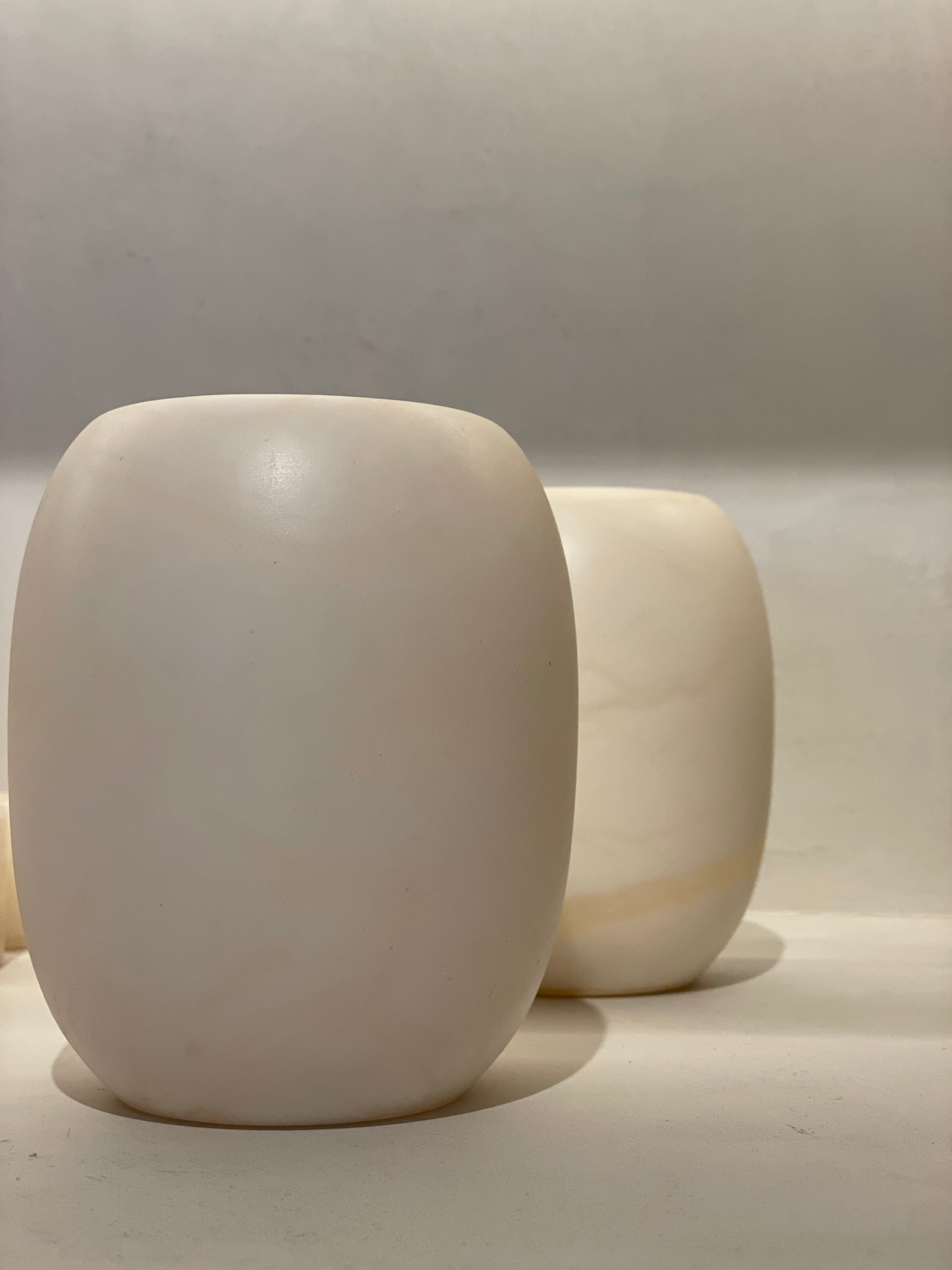
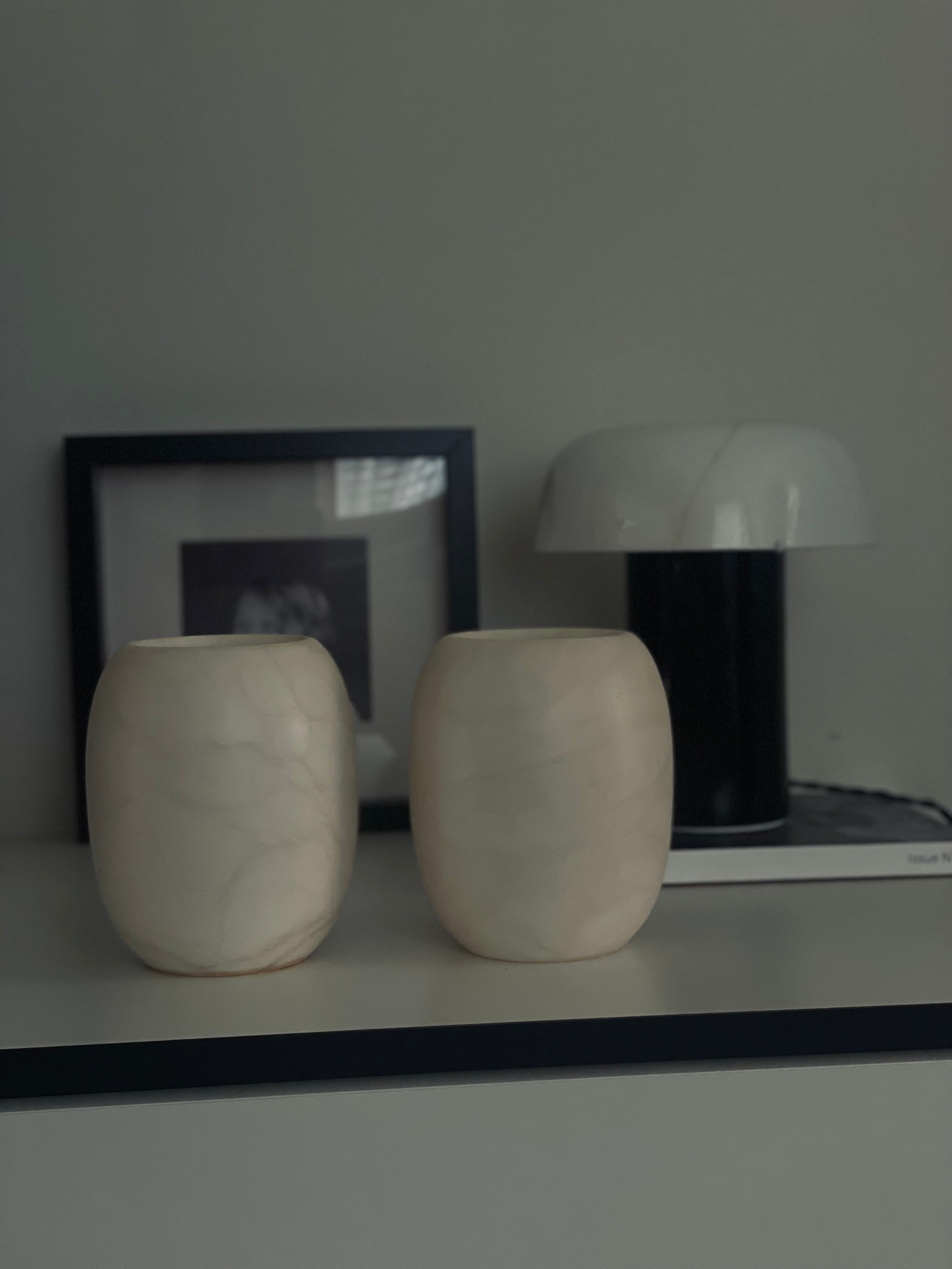
Alabaster has something magical about it. Its translucent nature captures light in a soft, almost dreamlike way, bringing warmth to any space. Because it is a natural stone, no two pieces are identical. Each vase or sculpture has its own veining, color nuances, and pattern. This makes alabaster not only a decorative object, but also an investment for your interior that you can cherish and expand for years to come. Still, choosing is not always easy. Which set really suits your home? These three questions will help you a long way.
How do you pick the right alabaster?
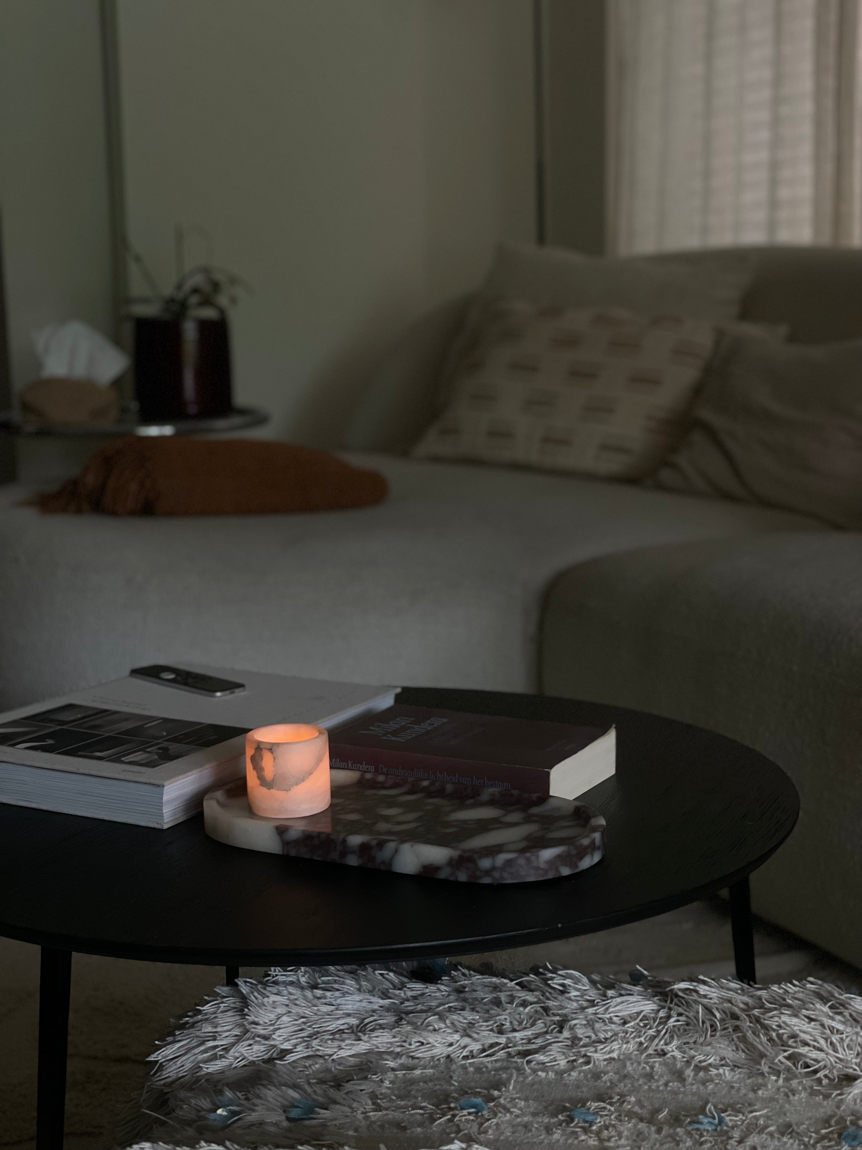
Where will your alabaster be placed?
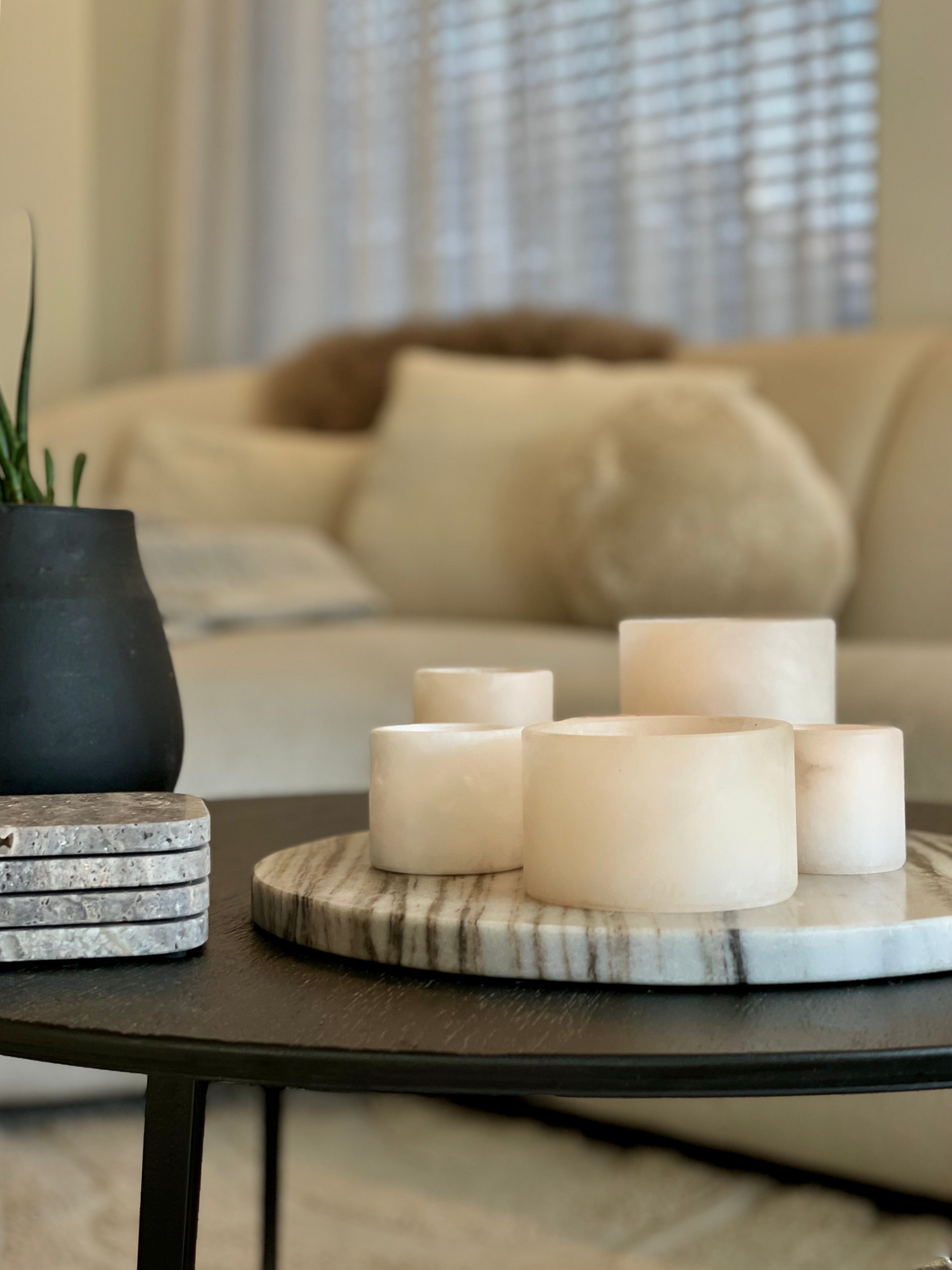
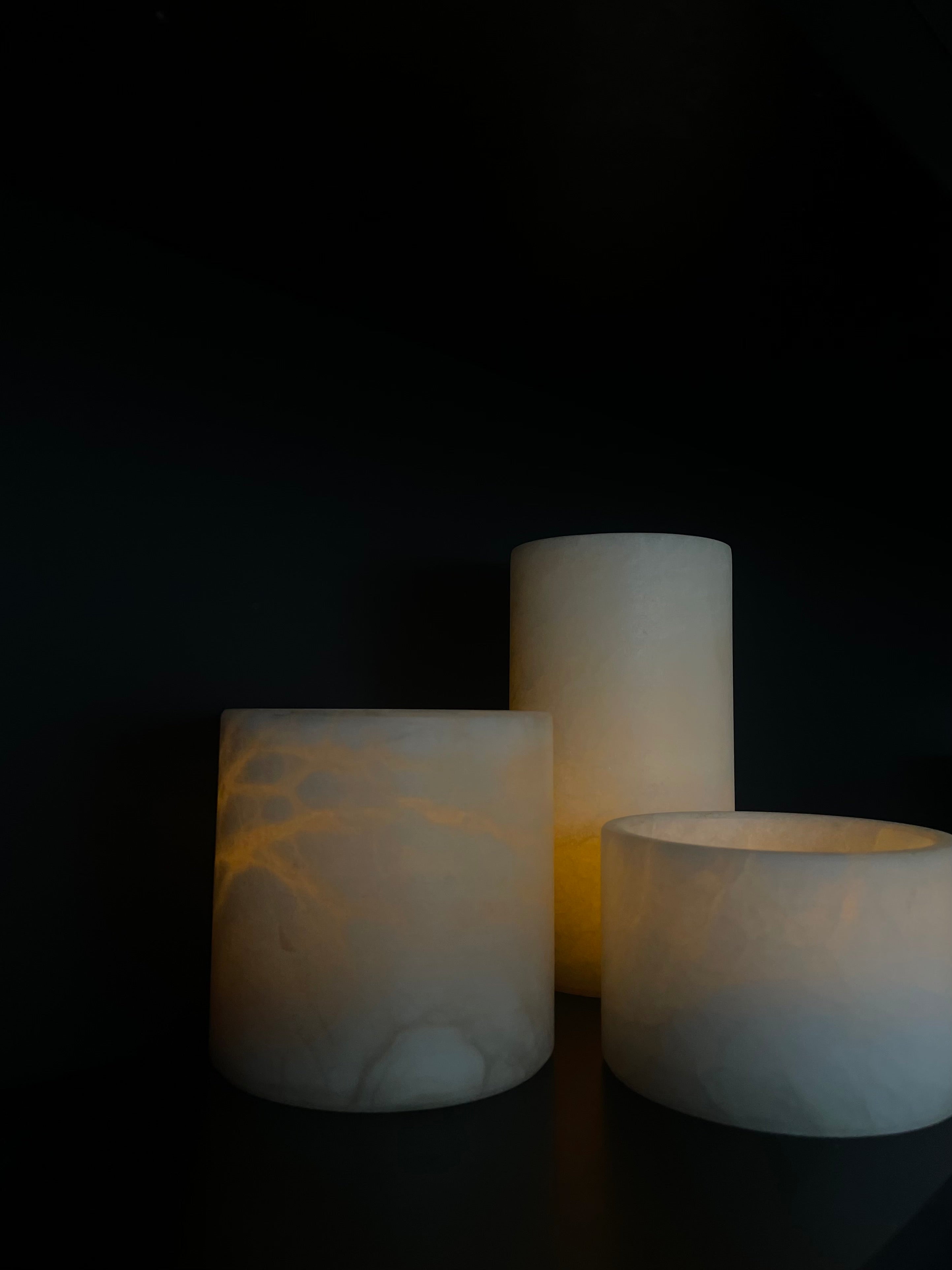
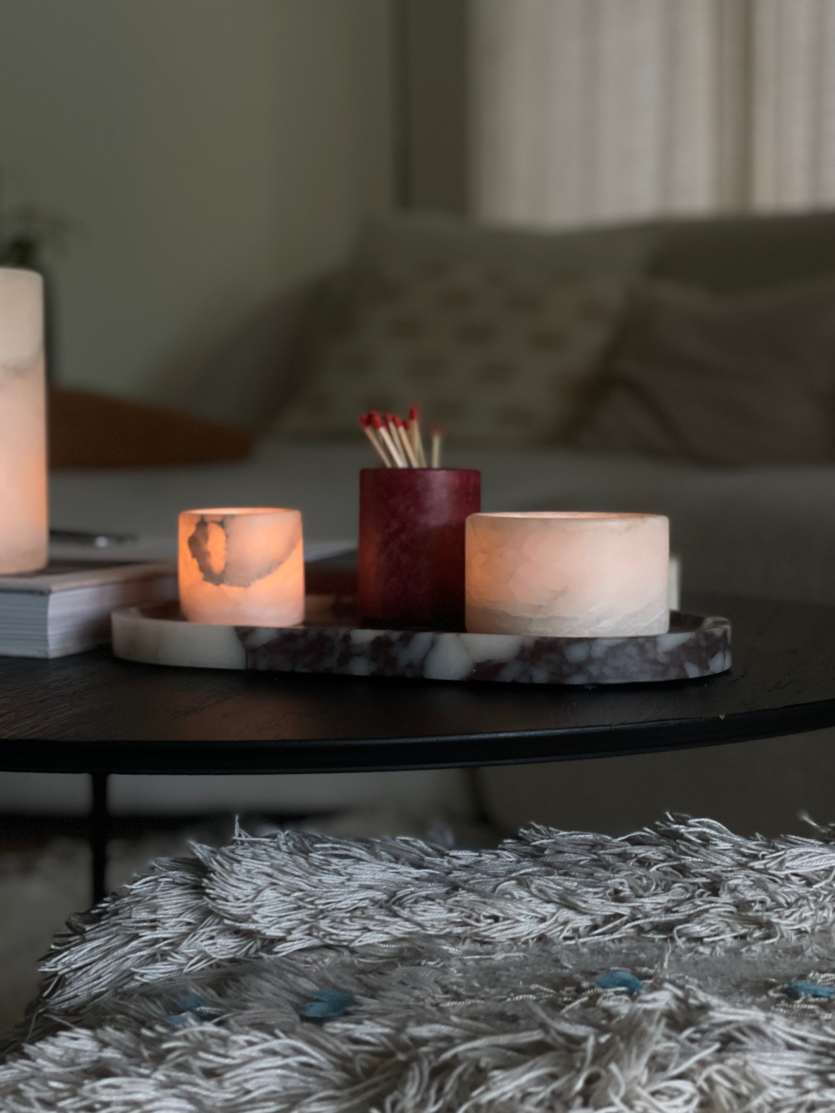
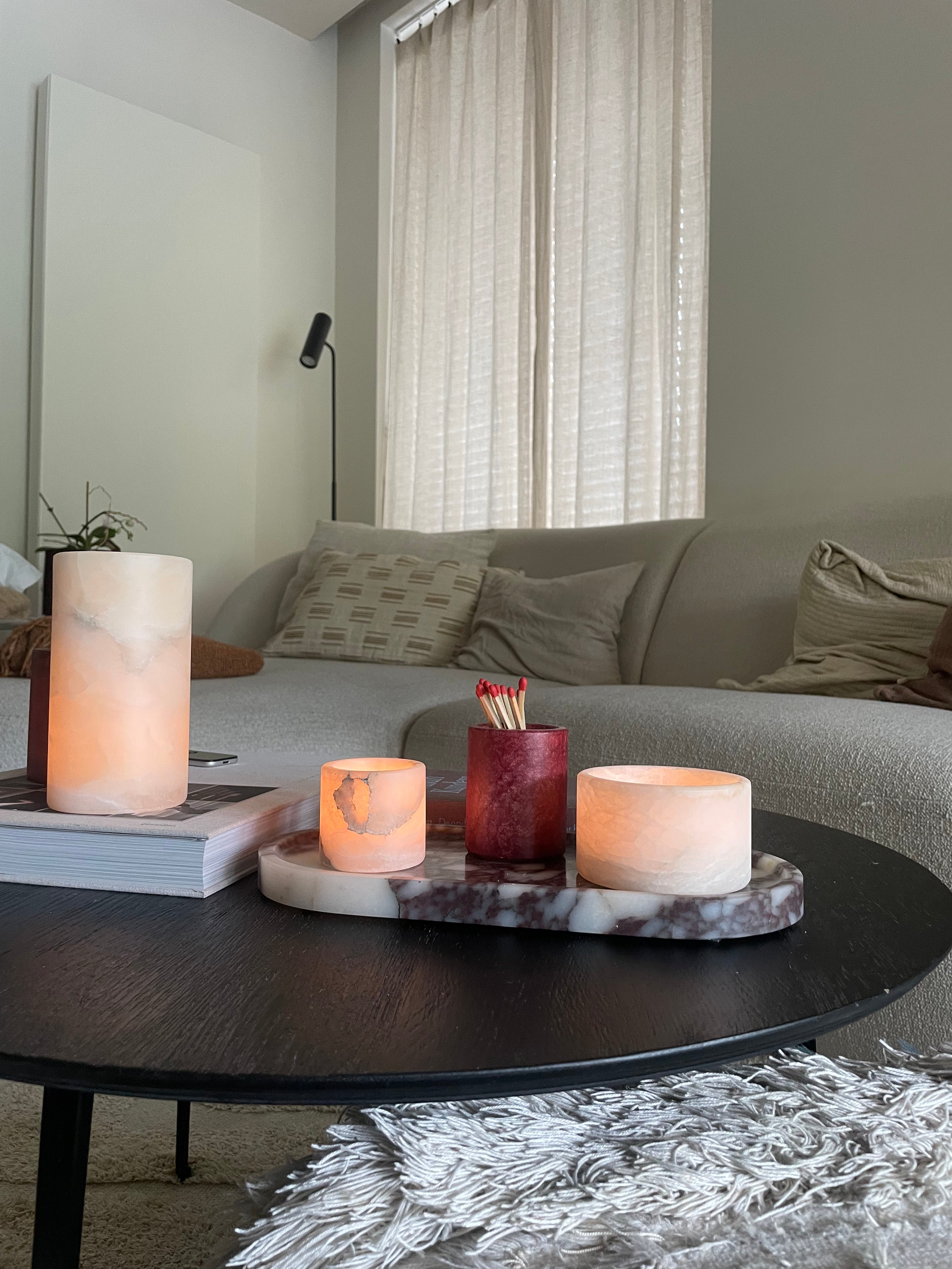
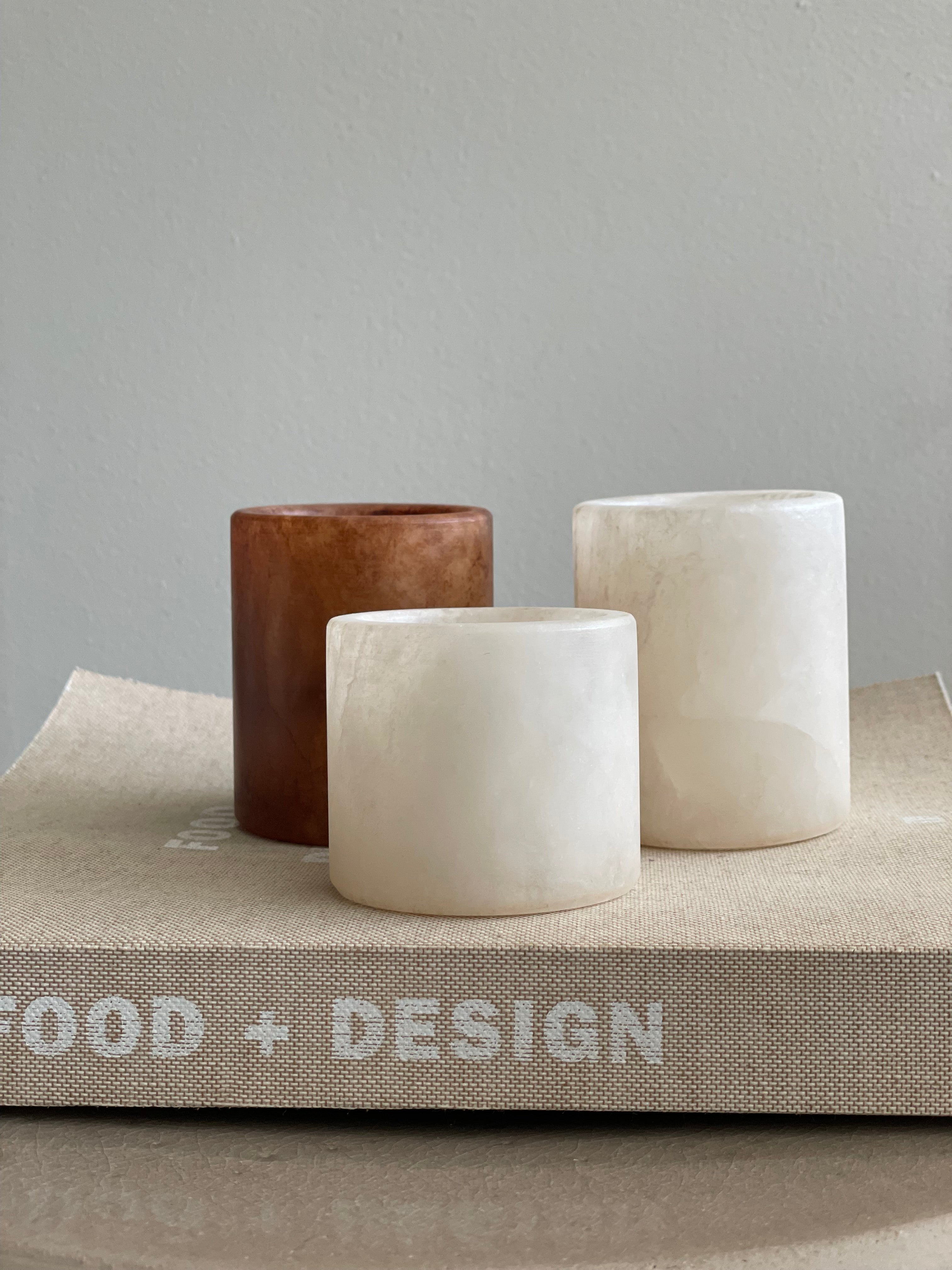
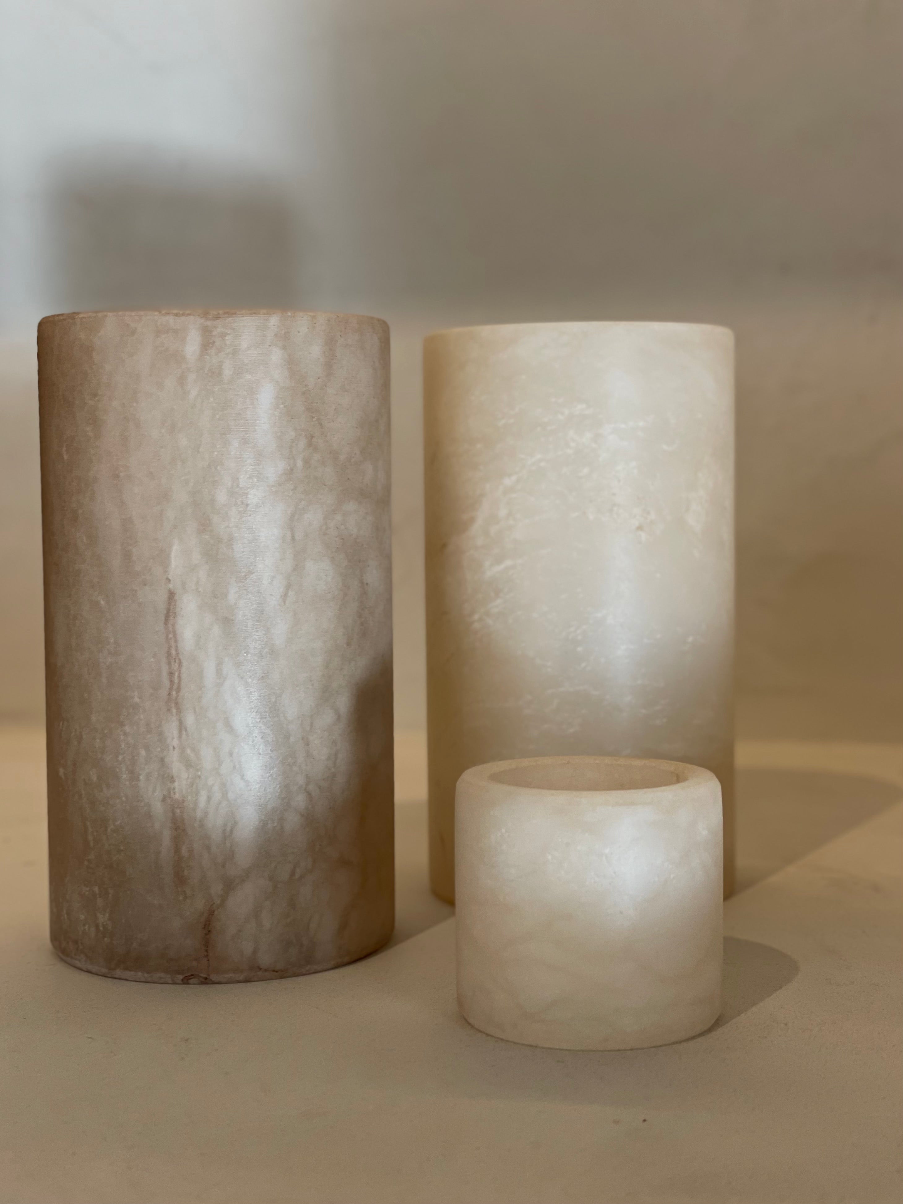
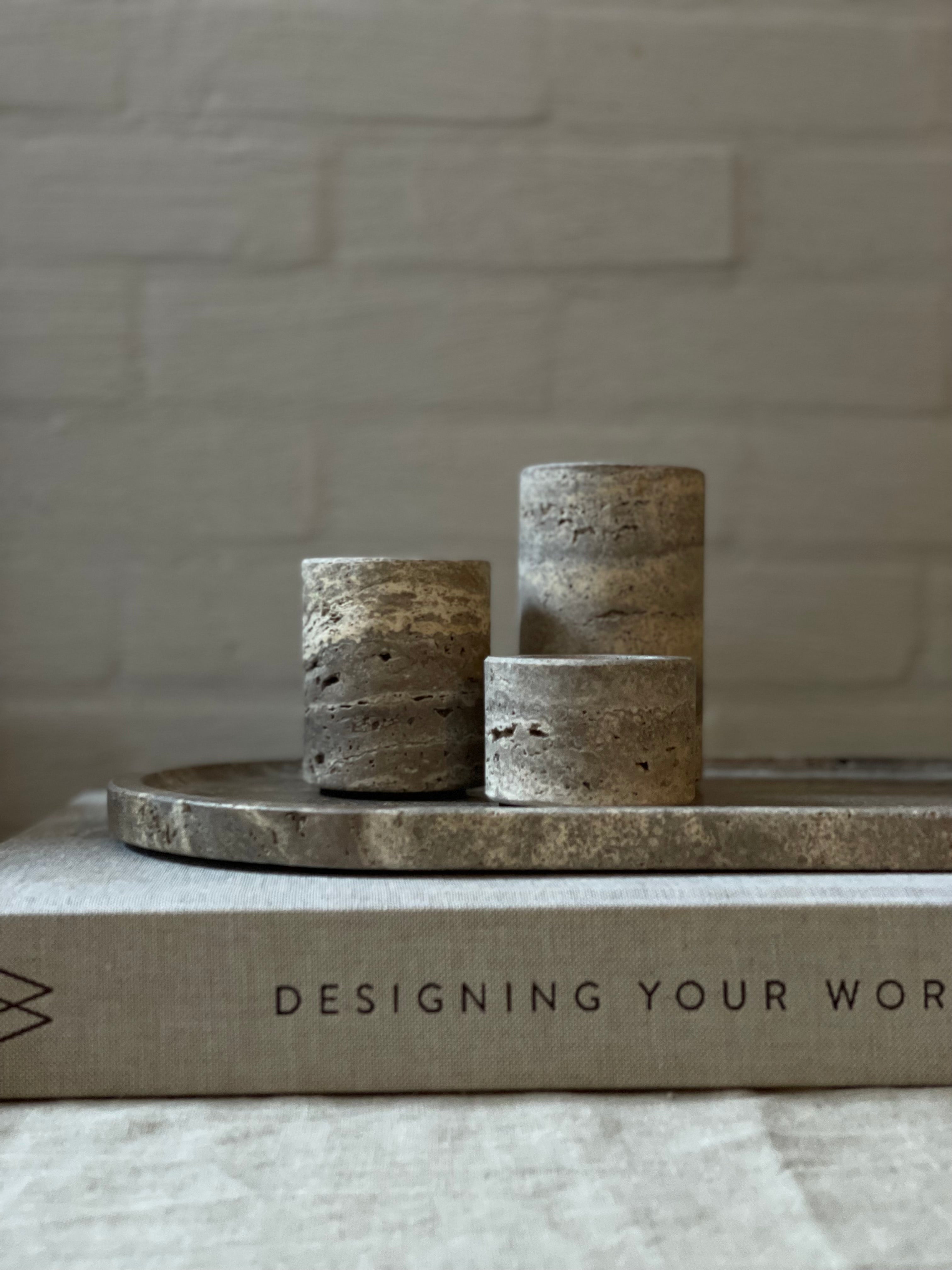
The location often determines the right proportions. A dining table can be a little higher and more sculptural, while a coffee table usually works better with lower shapes. Albaster rarely comes into its own as a solo piece. Groups almost always work better than a single object, especially when you play with different heights and volumes.
Placing pieces in a staggered arrangement creates a subtle waterfall effect: more depth, layering, and tranquility in the whole. A set of three is often chosen, but it is certainly not a must. Two or four can work just as well, as long as there is variation and balance.
Which color suits your interior?
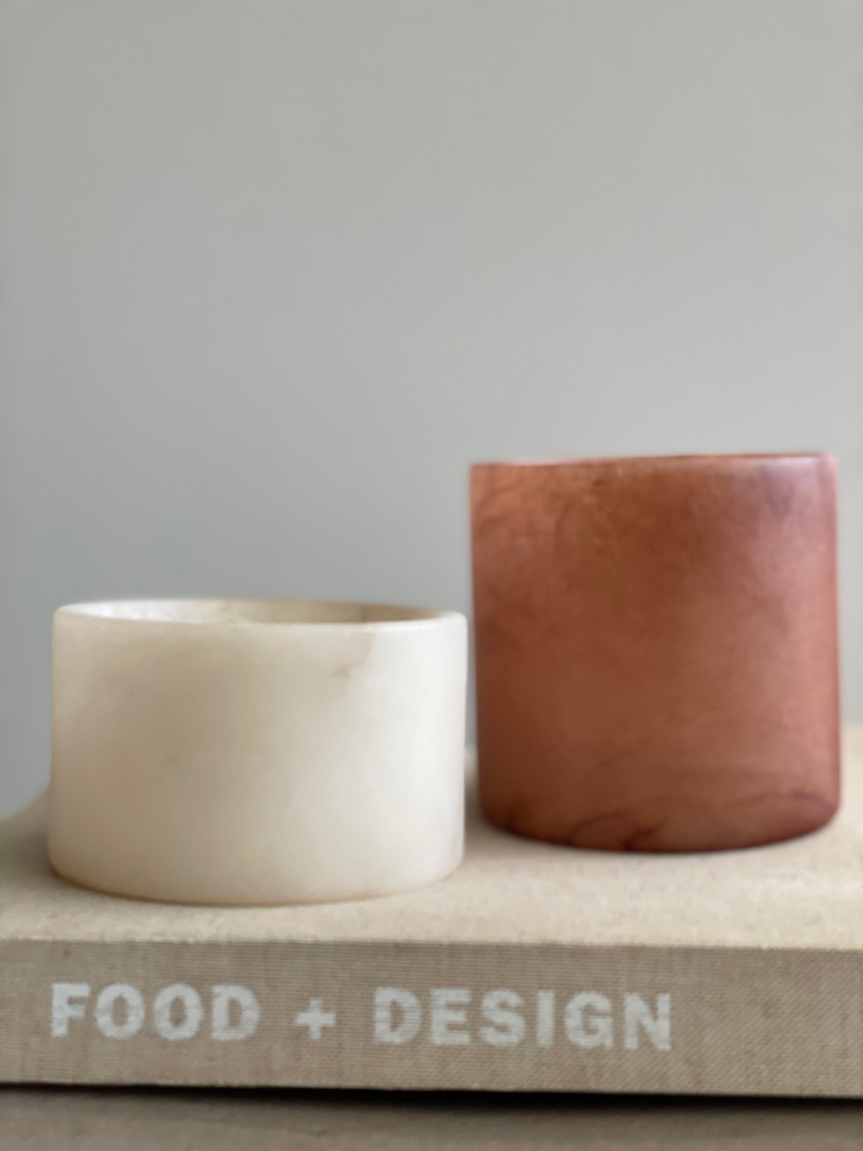
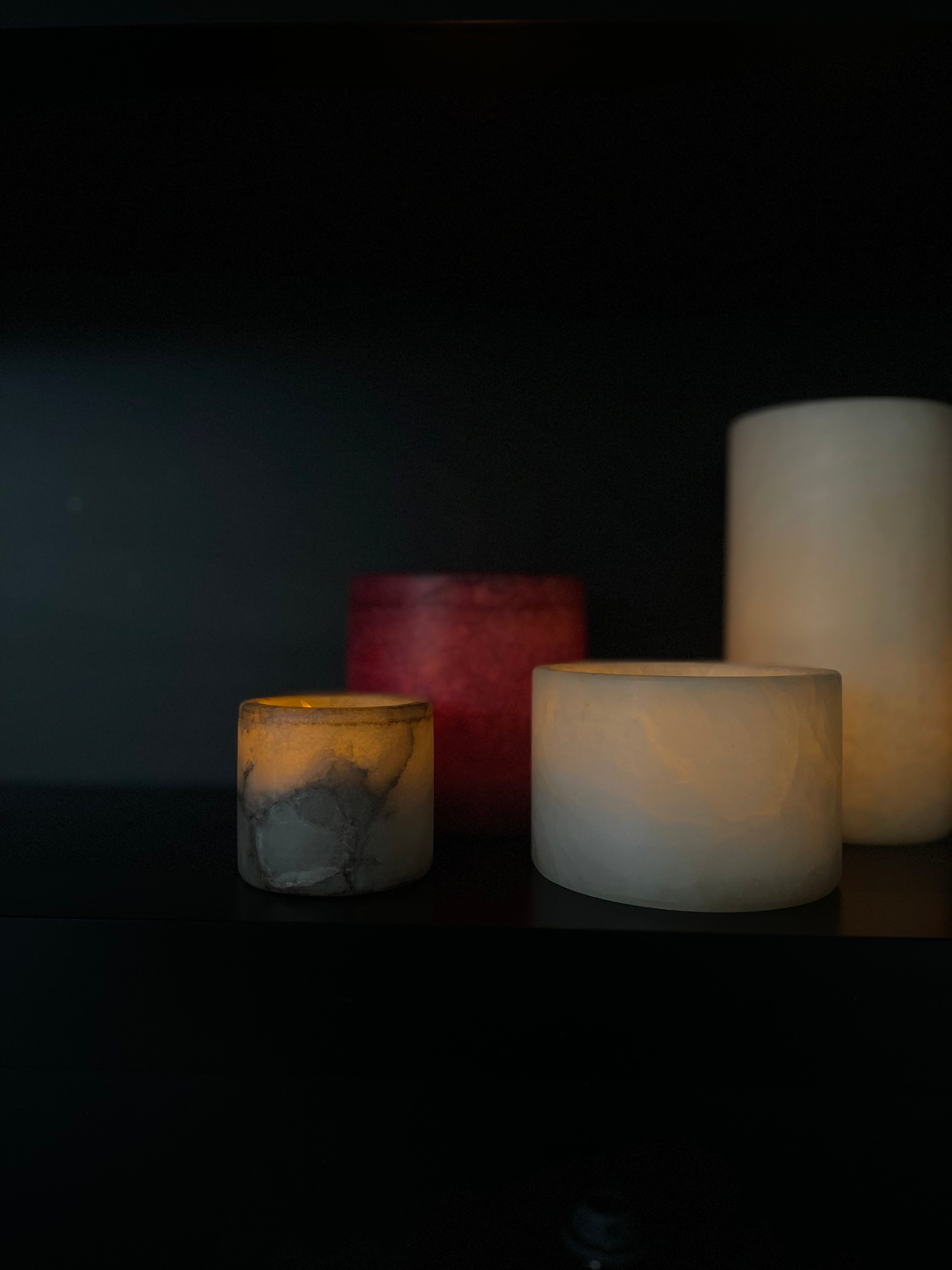
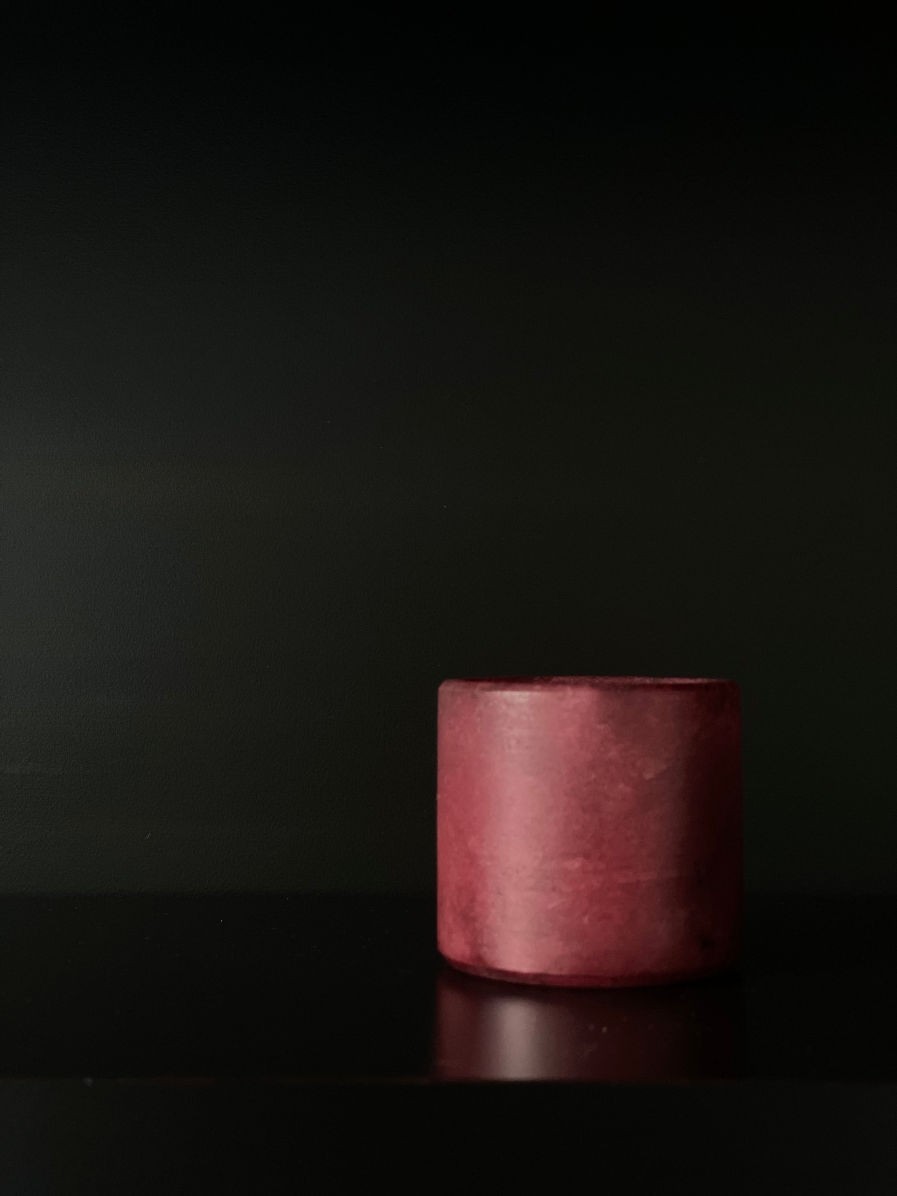
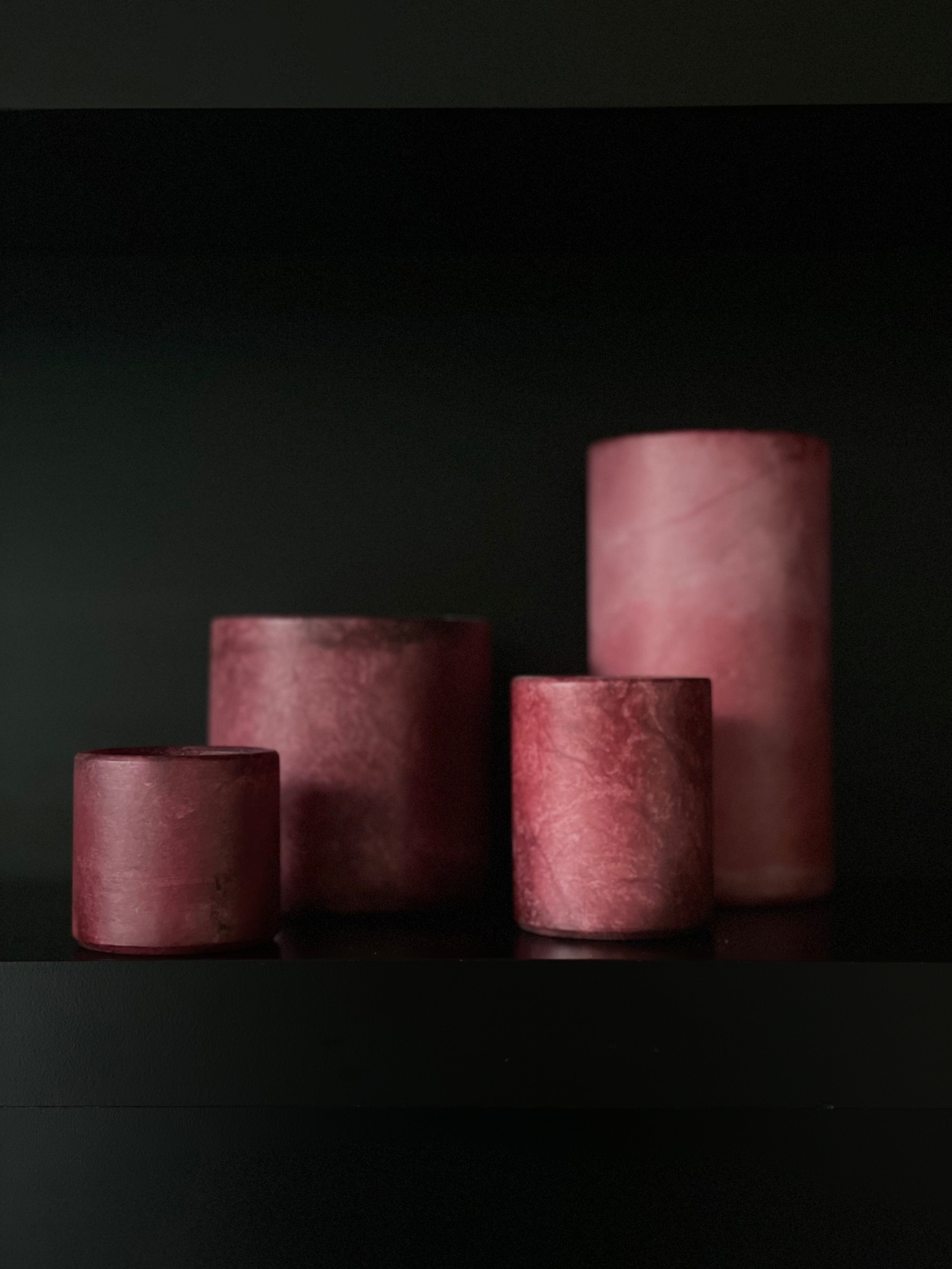
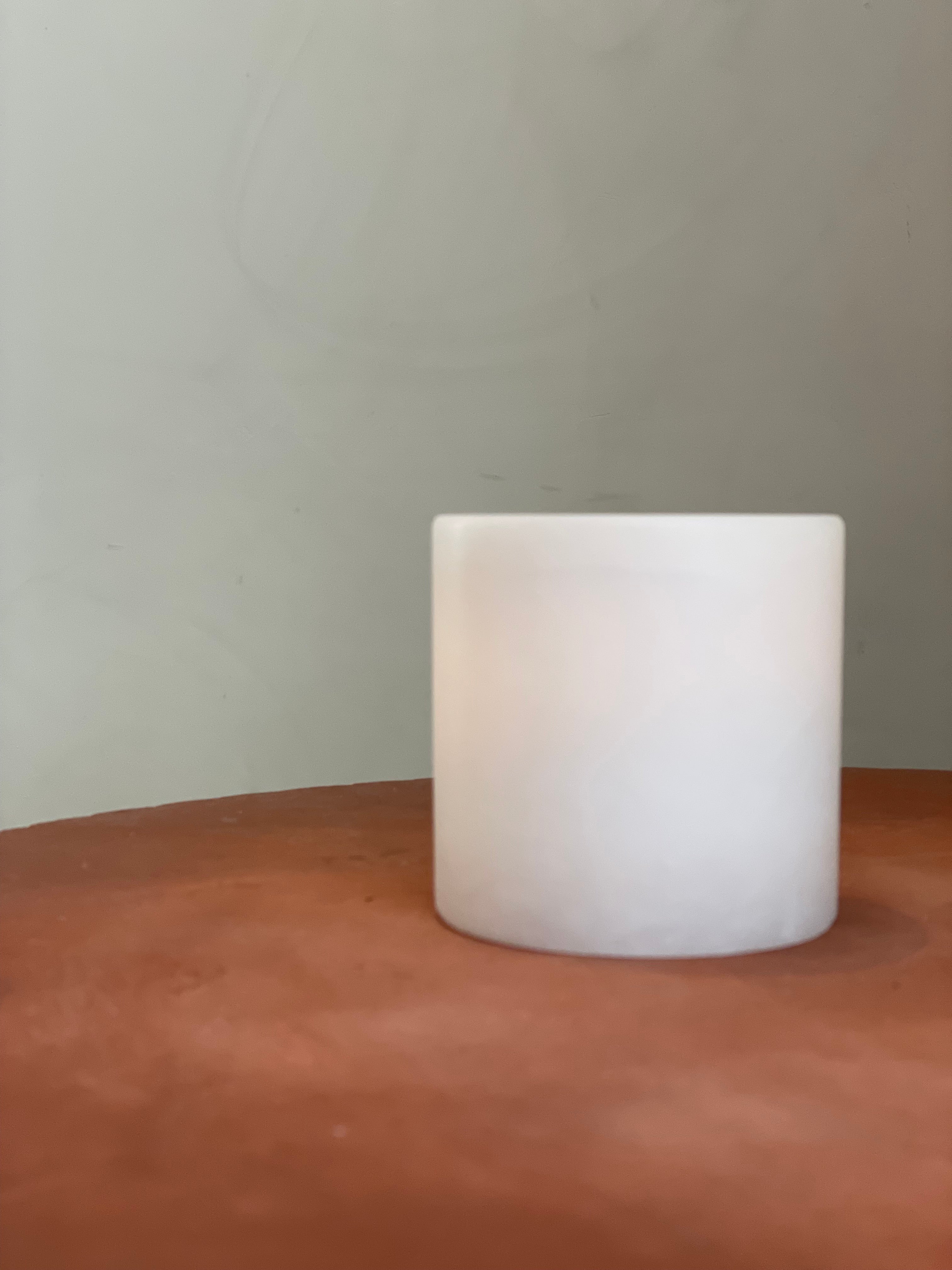
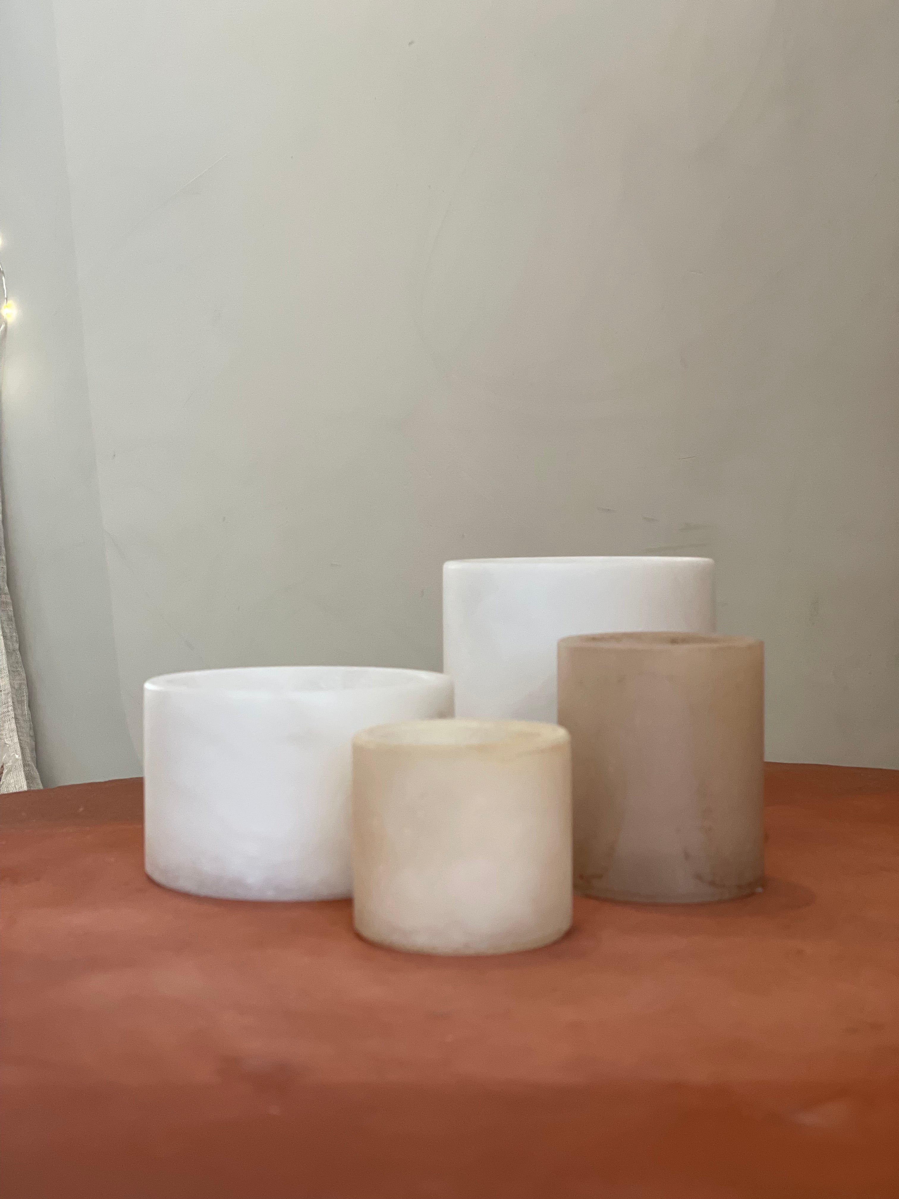
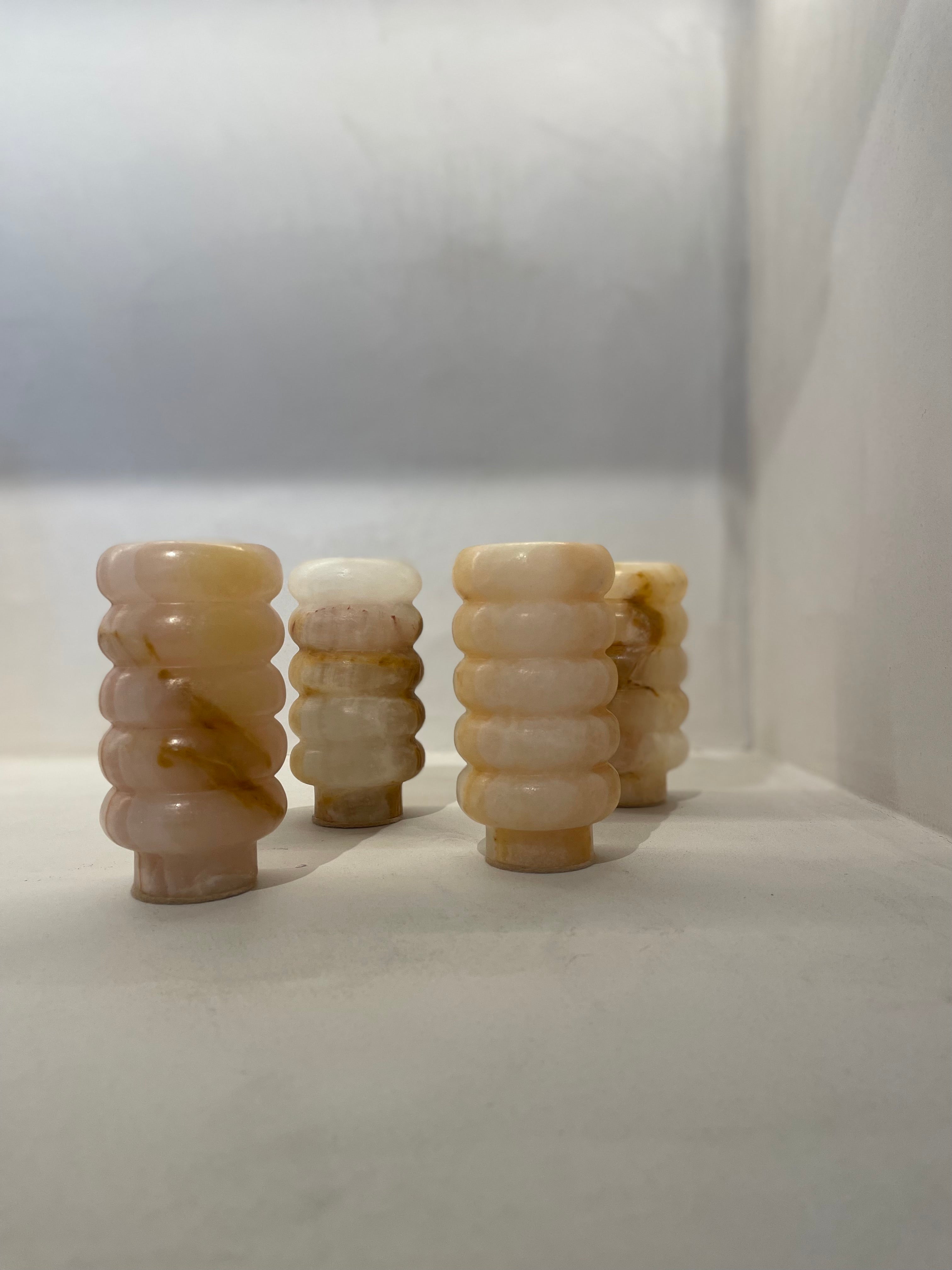
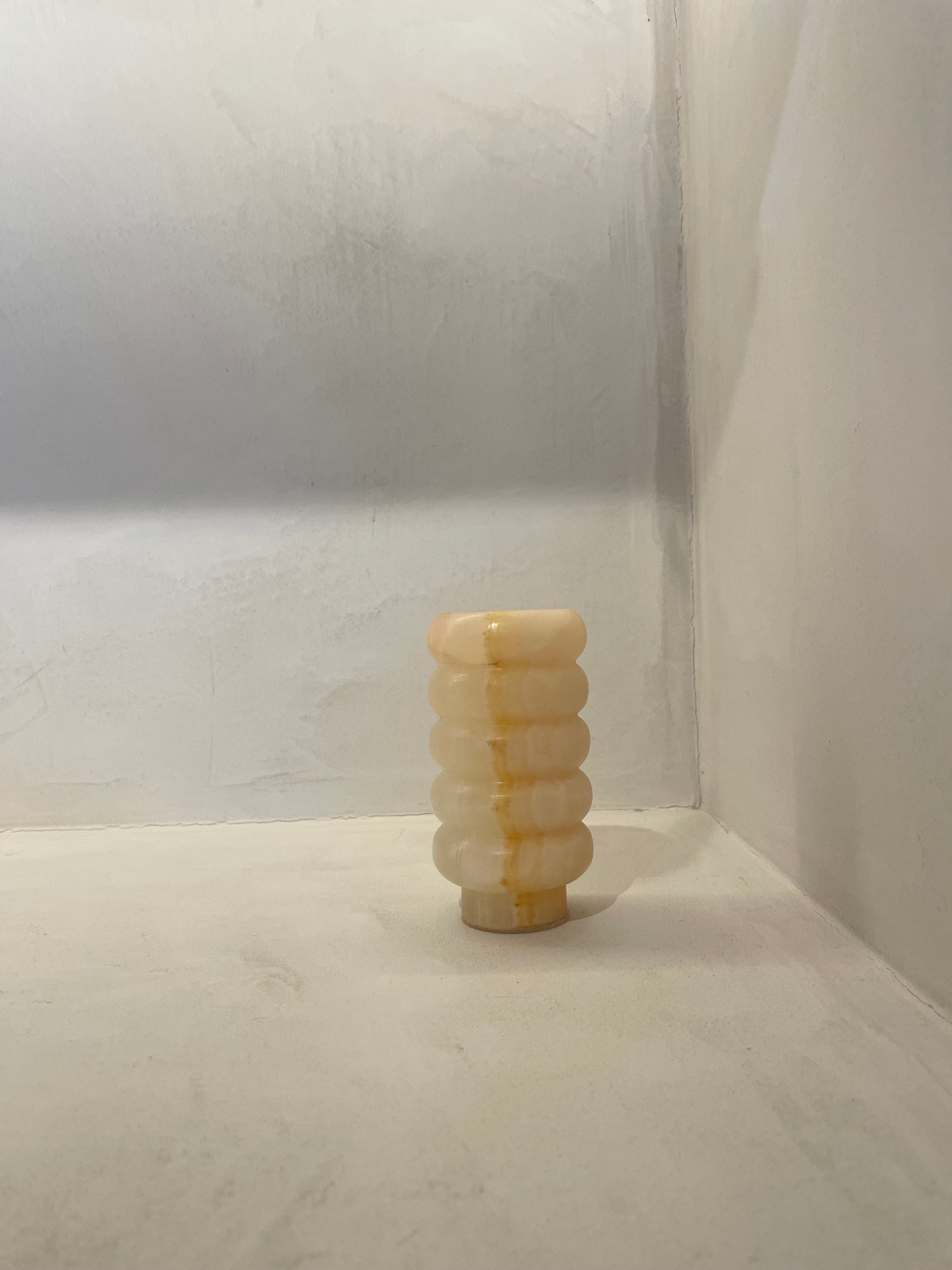
Traditionally, Spanish alabaster is white with varying degrees of veining and patterning in the stone. Some prefer a more uniform variety, while others opt for pronounced veins in gray, brown, or red.
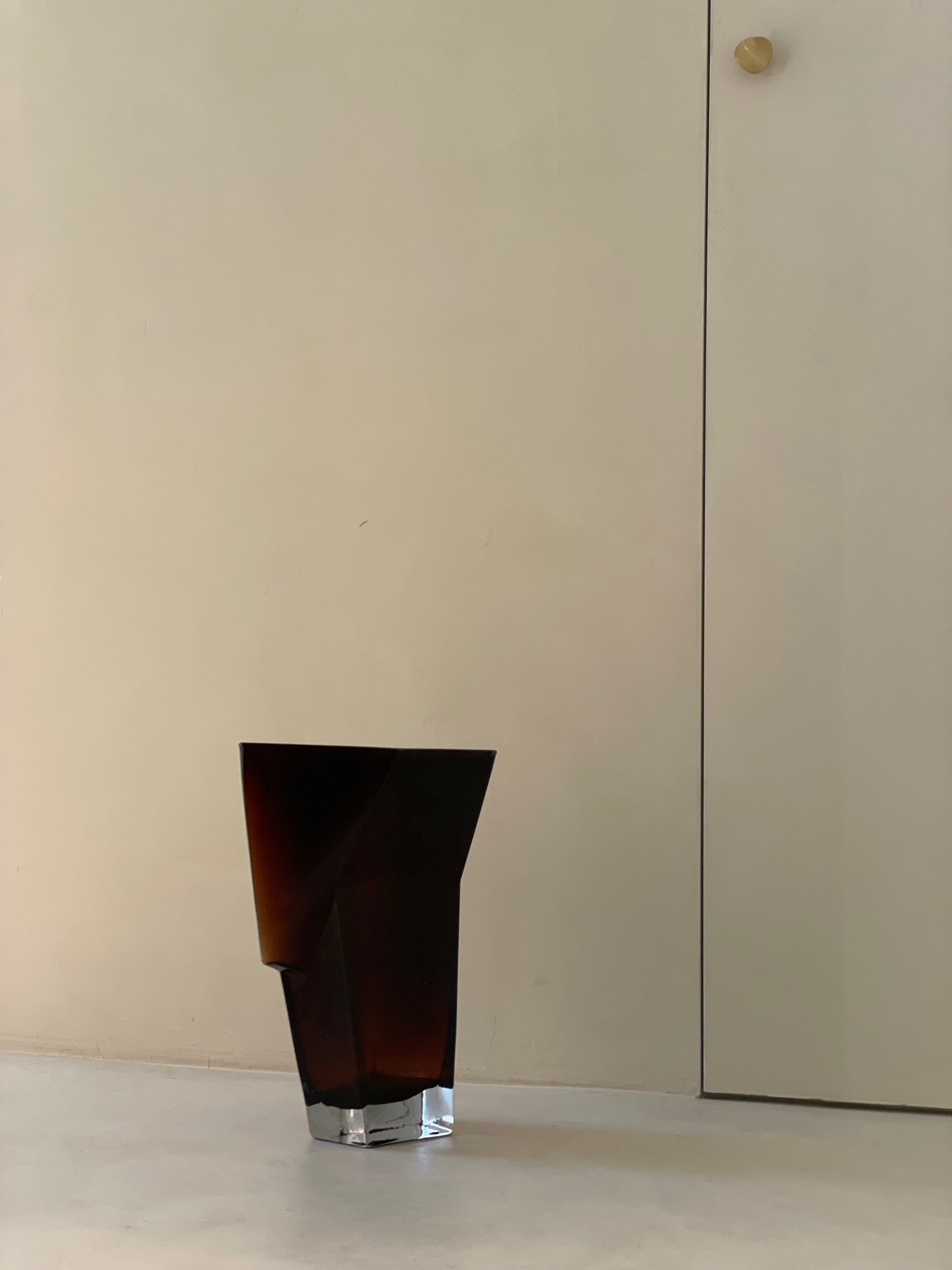
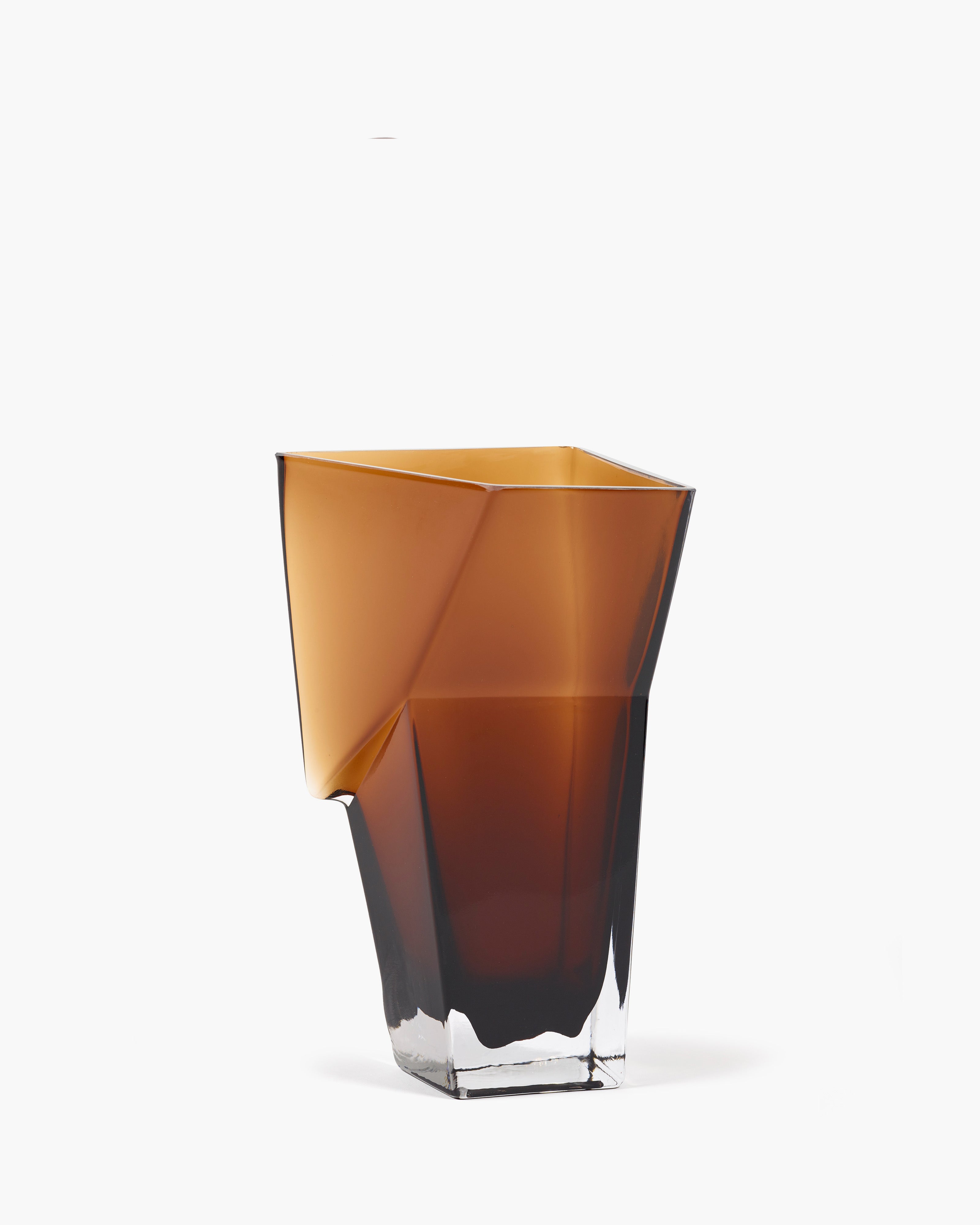
In addition to natural white, there is also pigmented alabaster:
Beige: warmer and softer
Tierra: with a subtle taupe undertone
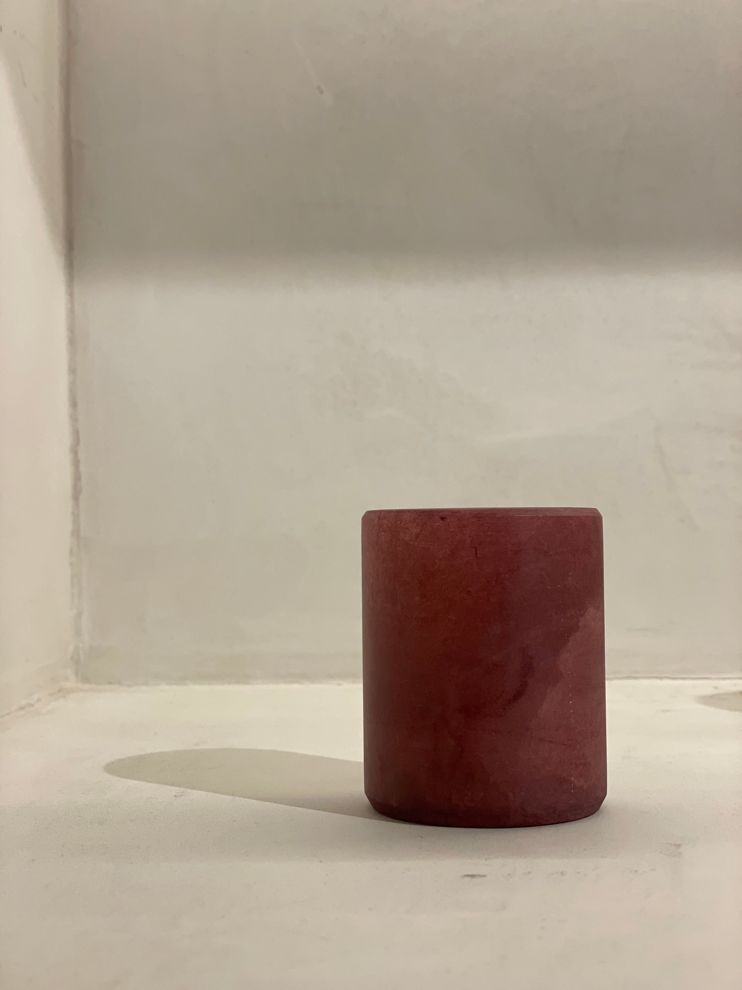
Terracotta: from brown-red to almost orange
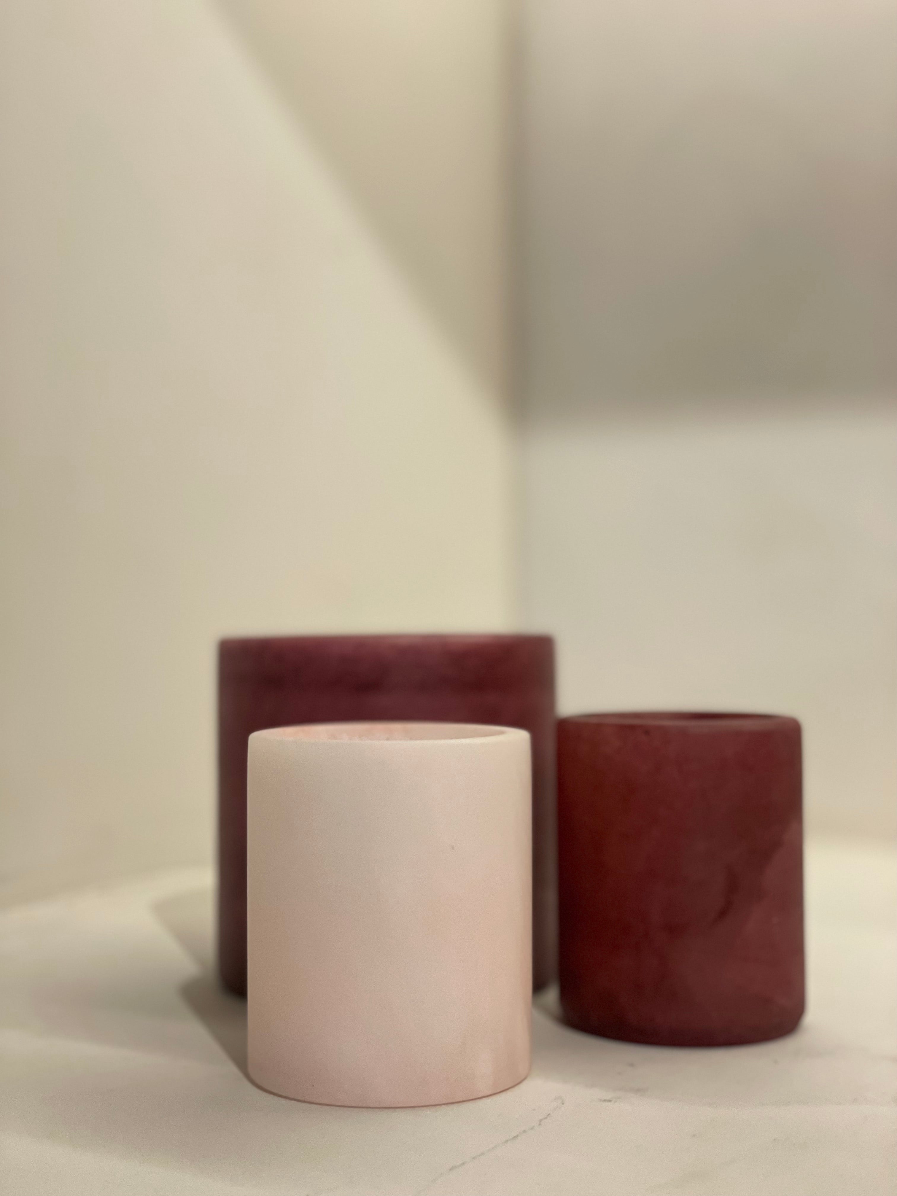
Bordeaux and green
White and beige can be easily combined with almost any interior. The other colors are slightly more pronounced and require a dialogue with the rest of your space. The combination of tierra and beige remains very neutral, while beige with terracotta and green creates a warmer, almost seventies atmosphere.
What is your budget?
This is also a factor, of course. The price varies according to size and color, but alabaster is something you can build up slowly. You don't have to buy a complete set right away. Start with one or two pieces and expand later. Because each stone is unique, the whole remains fascinating and personal over time.
Extra tip
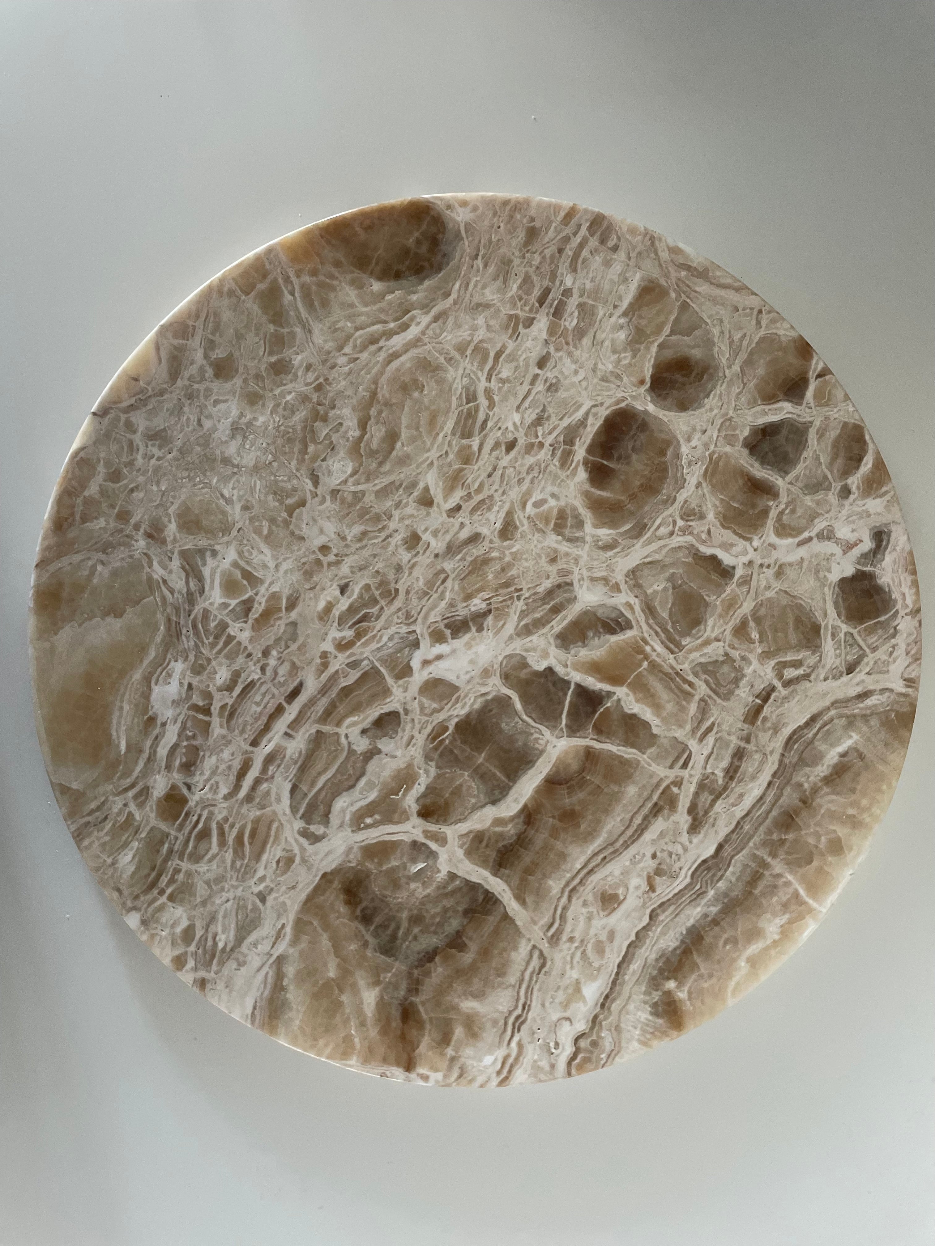
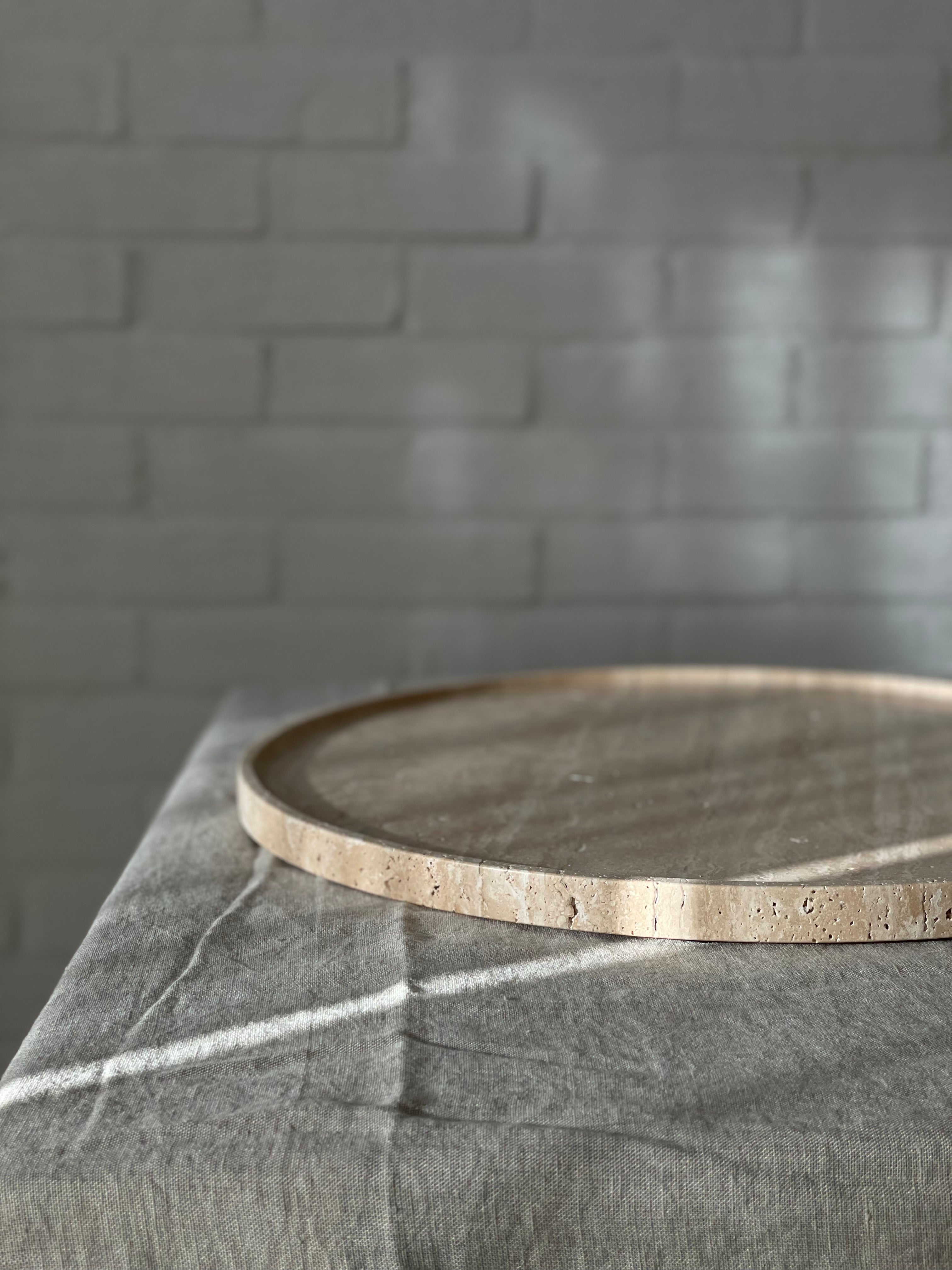
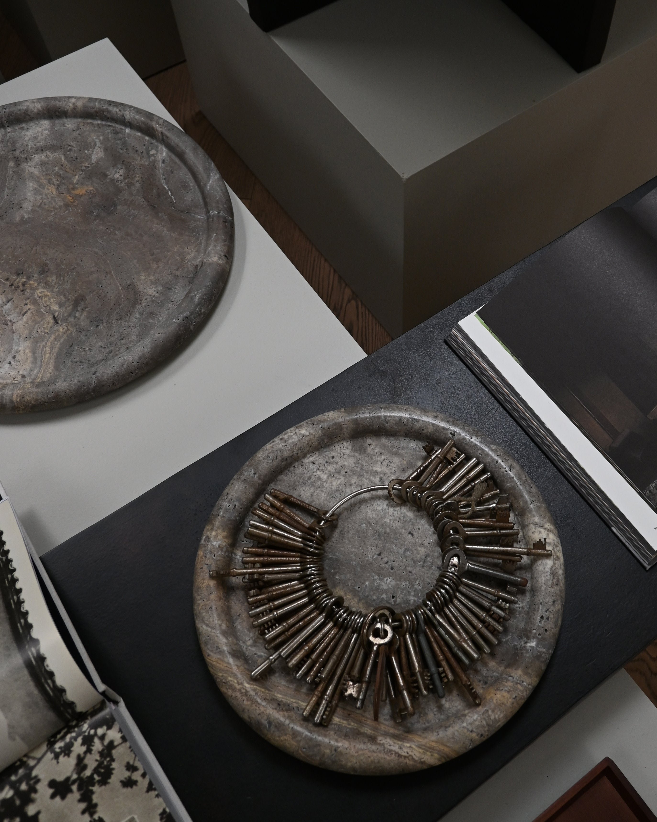
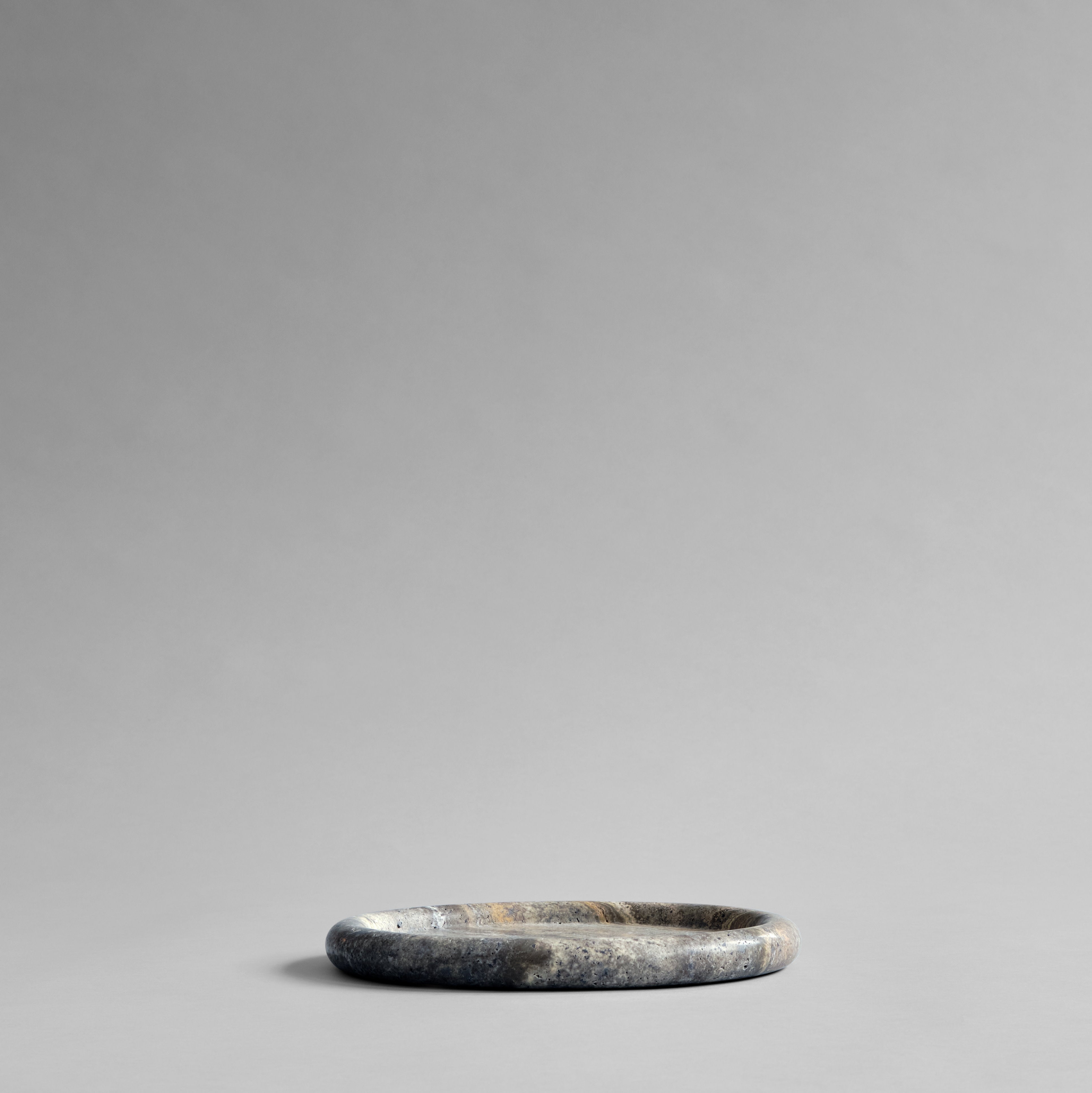
Alabaster combines beautifully with other natural stones. Consider a travertine tray or onyx candlesticks for extra contrast and depth. The interplay of different stones enhances the natural look.
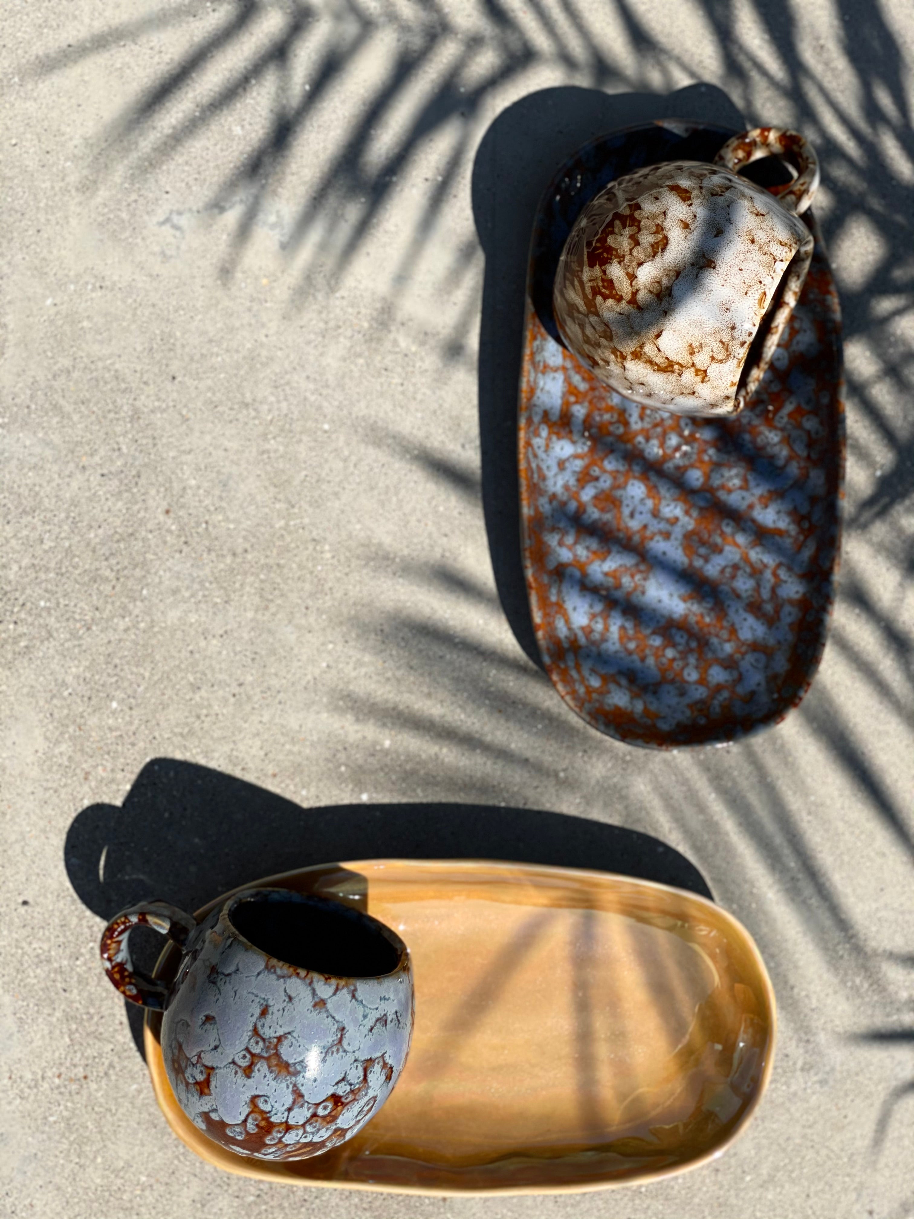
Testimonials
Let customers speak for us
Super vriendelijke service en snelle levering! Bovendien aan huis geleverd met een kleine attentie. Zeer tevreden! Ik zal hier zeker opnieuw bestellen.
Laïs B.
Zo blij met mijn aankoop en vooral ook van de service! Echt top! Jouw webshop is super, maar de volgende keer kom ik héél graag naar jouw showroom! T’is niet zo ver hé! 😉 tot snel!
Pascale H.
Prachtig exemplaar. Net zoals op de foto.
Degelijke verpakking. Zeer snelle levering.
Leuke attentie -> persoonlijke gerichte nota op bijgevoegd kaartje
Sofie A.
Babù is een super gezellige winkel met een prachtige collectie, zeer goede hulp en service van Bénédicte!
Echt een meerwaarde in Mortsel.
Sophie C.
Mijn nieuwe kussens, plaid en kaarsenhouders geven mijn interieur precies die upgrade die ik zocht. Dankjewel voor je hulp!
Chantal VN.
Favorites
Blog posts
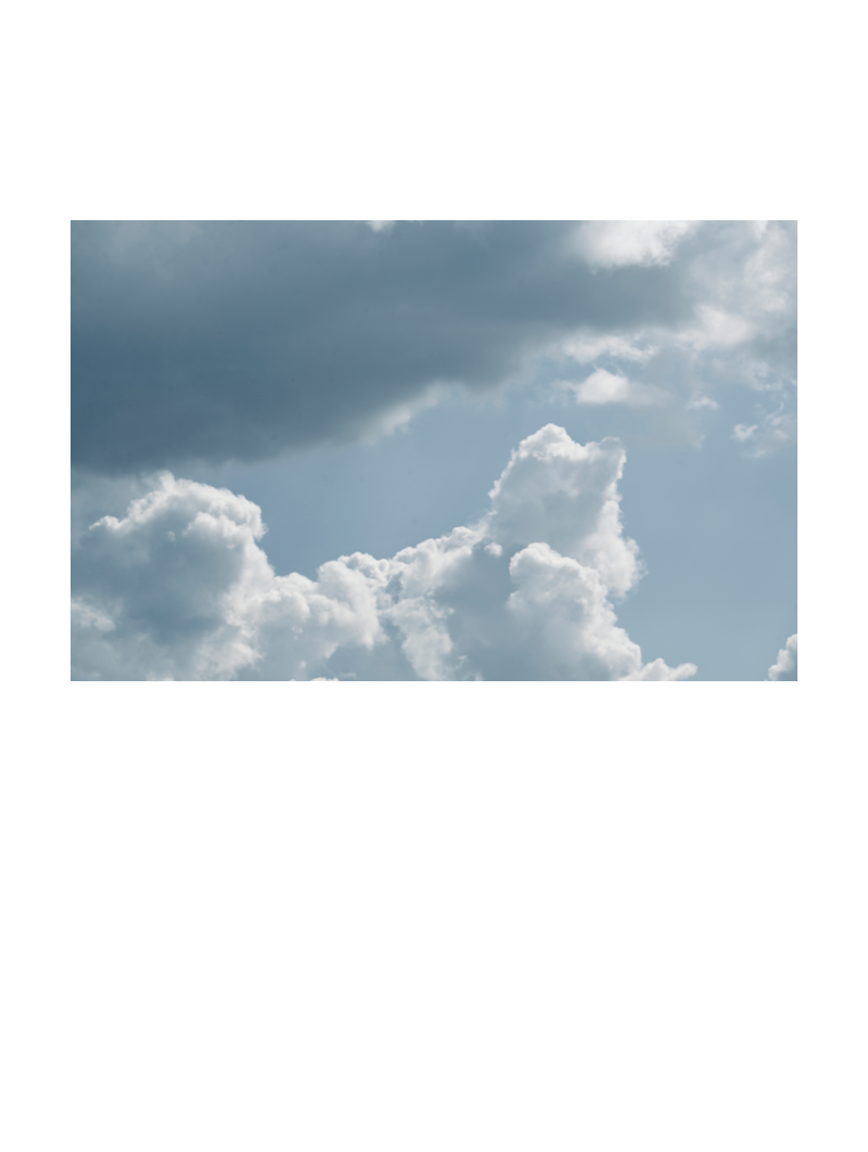
Cloud Dancer — Why Pantone’s 2026 Color of the year is more than 'Just White'
Pantone has announced its Color of the year for 2026: Cloud Dancer.At first glance it seems simple — even controversial — a soft white sparking quite a storm online. But when you look closely, Clou...
Read more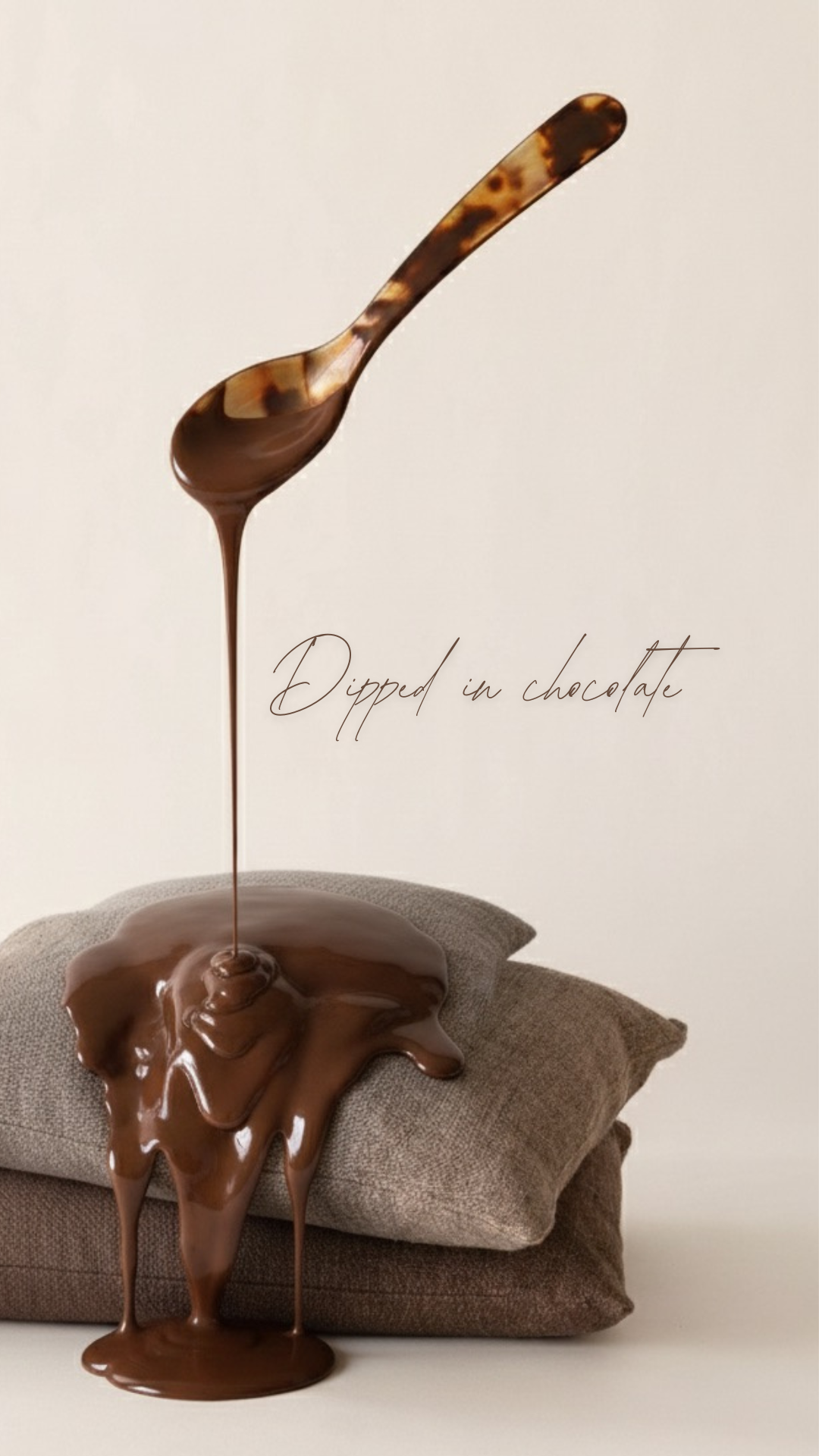
From the runway to your home - Translating F/W 2025's inspirations
Dipped in chocolate The rhythm of the fashion world is undeniable, dictating not just our wardrobes but also subtly reshaping the spaces we inhabit. For Fall/Winter 2025, the runways are a ric...
Read more
Ins and outs in 2025, my picks!
The Colors of 2025I’m thrilled that earthy tones are sticking around—they’re the quiet classics we can always rely on. And this year, Pantone’s Color of the Year, Mocha Mousse, takes it up a notch....
Read more